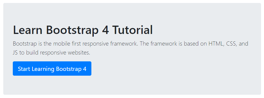
Bootstrap 4 jumbotron is a lightweight flexible content component to showcase the messages on your website. It creates a grey color box with some extra padding to grab the attention of users. You can place useful information on a web page to display viewers.
Bootstrap 4 Jumbotron
You can place headings, paragraphs, and other useful information in jumbotrons. To create jumbotrons using Bootstrap 4, you have to place all the content inside the <div> element with class .jumbotron.
|
1 2 3 4 5 |
<div class="jumbotron"> <h1>Learn Bootstrap 4 Tutorial</h1> <p class="lead">Bootstrap is the mobile-first responsive framework. The framework is based on HTML, CSS, and JS to build responsive websites.</p> <a href="#" class="btn btn-primary btn-lg">Start Learning Bootstrap 4</a> </div> |
Output

The above example shows the jumbotron that contains the heading, paragraph, and button elements.
Fluid or Full-Width Jumbotron
A full-width jumbotron is a component that covers the full viewport without rounded borders. To create a full-width container, you need to add the class .jumbotron-fluid within which add the class .container or .container-fluid.
|
1 2 3 4 5 6 7 |
<div class="jumbotron jumbotron-fluid"> <div class="container"> <h1>Learn Bootstrap 4 Tutorial</h1> <p class="lead">Bootstrap is the mobile-first responsive framework. The framework is based on HTML, CSS, and JS to build responsive websites.</p> <a href="#" class="btn btn-primary btn-lg">Start Learning Bootstrap 4</a> </div> </div> |
The above example uses the class .jumbotron with class .jumbotron-fluid to the <div> element. Inside this, it uses the .container class for full-width jumbotron.
