Bootstrap 4 collapse is the collapsible panel that shows and hides the visibility of content. It is required to use few Bootstrap classes to trigger the toggle effect on content. The collapse effect is useful when you want to hide the large size data and display it only on the button or anchor link click.
Let’s find out how to create collapsible content with the example given below.
Basic Bootstrap 4 Collapse Using Button Element
To create a simple collapsible element on button click, you have to use a <button> element with attributes data-toggle="collapse" and data-target="#id" in which id is the id of the <div> element that contains the content part as given below:
|
1 2 3 4 5 6 |
<button class="btn btn-primary" data-toggle="collapse" data-target="#collapseExample"> Collapsible Button </button> <div class="collapse" id="collapseExample"> Content that displays on click of the button element. </div> |
Output

Explanation: The above example contains the <button > element and the <div> element. The <div> element contains the attribute id="collapseExample" that gets added to the <button> element inside the attribute data-target="#collapseExample". The combination of these elements creates a collapsible element using Bootstrap 4.
Simple Collapse Using Anchor Link Element
Similarly, you can also use the anchor (<a>) link element to create a collapsible element. The only difference is that you have to add the id of the <div> element to the href attribute of <a> element as given below:
|
1 2 3 4 5 6 |
<a class="btn btn-primary" data-toggle="collapse" href="#collapseExample"> Collapsible Anchor Link </a> <div class="collapse" id="collapseExample"> Content that displays on click of the anchor link. </div> |
Output

The above example is a Bootstrap 4 collapse element using the <a> element. You can click the button ‘Test it Live’ button to test the above example live.
Let’s create an accordion using Bootstrap 4 collapse.
Accordion in Bootstrap 4
An accordion is an element that contains multiple links that display collapsible content on link clicks. You can create an accordion in Bootstrap 4 using a card header and body part. The card header contains the <button> element and the card body contains the content.
You need to add the attributes data-toggle="collapse" and data-target="#id" (where id is the id of the content <div>) to the <button> element. It also requires wrapping everything inside the class .accordion as given below:
|
1 2 3 4 5 6 7 8 9 10 11 12 13 14 15 16 17 18 19 20 21 22 23 24 25 26 27 28 29 30 31 32 33 34 35 36 37 38 39 40 41 42 |
<div class="accordion" id="accordionExample"> <div class="card"> <div class="card-header"> <button class="btn btn-link" data-toggle="collapse" data-target="#collapseOne"> Collapsible Group Item #1 </button> </div> <div class="collapse show" id="collapseOne" data-parent="#accordionExample"> <div class="card-body"> This is the collapsible content for the first accordion panel. </div> </div> </div> <div class="card"> <div class="card-header"> <button class="btn btn-link" data-toggle="collapse" data-target="#collapseTwo"> Collapsible Group Item #2 </button> </div> <div class="collapse" id="collapseTwo" data-parent="#accordionExample"> <div class="card-body"> This is the collapsible content for the second accordion panel. </div> </div> </div> <div class="card"> <div class="card-header"> <button class="btn btn-link" data-toggle="collapse" data-target="#collapseThree"> Collapsible Group Item #3 </button> </div> <div class="collapse" id="collapseThree" data-parent="#accordionExample"> <div class="card-body"> This is the collapsible content for the third accordion panel. </div> </div> </div> </div><!-- .accordion --> |
Output
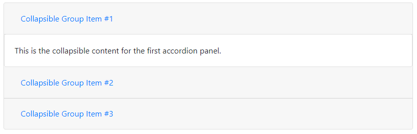
The above example shows the multiple collapse elements that create an accordion using Bootstrap 4. You can click the panels to open the collapsible content and test the above example live.
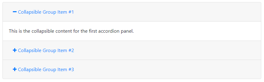
data-parent="#id" to the content parent <div> element. Here, id is the id of the <div> element that contains the class .accordion)Bootstrap 4 Accordion with Plus Minus Icons
To create a Bootstrap 4 accordion with plus/minus icons, you have to use the example given above. After that, add the font awesome icons for plus and minus and use the script given below:
|
1 2 3 4 5 6 7 8 9 10 11 12 13 14 15 16 17 18 19 20 21 22 23 24 25 26 27 28 29 30 31 32 33 34 35 36 37 38 39 40 41 42 43 44 45 46 47 48 49 50 51 52 53 54 55 56 57 58 |
<script> $(document).ready(function(){ //Add a minus icon to the collapse element that is open by default $('.collapse.show').each(function(){ $(this).parent().find(".fa").removeClass("fa-plus").addClass("fa-minus"); }); //Toggle plus/minus icon on show/hide of collapse element $('.collapse').on('shown.bs.collapse', function(){ $(this).parent().find(".fa").removeClass("fa-plus").addClass("fa-minus"); }).on('hidden.bs.collapse', function(){ $(this).parent().find(".fa").removeClass("fa-minus").addClass("fa-plus"); }); }); </script> <div class="accordion" id="accordionExample"> <div class="card"> <div class="card-header"> <button class="btn btn-link" data-toggle="collapse" data-target="#collapseOne"> <i class="fa fa-plus"></i> Collapsible Group Item #1 </button> </div> <div class="collapse show" id="collapseOne" data-parent="#accordionExample"> <div class="card-body"> This is the collapsible content for the first accordion panel. </div> </div> </div> <div class="card"> <div class="card-header"> <button class="btn btn-link" data-toggle="collapse" data-target="#collapseTwo"> <i class="fa fa-plus"></i> Collapsible Group Item #2 </button> </div> <div class="collapse" id="collapseTwo" data-parent="#accordionExample"> <div class="card-body"> This is the collapsible content for the second accordion panel. </div> </div> </div> <div class="card"> <div class="card-header"> <button class="btn btn-link" data-toggle="collapse" data-target="#collapseThree"> <i class="fa fa-plus"></i> Collapsible Group Item #3 </button> </div> <div class="collapse" id="collapseThree" data-parent="#accordionExample"> <div class="card-body"> This is the collapsible content for the third accordion panel. </div> </div> </div> </div><!-- .accordion --> |
Output
At the start, there is only one content item is open with a minus icon and other items are closed with a plus icon. When you click the other collapsible items, it gets opened and the plus icons change into the minus icon.