Bootstrap 4 forms controls are easily style and change the appearance with various layout options. You can create a wide variety of forms with the pre-defined classes of Bootstrap.
The forms can be easily customized to display on different screen sizes. You can easily style input, textarea, buttons, select options, labels, and more using Bootstrap 4.
Let’s find out how to create form layouts and style controls with the examples given below.
Simple Form Layout Using Bootstrap 4
You can create a simple layout of forms using the class .form-control for the <input>. After that, place it with <label> inside the class .form-group as given below:
|
1 2 3 4 5 6 7 8 9 10 11 12 13 14 15 16 17 |
<form> <div class="form-group"> <label>Email</label> </div> <div class="form-group"> <label>Password</label> <input type="password" class="form-control" placeholder="Your Password"> </div> <div class="form-group form-check"> <div class="form-check"> <input type="checkbox" class="form-check-input"> <label class="form-check-label">Remember me</label> </div> </div> <button type="submit" class="btn btn-primary">Login</button> </form> |
Output
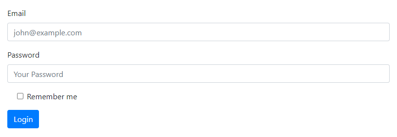
The above example contains the textbox for email and password. It also contains the checkbox and the button. You can learn about creating the checkbox later in this tutorial.
Different Form Layouts in Bootstrap 4
There are three different form layouts you can create in Bootstrap 4 as given below:
- Vertical Layout
- Horizontal Layout
- Inline Layout
Let’s check out each layout with examples and more details.
Default or Vertical Form Layout Using Form Group
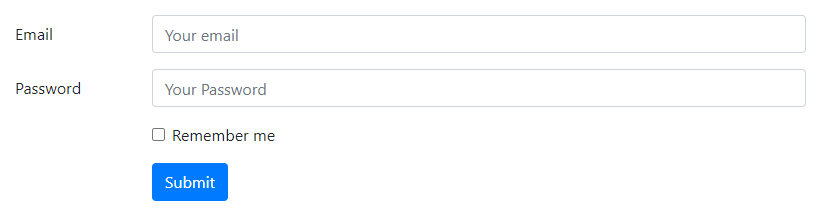
It is the default form layout that we can also call a simple or vertical form layout. To create the default form layout, you have to place the <label> and the form controls (like <input>, <textarea>, etc) inside the class .form-group as given below:
|
1 2 3 4 5 6 7 8 9 10 11 12 13 14 15 16 17 |
<form> <div class="form-group"> <label for="email">Email</label> <input type="email" class="form-control" placeholder="Your email"> </div> <div class="form-group"> <label for="password">Password</label> <input type="password" class="form-control" placeholder="Your password"> </div> <div class="form-group form-check"> <input type="checkbox" class="form-check-input" name="rememberme"> <label class="form-check-label">Remember me</label> </div> <div class="form-group"> <button type="submit" class="btn btn-primary">Submit</button> </div> </form> |
Output

The above example is the default layout that is the same as the simple layout that you have created in the previous example.
Horizontal Forms Layout in Bootstrap 4
The horizontal layout is the form layout in which the label and form controls (like <input>, <textarea>, etc) are placed horizontally. To create the horizontal layout, you have to use the grid classes as given below:
|
1 2 3 4 5 6 7 8 9 10 11 12 13 14 15 16 17 18 19 20 21 22 23 24 25 26 27 |
<form> <div class="form-group row"> <label for="email" class="col-sm-2 col-form-label">Email</label> <div class="col-sm-10"> <input type="email" class="form-control" placeholder="Your email"> </div> </div> <div class="form-group row"> <label for="password" class="col-sm-2 col-form-label">Password</label> <div class="col-sm-10"> <input type="password" class="form-control" placeholder="Your Password"> </div> </div> <div class="form-group row"> <div class="col-sm-10 offset-sm-2"> <div class="form-check"> <input type="checkbox" class="form-check-input"> <label class="form-check-label">Remember me</label> </div> </div> </div> <div class="form-group row"> <div class="col-sm-10 offset-sm-2"> <button type="submit" class="btn btn-primary">Submit</button> </div> </div> </form> |
Output
The above example contains the same form fields but with a horizontal form layout.
Inline Form Layout
The inline form layout is the layout in which all the form fields are placed in a single line. To create an inline form layout, you have to add the class .form-inline to the <form> tag. The form fields and controls are the same as the previous example as given below:
|
1 2 3 4 5 6 7 8 9 10 11 12 13 14 15 16 17 |
<form class="form-inline"> <div class="form-group mr-3 mb-3"> <input type="email" class="form-control" placeholder="Enter your email"> </div> <div class="form-group mr-3 mb-3"> <input type="password" class="form-control" placeholder="Enter your password"> </div> <div class="form-group mr-3 mb-3"> <div class="form-check"> <input type="checkbox" class="form-check-input"> <label class="form-check-label">Remember me</label> </div> </div> <div class="form-group mb-3"> <button type="submit" class="btn btn-primary">Submit</button> </div> </form> |
Output

You can test the above example live to check the inline form layout. The form fields are placed in a single line.
Let’s take a look at the appearance and styling of Bootstrap 4 forms elements.
Appearance and Styling of Form Elements in Bootstrap 4
You can change the appearance and style of any form elements using different styling classes of Bootstrap 4. The classes are available for almost every form elements like <input>, <select>, <textarea>, etc.
Input Type Element
Input type elements are the simple textbox that takes input as text, email, password, and others. You can style a textbox by adding a single class .form-control. It adds a width of 100% to the textbox and other styles to it as given below:
|
1 2 3 4 5 6 |
<form> <div class="form-group"> <label>Email</label> </div> </form> |
Output
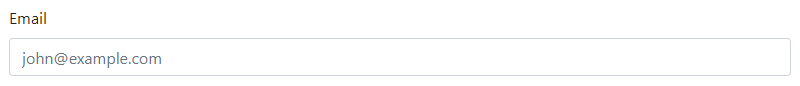
The textbox showing above contains the input type email with the full width of the parent element.
Select Type Element in Bootstrap 4
The select box is a dropdown that contains many options to choose or select. You can style the select box by adding the class .form-control that changes the appearance as given below:
|
1 2 3 4 5 6 7 8 9 10 11 |
<form> <div class="form-group"> <label>Select Your Choice</label> <select class="form-control"> <option value="One">One</option> <option value="Two">Two</option> <option value="Three">Three</option> <option value="Fore">Fore</option> </select> </div> </form> |
Output
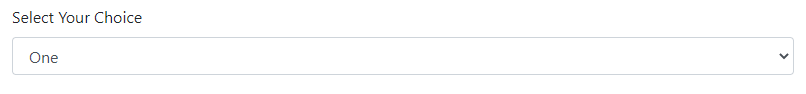
The select box given above is a full-width select box that contains options to select as your choice.
Multiselect Type Element
A multi-select element is useful to allow users to select multiple options simultaneously. You can create a multi-select box by adding the attribute multiple to the <select> element as given below:
|
1 2 3 4 5 6 7 8 9 10 11 |
<form> <div class="form-group"> <label>Select Multiple Choice</label> <select multiple class="form-control"> <option value="0">0</option> <option value="1">1</option> <option value="2">2</option> <option value="3">3</option> </select> </div> </form> |
Output
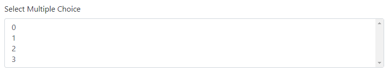
The multi-select box given above contains options to select single as well as multiple.
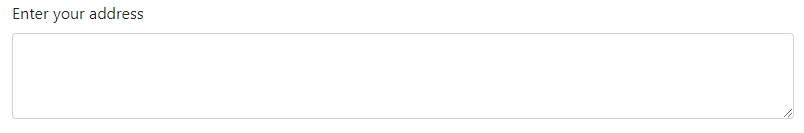
Textarea Element in Bootstrap 4
A textarea is a multiline textbox that is useful to get large messages from users. You can easily style textarea by adding the class .form-control as given below:
|
1 2 3 4 5 6 |
<form> <div class="form-group"> <label>Enter your address</label> <textarea class="form-control" rows="3"></textarea> </div> </form> |
Output
File Upload Form Field
A file upload field takes input as a file to upload and save to some location. You can add class .form-control-file to style it using Bootstrap 4 as given below:
|
1 2 3 4 5 6 |
<form> <div class="form-group"> <label>Upload a File</label> <input type="file" class="form-control-file"> </div> </form> |
Output
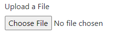
The above example contains the file upload field that you can click and upload a file to check it’s working.
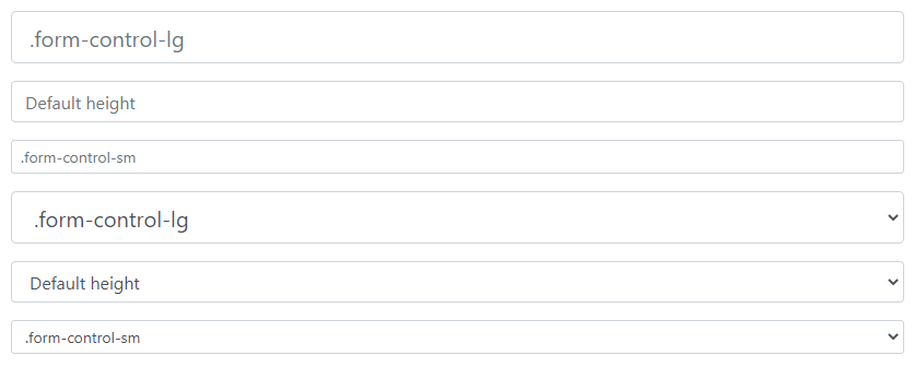
Sizing Height of Input and Select Element
You can increase or decrease the size of the <input> and <select> elements in Bootstrap 4. To increase the size of the elements you can add the class .form-control-lg. While to decrease the size of the elements, the available class is .form-control-sm as given below:
|
1 2 3 4 5 6 7 8 9 10 11 12 13 14 15 16 17 18 19 20 21 22 23 24 25 26 |
<form> <div class="form-group"> <input type="email" class="form-control form-control-lg" placeholder=".form-control-lg"> </div> <div class="form-group"> <input type="email" class="form-control" placeholder="Default height"> </div> <div class="form-group"> <input type="email" class="form-control form-control-sm" placeholder=".form-control-sm"> </div> <div class="form-group"> <select class="form-control form-control-lg"> <option>.form-control-lg</option> </select> </div> <div class="form-group"> <select class="form-control"> <option>Default height</option> </select> </div> <div class="form-group"> <select class="form-control form-control-sm"> <option>.form-control-sm</option> </select> </div> </form> |
Output
Sizing Height of Horizontal Form Labels
In addition to sizing the form controls, you can also increase or decrease the height of the form <label> elements. To increase the height of the labels, you can add the class .col-form-label-sm to it. However, to decrease the height of the labels, use the class .col-form-label-lg as given below:
|
1 2 3 4 5 6 7 8 9 10 11 12 13 14 15 16 17 18 19 20 |
<form> <div class="form-group row"> <label for="email" class="col-sm-2 col-form-label col-form-label-sm">Email</label> <div class="col-sm-10"> <input type="email" class="form-control form-control-sm" placeholder=".col-form-label-sm"> </div> </div> <div class="form-group row"> <label for="email" class="col-sm-2 col-form-label">Email</label> <div class="col-sm-10"> <input type="email" class="form-control" placeholder=".col-form-label"> </div> </div> <div class="form-group row"> <label for="email" class="col-sm-2 col-form-label col-form-label-lg">Email</label> <div class="col-sm-10"> <input type="email" class="form-control form-control-lg" placeholder=".col-form-label-lg"> </div> </div> </form> |
Output
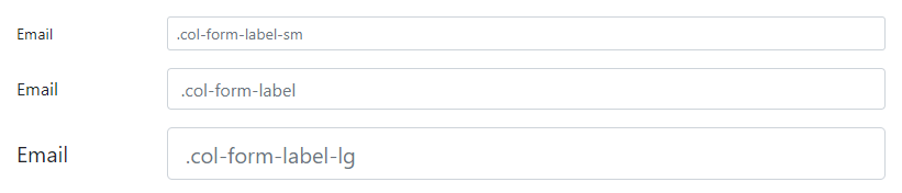
It is recommended to use the sizing of labels with the sizing of form controls to match the equal height.
Readonly Fields in Bootstrap 4 Forms
Readonly form fields are useful to display form fields that you can read and not able to write or modify. To create a read-only form field, you have to add the attribute readonly to the form control elements as given below:
|
1 2 3 4 5 6 7 8 9 10 |
<form> <div class="form-group"> <input type="email" class="form-control" placeholder="Readonly input field" readonly> </div> </form> <form> <div class="form-group"> <textarea class="form-control" rows="3" readonly>Readonly textarea field</textarea> </div> </form> |
Output
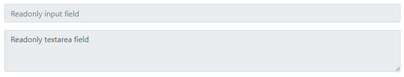
You can check the above form field and test it live by clicking on the ‘Test it Live’ button given above. Users are not allowed to click and add content or modify.
Readonly Plaintext Fields in Bootstrap 4 Forms
A plain text in form fields is the simple visible text content already present in textboxes. It has no style and borders to display with form fields with only visible text content.
To create plaintext form fields, you have to add the class .form-control-plaintext to the form fields as given below:
|
1 2 3 4 5 6 7 8 9 10 |
<form> <div class="form-group"> </div> </form> <form> <div class="form-group"> <textarea class="form-control-plaintext" rows="3" readonly>This is a textarea with readonly plaintext content inside it.</textarea> </div> </form> |
Output
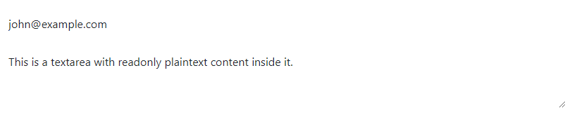
The above example showing the text content in the input text box and textarea.
Range Input Field in Bootstrap 4
A range input field contains a horizontally scrollable value to select. To style the input range field, you have to add the class .form-control-range to the <input type="range"> element as given below:
|
1 2 3 4 5 6 |
<form> <div class="form-group"> <label>Range Input Field</label> <input type="range" class="form-control-range"> </div> </form> |
Output

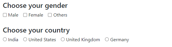
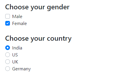
Default or Stacked Checkboxes and Radio Buttons
A default or stacked checkboxes and radio buttons are then vertically placed checkbox and radio button elements as given below. To create a checkbox and radio buttons in Bootstrap 4, you have to add the class .form-check-input to the checkbox and radio button and places them inside the class form-check as given below:
|
1 2 3 4 5 6 7 8 9 10 11 12 13 14 15 16 17 18 19 20 21 22 23 24 25 26 27 28 29 30 31 32 |
<form> <h4>Choose your gender</h4> <div class="form-check"> <input type="checkbox" class="form-check-input" name="gender"> <label class="form-check-label">Male</label> </div> <div class="form-check"> <input type="checkbox" class="form-check-input" name="gender"> <label class="form-check-label">Female</label> </div> <div class="form-check"> <input type="checkbox" class="form-check-input" name="gender"> <label class="form-check-label">Others</label> </div> <h4 class="mt-4">Choose your country</h4> <div class="form-check"> <input type="radio" class="form-check-input" name="country"> <label class="form-check-label">India</label> </div> <div class="form-check"> <input type="radio" class="form-check-input" name="country"> <label class="form-check-label">United States</label> </div> <div class="form-check"> <input type="radio" class="form-check-input" name="country"> <label class="form-check-label">United Kingdom</label> </div> <div class="form-check"> <input type="radio" class="form-check-input" name="country"> <label class="form-check-label">Germany</label> </div> </form> |
Output

The above example shows the stacked checkboxes and radio buttons
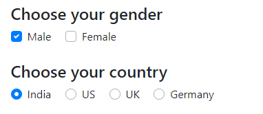
Inline Checkboxes and Radio Buttons
You can also set the inline layout to place all the checkboxes or radio buttons in a single line. To place all the checkboxes or radio buttons in a single line, you have to add the class .form-check-inline with the class .form-check as given below:
|
1 2 3 4 5 6 7 8 9 10 11 12 13 14 15 16 17 18 19 20 21 22 23 24 25 26 27 28 29 30 31 32 |
<form> <h4>Choose your gender</h4> <div class="form-check form-check-inline"> <input type="checkbox" class="form-check-input" name="gender"> <label class="form-check-label">Male</label> </div> <div class="form-check form-check-inline"> <input type="checkbox" class="form-check-input" name="gender"> <label class="form-check-label">Female</label> </div> <div class="form-check form-check-inline"> <input type="checkbox" class="form-check-input" name="gender"> <label class="form-check-label">Others</label> </div> <h4 class="mt-4">Choose your country</h4> <div class="form-check form-check-inline"> <input type="radio" class="form-check-input" name="country"> <label class="form-check-label">India</label> </div> <div class="form-check form-check-inline"> <input type="radio" class="form-check-input" name="country"> <label class="form-check-label">United States</label> </div> <div class="form-check form-check-inline"> <input type="radio" class="form-check-input" name="country"> <label class="form-check-label">United Kingdom</label> </div> <div class="form-check form-check-inline"> <input type="radio" class="form-check-input" name="country"> <label class="form-check-label">Germany</label> </div> </form> |
Output
The above example shows all the checkboxes in the same line in the ‘Choose your gender’ section. It also contains the radio buttons in the same line in the ‘Choose your country’ section.
Form Grid, Form Row, and Autosizing Layout
You can use the grid and form row to set the form controls and labels in grid columns. The auto-layout is useful to create a layout that automatically set according to the screen sizes.
Let’s find out how to create them with the examples given below.
Form Grid
A form grid can be created by using the row and columns using the grid classes. You have to place all the form controls inside the grid row and columns as given below:
|
1 2 3 4 5 6 7 8 9 10 |
<form> <div class="row"> <div class="col"> <input type="email" class="form-control" placeholder="Your email"> </div> <div class="col"> <input type="password" class="form-control" placeholder="Your password"> </div> </div> </form> |
Output

Form Row Grid
You can use the class .form-row in place of the .row class to create more closure elements in Bootstrap 4 forms.
|
1 2 3 4 5 6 7 8 9 10 |
<form> <div class="form-row"> <div class="col"> <input type="email" class="form-control" placeholder="Your email"> </div> <div class="col"> <input type="password" class="form-control" placeholder="Your password"> </div> </div> </form> |
Output

The above example contains the two form fields in grid columns and they appear closer to each other.
Forms Auto-sizing in Bootstrap 4
For auto-sizing of columns for form controls in a form, you have to use the .col-auto class for grid columns as given below:
|
1 2 3 4 5 6 7 8 9 10 11 12 13 14 15 16 17 18 19 |
<form> <div class="form-row align-items-center"> <div class="col-auto mb-3"> <input type="email" class="form-control" placeholder="Enter email"> </div> <div class="col-auto mb-3"> <input type="password" class="form-control" placeholder="Enter password"> </div> <div class="col-auto mb-3"> <div class="form-check"> <input type="checkbox" class="form-check-input"> <label class="form-check-label">Remember me</label> </div> </div> <div class="col-auto mb-3"> <button type="submit" class="btn btn-primary">Submit</button> </div> </div> </form> |
Output

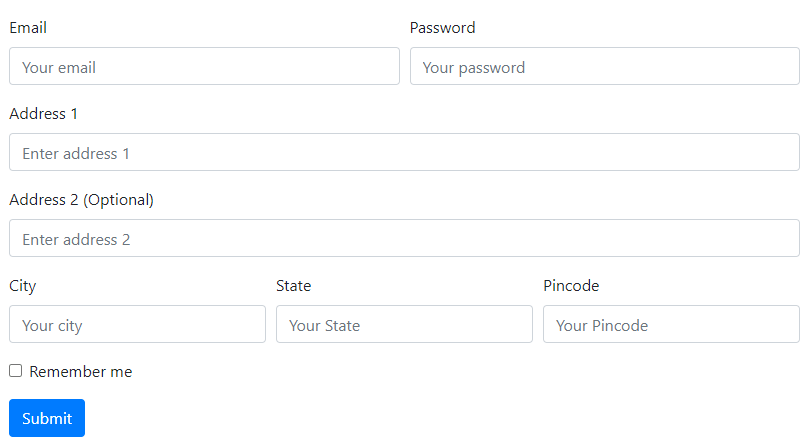
More Complex Bootstrap 4 Forms Using Row and Grid Classes
It is more useful to use grid columns to create a form layout that is more complex to create. The below form controls are more complex to set a layout. Grid columns make it easier to create a layout fastly as given below:
|
1 2 3 4 5 6 7 8 9 10 11 12 13 14 15 16 17 18 19 20 21 22 23 24 25 26 27 28 29 30 31 32 33 34 35 36 37 38 39 40 41 42 43 |
<form> <div class="form-row"> <div class="form-group col-sm-6"> <label for="email">Email</label> <input type="email" class="form-control" placeholder="Your email"> </div> <div class="form-group col-sm-6"> <label for="password">Password</label> <input type="password" class="form-control" placeholder="Your password"> </div> </div> <div class="form-group"> <label for="address1">Address 1</label> <input type="text" class="form-control" placeholder="Enter address 1"> </div> <div class="form-group"> <label for="address2">Address 2 (Optional)</label> <input type="text" class="form-control" placeholder="Enter address 2"> </div> <div class="form-row"> <div class="form-group col-sm-4"> <label for="city">City</label> <input type="text" class="form-control" placeholder="Your city"> </div> <div class="form-group col-sm-4"> <label for="state">State</label> <input type="text" class="form-control" placeholder="Your State"> </div> <div class="form-group col-sm-4"> <label for="pincode">Pincode</label> <input type="text" class="form-control" placeholder="Your Pincode"> </div> </div> <div class="form-group"> <div class="form-check"> <input type="checkbox" class="form-check-input"> <label class="form-check-label">Remember me</label> </div> </div> <div class="form-group"> <button type="submit" class="btn btn-primary">Submit</button> </div> </form> |
Output
Help Text with Form Fields in Bootstrap 4
The help text is useful to describe the purpose of the form controls added to the form. You can create a help text by adding the <small> tag with class .form-text and .text-muted as given below:
|
1 2 3 4 5 6 7 8 9 |
<form> <div class="form-group"> <label for="password">Password</label> <input type="password" class="form-control" placeholder="Your password"> <small class="form-text text-muted"> Password must be 8 to 20 characters long, contain letters, numbers, special characters, and must not contain spaces. </small> </div> </form> |
Output
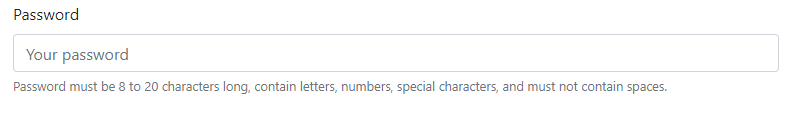
The above example shows the input text field to input as a password. Help text makes it easier for users to define the valid input for the password to get from users.
Inline Help Text
The inline help text is the content that is placed after the input field in a single line. It uses the .form-inline to the <form> tag to place the content in a single line as given below:
|
1 2 3 4 5 6 7 8 9 |
<form class="form-inline"> <div class="form-group"> <label for="password">Password</label> <input type="password" class="form-control mx-3" placeholder="Your password"> <small class="form-text text-muted"> Must be 8 to 20 characters long. </small> </div> </form> |
Output

The above example contains the password input field and the help text content after it in one line.
Make Disabled Form Fields in Bootstrap 4
Disabled form fields are useful to create form fields that are not allowed users to click. When you don’t want to set the input field disabled according to the users on your website, you can use the disabled form field.
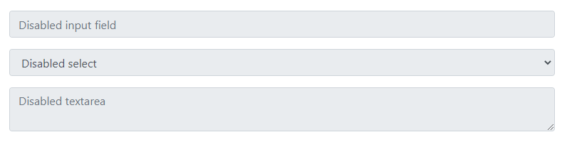
Disable Individual Form Fields
The individual disabled form fields are the forms in which users can set the disabled form field individually. To create the disabled form fields, you have to add the attribute disabled to the form field as given below:
|
1 2 3 4 5 6 7 8 9 10 11 12 13 |
<form> <div class="form-group"> <input type="text" class="form-control" placeholder="Disabled input field" disabled> </div> <div class="form-group"> <textarea class="form-control" placeholder="Disabled textarea" disabled></textarea> </div> <div class="form-group"> <select class="form-control" disabled> <option>Disabled select</option> </select> </div> </form> |
Output
Disable All Form Fields
If you want to make all the form fields disabled, you can easily perform this task by adding the attribute disabled to the <fieldset>. After that, place the form fields within the <fieldset> as given below:
|
1 2 3 4 5 6 7 8 9 10 11 12 13 14 15 16 17 18 19 |
<form> <fieldset disabled> <div class="form-group"> <label for="email">Email</label> <input type="email" class="form-control" placeholder="Your email"> </div> <div class="form-group"> <label for="password">Password</label> <input type="password" class="form-control" placeholder="Your password"> </div> <div class="form-group form-check"> <input type="checkbox" class="form-check-input" name="rememberme"> <label class="form-check-label">Remember me</label> </div> <div class="form-group"> <button type="submit" class="btn btn-primary">Submit</button> </div> </fieldset> </form> |
Output
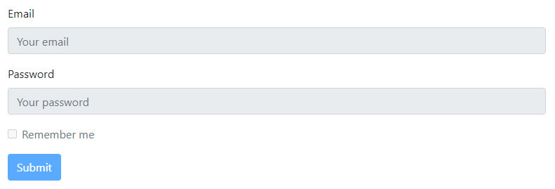
Users are not allowed to click the form fields given above. You can take your mouse to the form fields given above to check if they are clickable or not.
Form Validation in Bootstrap 4
The form validation is useful when you want to get valid input from users. You can display messages to users when they enter the wrong input in form fields.
Bootstrap 4 forms validation works on two CSS pseudo-classes, :valid and :invalid. These pseudo-classes are applied to form control elements <input>, <select>, and <textarea>. Bootstrap
Let’s find out how to use the validation in forms with the examples given below.
Display Custom Bootstrap Form Validation Messages
Bootstrap 4 custom form validation is the validation in forms that disables the browser default feedback tooltips. But, Bootstrap uses Javascript to provide custom validations to forms. You need to add the Javascript with form elements to make it work.
To create a custom validation, you have to add the attribute novalidate to your <form> element. You can try to submit the below form and see the valid and invalid message for the form fields as given below:
|
1 2 3 4 5 6 7 8 9 10 11 12 13 14 15 16 17 18 19 20 21 22 23 24 25 26 27 28 29 30 31 32 33 34 35 36 37 38 39 40 41 42 43 44 45 46 47 48 49 50 51 52 |
<form class="needs-validation" novalidate> <div class="form-group"> <label for="email">Email</label> <input type="email" class="form-control" placeholder="Your email" required> <div class="valid-feedback"> Looks good! </div> <div class="invalid-feedback"> Please enter a valid email address. </div> </div> <div class="form-group"> <label for="password">Password</label> <input type="password" class="form-control" placeholder="Your password" required> <div class="valid-feedback"> Looks good! </div> <div class="invalid-feedback"> Please enter your password to validate. </div> </div> <div class="form-group form-check"> <input type="checkbox" class="form-check-input" name="rememberme" required> <label class="form-check-label">Agree to terms and conditions</label> <div class="invalid-feedback"> You must agree before submitting. </div> </div> <div class="form-group"> <button type="submit" class="btn btn-primary">Submit</button> </div> </form> <script> // Example starter JavaScript for disabling form submissions if there are invalid fields (function() { 'use strict'; window.addEventListener('load', function() { // Fetch all the forms we want to apply custom Bootstrap validation styles to var forms = document.getElementsByClassName('needs-validation'); // Loop over them and prevent submission var validation = Array.prototype.filter.call(forms, function(form) { form.addEventListener('submit', function(event) { if (form.checkValidity() === false) { event.preventDefault(); event.stopPropagation(); } form.classList.add('was-validated'); }, false); }); }, false); })(); </script> |
Output
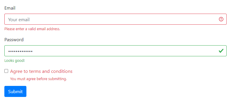
The above example shows the invalid and valid messages for the form fields including the checkbox. It also contains the Javascript after the form element in Bootstrap 4 forms.
Browser Default Messages Form Validation
You can display browser default messages when you don’t want to use the Bootstrap custom form validation. It is simple to create form validation that displays browser messages. You need to add the attribute required to the form fields as given below:
|
1 2 3 4 5 6 7 8 9 10 11 12 13 14 15 16 17 |
<form> <div class="form-group"> <label for="email">Email</label> <input type="email" class="form-control" placeholder="Your email" required> </div> <div class="form-group"> <label for="password">Password</label> <input type="password" class="form-control" placeholder="Your password" required> </div> <div class="form-group form-check"> <input type="checkbox" class="form-check-input" name="rememberme" required> <label class="form-check-label">Agree to terms and conditions</label> </div> <div class="form-group"> <button type="submit" class="btn btn-primary">Submit</button> </div> </form> |
Output
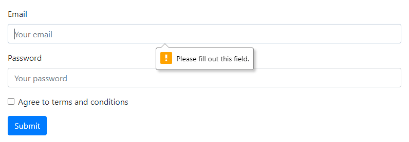
You can fill the above form and click the submit button to see the browser default messages.
Server Side Messages in Form Validation in Bootstrap 4
When you want to display the server-side validation messages, you can use the classes .is-valid and .is-invalid. These classes show messages when the value entered by the user is valid and invalid.
You can also use the classes .valid-feedback and .valid-feedback These classes are useful to display messages when the users are given valid or invalid feedback in form as given below:
|
1 2 3 4 5 6 7 8 9 10 11 12 13 14 15 16 17 18 19 20 21 22 23 24 25 26 27 28 29 30 31 32 33 34 35 36 37 38 39 40 41 42 43 44 45 46 47 48 49 50 51 |
<form> <div class="form-group"> <label for="email">Email</label> <div class="valid-feedback"> Looks good </div> </div> <div class="form-group"> <label for="address1">Address</label> <input type="text" class="form-control is-invalid" placeholder="Enter address 1"> <div class="invalid-feedback"> Please provide a valid address. </div> </div> <div class="form-row"> <div class="form-group col-sm-4"> <label for="city">City</label> <input type="text" class="form-control is-invalid" placeholder="Your city"> <div class="invalid-feedback"> Please provide a valid city. </div> </div> <div class="form-group col-sm-4"> <label for="state">State</label> <input type="text" class="form-control is-invalid" placeholder="Your State"> <div class="invalid-feedback"> Please provide a valid state. </div> </div> <div class="form-group col-sm-4"> <label for="pincode">Pincode</label> <input type="text" class="form-control is-invalid" placeholder="Your Pincode"> <div class="invalid-feedback"> Please provide a valid pincode. </div> </div> </div> <div class="form-group"> <div class="form-check"> <input type="checkbox" class="form-check-input is-invalid"> <label class="form-check-label">Remember me</label> <div class="invalid-feedback"> Please provide a valid pincode. </div> </div> </div> <div class="form-group"> <button type="submit" class="btn btn-primary">Submit</button> </div> </form> |
Output
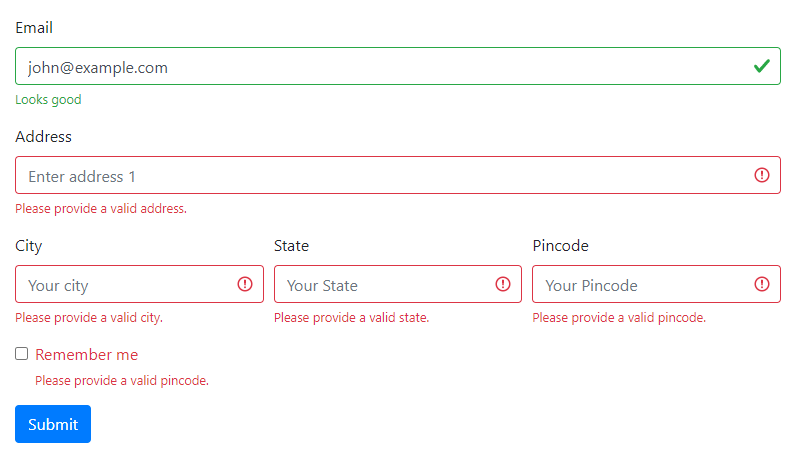
The above example displays the server-side valid and invalid messages and feedback when the user submits the form. You can enter the valid value and click the submit button to get the messages.
Tooltips in Form Validation in Bootstrap 4
You can also display valid and invalid messages in tooltip style format using Bootstrap 4. To create tooltip messages, you have to use the class .{valid|invalid}-tooltip. Also, don’t forget to add the .position-relative class to the .form-group class to properly display tooltip as given below:
|
1 2 3 4 5 6 7 8 9 10 11 12 13 14 15 16 17 18 19 20 21 22 23 24 25 26 |
<form class="needs-validation" novalidate> <div class="form-group position-relative"> <label for="email">Email</label> <div class="valid-tooltip"> Looks good! </div> </div> <div class="form-group position-relative"> <label for="password">Password</label> <input type="password" class="form-control is-invalid" placeholder="Your password" required> <div class="invalid-tooltip"> Please enter your password to validate. </div> </div> <div class="form-group form-check position-relative"> <input type="checkbox" class="form-check-input is-invalid" name="rememberme" required> <label class="form-check-label">Agree to terms and conditions</label> <div class="invalid-tooltip"> You must agree before submitting. </div> </div> <div class="form-group"> <button type="submit" class="btn btn-primary">Submit</button> </div> </form> |
Output
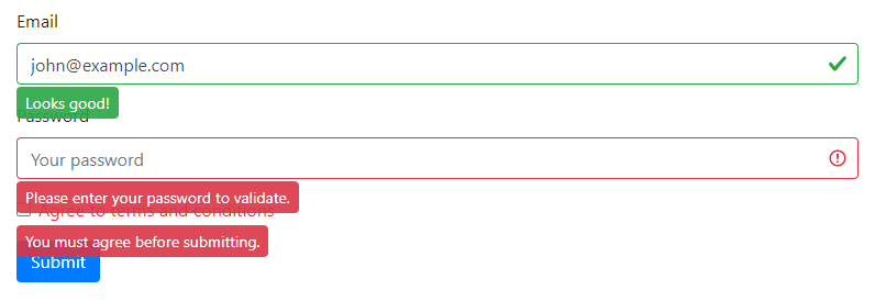
Fill in the above form to display the tooltip when the message is valid and invalid. The above example shows tooltip messages as it also contains the classes .is-valid and .is-invalid.
Create Custom Form Elements in Bootstrap 4
You can create custom style form elements for <input>, <select>, and <textarea>.
To create custom styled form elements, you have to use the class .custom-control in place of .form-group. It also replaces the class .form-control with class .custom-control-input.
Let’s find out how to create custom style form fields with the examples given below.
Custom Checkbox and Radio Button in a Form
The custom checkbox and radio buttons are the custom-styled form elements using Bootstrap 4. To create custom styled checkboxes and radio buttons, you have to use the class .custom-control-input. The default layout of checkboxes and radio are in the stacked format as given below:
|
1 2 3 4 5 6 7 8 9 10 11 12 13 14 15 16 17 18 19 20 21 22 23 24 25 26 27 28 |
<form> <h4>Choose your gender</h4> <div class="custom-control custom-checkbox"> <input type="checkbox" class="custom-control-input" id="checkboxmale" name="gender"> <label class="custom-control-label" for="checkboxmale">Male</label> </div> <div class="custom-control custom-checkbox"> <input type="checkbox" class="custom-control-input" id="checkboxfemale" name="gender"> <label class="custom-control-label" for="checkboxfemale">Female</label> </div> <h4 class="mt-4">Choose your country</h4> <div class="custom-control custom-radio"> <input type="radio" class="custom-control-input" id="radioindia" name="country"> <label class="custom-control-label" for="radioindia">India</label> </div> <div class="custom-control custom-radio"> <input type="radio" class="custom-control-input" id="radious" name="country"> <label class="custom-control-label" for="radious">US</label> </div> <div class="custom-control custom-radio"> <input type="radio" class="custom-control-input" id="radiouk" name="country"> <label class="custom-control-label" for="radiouk">UK</label> </div> <div class="custom-control custom-radio"> <input type="radio" class="custom-control-input" id="radiogermany" name="country"> <label class="custom-control-label" for="radiogermany">Germany</label> </div> </form> |
Output
The above example contains the custom-styled checkboxes and radio buttons. You can click the above checkboxes and radio buttons to select them.
Inline Custom Checkbox and Radio Button in a Form
The inline custom checkboxes and radio buttons are the layouts in which they are arranged in a single line. To create an inline layout, you have to add the class .custom-control, .custom-checkbox, and .custom-control-inline as given below:
|
1 2 3 4 5 6 7 8 9 10 11 12 13 14 15 16 17 18 19 20 21 22 23 24 25 26 27 28 |
<form> <h4>Choose your gender</h4> <div class="custom-control custom-checkbox custom-control-inline"> <input type="checkbox" class="custom-control-input" id="checkboxmale" name="gender"> <label class="custom-control-label" for="checkboxmale">Male</label> </div> <div class="custom-control custom-checkbox custom-control-inline"> <input type="checkbox" class="custom-control-input" id="checkboxfemale" name="gender"> <label class="custom-control-label" for="checkboxfemale">Female</label> </div> <h4 class="mt-4">Choose your country</h4> <div class="custom-control custom-radio custom-control-inline"> <input type="radio" class="custom-control-input" id="radioindia" name="country"> <label class="custom-control-label" for="radioindia">India</label> </div> <div class="custom-control custom-radio custom-control-inline"> <input type="radio" class="custom-control-input" id="radious" name="country"> <label class="custom-control-label" for="radious">US</label> </div> <div class="custom-control custom-radio custom-control-inline"> <input type="radio" class="custom-control-input" id="radiouk" name="country"> <label class="custom-control-label" for="radiouk">UK</label> </div> <div class="custom-control custom-radio custom-control-inline"> <input type="radio" class="custom-control-input" id="radiogermany" name="country"> <label class="custom-control-label" for="radiogermany">Germany</label> </div> </form> |
Output
The above example shows all the checkboxes in one line. It also contains the radio buttons in a single line.
Custom Toggle Switch Element
The custom toggle switch element is a toggleable input field to click for making it on/off. To create a custom toggleable input field, you have to add the class .custom-control with the class .custom-switch as given below:
|
1 2 3 4 5 6 7 8 9 10 |
<form> <div class="custom-control custom-switch"> <input type="checkbox" class="custom-control-input" id="customswitch1"> <label class="custom-control-label" for="customswitch1">Toggleable switch element</label> </div> <div class="custom-control custom-switch"> <input type="checkbox" class="custom-control-input" id="customswitch2" disabled> <label class="custom-control-label" for="customswitch2">Disabled Toggle switch element</label> </div> </form> |
Output
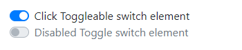
The above example contains the active toggleable switch and the disabled switch. You can click it to see the status whether it is on or in off condition.
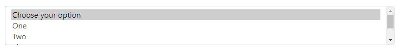
Custom Style Select Menu
To create a custom-styled select box, you have to add the class .custom-select to the <select> element as given below:
|
1 2 3 4 5 6 7 8 |
<form> <select class="custom-select"> <option selected>Choose your option</option> <option value="1">One</option> <option value="2">Two</option> <option value="3">Three</option> </select> </form> |
Output

The example contains the custom select box that is 100% full width. You can click the above select box to see the appearance of options and select it.
Sizing Custom Select Menu
You can set the sizing of the custom select box that increases or decrease the height of the select box. To increase the height of the select box, you have to use the class .custom-select-lg. While, for decreasing the height, you have to use the class .custom-select-sm as given below:
|
1 2 3 4 5 6 7 8 9 10 11 12 13 14 15 16 17 18 19 20 21 22 |
<form> <select class="custom-select custom-select-lg mb-3"> <option selected>Choose your option (.custom-select-lg)</option> <option value="1">One</option> <option value="2">Two</option> <option value="3">Three</option> </select> <select class="custom-select mb-3"> <option selected>Choose your option (default size)</option> <option value="1">One</option> <option value="2">Two</option> <option value="3">Three</option> </select> <select class="custom-select custom-select-sm"> <option selected>Choose your option (.custom-select-sm)</option> <option value="1">One</option> <option value="2">Two</option> <option value="3">Three</option> </select> </form> |
Output
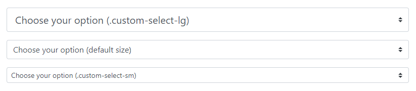
The middle select box is the default size of the custom select box. You can click them to see the options to choose from them.
Custom Multiple Select Element
The custom multiple select boxes contain the various option to select single or multiple together. You can custom style the multi-select box by adding the class .custom-select and attribute multiple as given below:
|
1 2 3 4 5 6 7 8 9 |
<form> <select class="custom-select" multiple> <option selected>Choose your option</option> <option value="1">One</option> <option value="2">Two</option> <option value="3">Three</option> <option value="4">fore</option> </select> </form> |
Output
The above example contains many options to select one or more than one. You can press and hold the ‘CTRL’ button and click the multiple options to select multiple and the selected options.
Sizing Height of Custom Select Menu
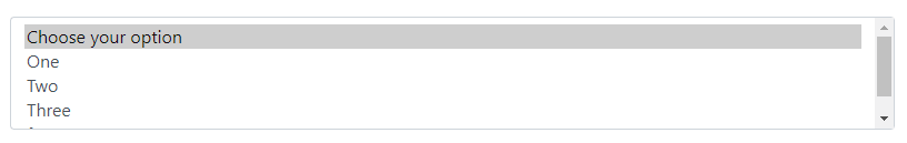
You can set the size of the custom select box in Bootstrap 4. To set the height of the multi-select box, you have to add the attribute size with its value as the number of elements to display. For example, if you want to display 3 items, you have to mention its value as 3 as given below:
|
1 2 3 4 5 6 7 8 9 |
<form> <select class="custom-select" size="3"> <option selected>Choose your option</option> <option value="1">One</option> <option value="2">Two</option> <option value="3">Three</option> <option value="4">fore</option> </select> </form> |
Output
Create Custom Range
A range is useful when you want to display the progress of a process. To create a custom styled input type range, you have to use add the class .custom-range to the <input type="range"> as given below:
|
1 2 3 4 |
<form> <label for="customrange1">Example custom range</label> <input type="range" class="custom-range" id="customrange1"> </form> |
Output

You can set the range given above as per your requirements.
The range can also be used with specifying min and max value as given below:
|
1 2 3 4 |
<form> <label for="customrange2">Custom Range with min and max values</label> <input type="range" class="custom-range" min="0" max="5" id="customrange2"> </form> |
Output

The range input ‘snap’ to integer values in the default way. However, you can change this by specifying step value as given below:
|
1 2 3 4 |
<form> <label for="customrange3">Custom Range with Step Value</label> <input type="range" class="custom-range" min="0" max="5" step="0.5" id="customrange3"> </form> |
Output
