Bootstrap 4 Input Group is the form control created by adding text, buttons on either side of inputs, custom selects, custom file inputs, and help texts.
Basic Input Group Prepend and Append in Bootstrap 4
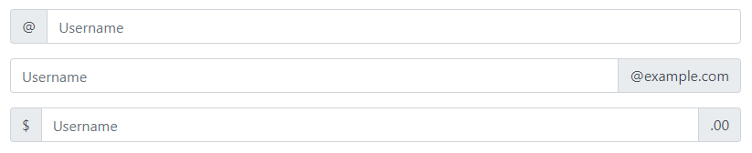
Input groups are created by placing them inside the container with class .input-group. Inside that container, you have to use the class .input-group-prepend to place the help text before the input. While you can use the class .input-group-append to place the addons and help text after the input.
Inside these prepend and append classes, use the <span> element and add class .input-group-text to style the help text or icon.
|
1 2 3 4 5 6 7 8 9 10 11 12 13 14 15 16 17 18 19 20 21 |
<div class="input-group mb-3"> <div class="input-group-prepend"> <span class="input-group-text">@</span> </div> <input type="text" class="form-control" placeholder="Username"> </div> <div class="input-group mb-3"> <input type="text" class="form-control" placeholder="Username"> <div class="input-group-append"> <span class="input-group-text">@example.com</span> </div> </div> <div class="input-group mb-3"> <div class="input-group-prepend"> <span class="input-group-text">$</span> </div> <input type="text" class="form-control" placeholder="Username"> <div class="input-group-append"> <span class="input-group-text">.00</span> </div> </div> |
Output
Sizing Input Groups in Bootstrap 4
To set the height and sizing the input groups, you can use sizing classes like .input-group-sm, .input-group, and .input-group-lg. When using the sizing classes, there is no need for repeating the form control size classes on each element.
The class .input-group creates a default size input group without the need of adding the sizing classes to get the default size.
|
1 2 3 4 5 6 7 8 9 10 11 12 13 14 15 16 17 18 |
<div class="input-group input-group-sm mb-3"> <div class="input-group-prepend"> <span class="input-group-text">Small</span> </div> <input type="text" class="form-control"> </div> <div class="input-group mb-3"> <div class="input-group-prepend"> <span class="input-group-text">Default</span> </div> <input type="text" class="form-control"> </div> <div class="input-group input-group-lg mb-3"> <div class="input-group-prepend"> <span class="input-group-text">Large</span> </div> <input type="text" class="form-control"> </div> |
Output
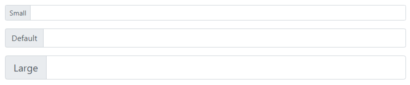
The above example shows the three sizings of the input group. Out of them, the middle input group shows the default size.
Placing Checkboxes and Radio Buttons in Input Groups
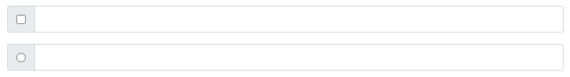
You can use the checkboxes and radio button in place of text content in input groups. Place the radio buttons and checkboxes inside the class .input-group-text as given below:
|
1 2 3 4 5 6 7 8 9 10 11 12 13 14 15 16 |
<div class="input-group mb-3"> <div class="input-group-prepend"> <div class="input-group-text"> <input type="checkbox"> </div> </div> <input type="text" class="form-control"> </div> <div class="input-group mb-3"> <div class="input-group-prepend"> <div class="input-group-text"> <input type="radio"> </div> </div> <input type="text" class="form-control"> </div> |
Output
Creating Multiple Inputs and addons
The multiple inputs addons are the adding multiple inputs and help texts side-by-side as given below. You can multiple inputs and multiple addons or help text.
|
1 2 3 4 5 6 7 8 9 10 11 12 13 14 15 16 17 |
<div class="input-group mb-3"> <div class="input-group-prepend"> <div class="input-group-text"> Enter your name </div> </div> <input type="text" class="form-control" placeholder="First Name"> <input type="text" class="form-control" placeholder="Last Name"> </div> <div class="input-group"> <div class="input-group-prepend"> <div class="input-group-text">First</div> <div class="input-group-text">Second</div> <div class="input-group-text">Third</div> </div> <input type="text" class="form-control"> </div> |
Output
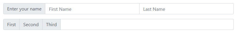
In the above example, the first input group contains single text with multiple inputs. While the second input group shows multiple addons or help text with a single input.
Button addons Input Groups
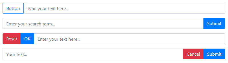
You can add buttons and inputs together in place of text content. It requires adding single or multiple buttons in the prepend and append container with the single input after or before it.
|
1 2 3 4 5 6 7 8 9 10 11 12 13 14 15 16 17 18 19 20 21 22 23 24 25 26 |
<div class="input-group mb-3"> <div class="input-group-prepend"> <button type="button" class="btn btn-outline-primary">Button</button> </div> <input type="text" class="form-control" placeholder="Type your text here..."> </div> <div class="input-group mb-3"> <input type="text" class="form-control" placeholder="Enter your search term..."> <div class="input-group-append"> <button type="button" class="btn btn-primary">Submit</button> </div> </div> <div class="input-group mb-3"> <div class="input-group-prepend"> <button type="button" class="btn btn-danger">Reset</button> <button type="button" class="btn btn-primary">OK</button> </div> <input type="text" class="form-control" placeholder="Enter your text here..."> </div> <div class="input-group mb-3"> <input type="text" class="form-control" placeholder="Your text..."> <div class="input-group-append"> <button type="button" class="btn btn-danger">Cancel</button> <button type="button" class="btn btn-primary">Submit</button> </div> </div> |
Output
Placing Button Dropdowns in Input Groups
When you want to perform more than one action in an input group, you can use the dropdowns. You don’t need to use the .dropdown wrapper class as it is normally required to create dropdowns.
|
1 2 3 4 5 6 7 8 9 10 11 12 13 14 15 16 17 18 19 20 21 22 23 24 25 26 27 28 |
<div class="input-group mb-3"> <div class="input-group-prepend"> <button type="button" class="btn btn-outline-secondary dropdown-toggle" data-toggle="dropdown"> Dropdown </button> <div class="dropdown-menu"> <a href="#" class="dropdown-item">Link 1</a> <a href="#" class="dropdown-item">Link 2</a> <a href="#" class="dropdown-item">Link 3</a> </div> </div> <input type="text" class="form-control"> </div> <div class="input-group"> <input type="text" class="form-control"> <div class="input-group-append"> <button type="button" class="btn btn-outline-secondary dropdown-toggle" data-toggle="dropdown"> Dropdown </button> <div class="dropdown-menu"> <a href="#" class="dropdown-item">Link 1</a> <a href="#" class="dropdown-item">Link 2</a> <a href="#" class="dropdown-item">Link 3</a> </div> </div> </div> |
Output
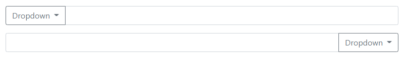
The above example shows the dropdowns added before or after the inputs.
Segmented Dropdown Buttons in Input Groups
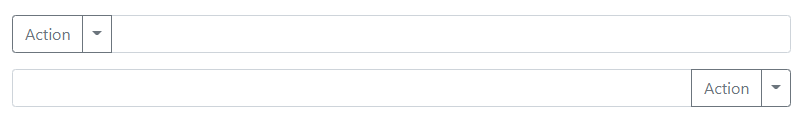
The segmented dropdowns contain links that are separated by buttons. You can place segmented dropdowns with inputs to make input groups.
|
1 2 3 4 5 6 7 8 9 10 11 12 13 14 15 16 17 18 19 20 21 22 23 24 25 26 27 28 29 30 31 32 33 34 |
<div class="input-group mb-3"> <div class="input-group-prepend"> <button type="button" class="btn btn-outline-secondary"> Action </button> <button type="button" class="btn btn-outline-secondary dropdown-toggle dropdown-toggle-split" data-toggle="dropdown"> <span class="sr-only">Toggle Dropdown</span> </button> <div class="dropdown-menu"> <a href="#" class="dropdown-item">Link 1</a> <a href="#" class="dropdown-item">Link 2</a> <a href="#" class="dropdown-item">Link 3</a> </div> </div> <input type="text" class="form-control"> </div> <div class="input-group"> <input type="text" class="form-control"> <div class="input-group-append"> <button type="button" class="btn btn-outline-secondary"> Action </button> <button type="button" class="btn btn-outline-secondary dropdown-toggle dropdown-toggle-split" data-toggle="dropdown"> <span class="sr-only">Toggle Dropdown</span> </button> <div class="dropdown-menu"> <a href="#" class="dropdown-item">Link 1</a> <a href="#" class="dropdown-item">Link 2</a> <a href="#" class="dropdown-item">Link 3</a> </div> </div> </div> |
Output
Custom Forms in Input Groups
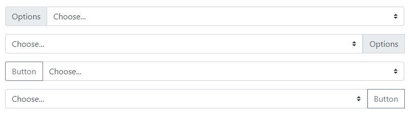
You can place custom select options in input groups with text or buttons. The buttons and texts are placed before or after the custom select options.
|
1 2 3 4 5 6 7 8 9 10 11 12 13 14 15 16 17 18 19 20 21 22 23 24 25 26 27 28 29 30 31 32 33 34 35 36 37 38 39 40 41 42 43 44 |
<div class="input-group mb-3"> <div class="input-group-prepend"> <label class="input-group-text">Options</label> </div> <select class="custom-select"> <option selected>Choose...</option> <option value="1">One</option> <option value="2">Two</option> <option value="3">Three</option> </select> </div> <div class="input-group mb-3"> <select class="custom-select"> <option selected>Choose...</option> <option value="1">One</option> <option value="2">Two</option> <option value="3">Three</option> </select> <div class="input-group-append"> <label class="input-group-text">Options</label> </div> </div> <div class="input-group mb-3"> <div class="input-group-prepend"> <button type="button" class="btn btn-outline-secondary">Button</button> </div> <select class="custom-select"> <option selected>Choose...</option> <option value="1">One</option> <option value="2">Two</option> <option value="3">Three</option> </select> </div> <div class="input-group mb-3"> <select class="custom-select"> <option selected>Choose...</option> <option value="1">One</option> <option value="2">Two</option> <option value="3">Three</option> </select> <div class="input-group-append"> <button type="button" class="btn btn-outline-secondary">Button</button> </div> </div> |
Output
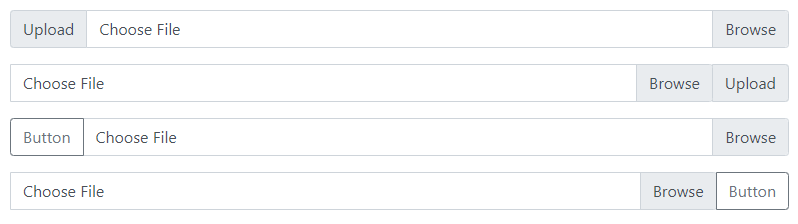
Custom File Inputs in Input Groups
You can place custom file uploads with help texts to give hints to users. It can also contain buttons before or after the custom file inputs.
|
1 2 3 4 5 6 7 8 9 10 11 12 13 14 15 16 17 18 19 20 21 22 23 24 25 26 27 28 29 30 31 32 33 34 35 36 |
<div class="input-group mb-3"> <div class="input-group-prepend"> <label class="input-group-text">Upload</label> </div> <div class="custom-file"> <input type="file" class="custom-file-input" id="InputGroupFile1"> <label class="custom-file-label" for="InputGroupFile1">Choose File</label> </div> </div> <div class="input-group mb-3"> <div class="custom-file"> <input type="file" class="custom-file-input" id="InputGroupFile1"> <label class="custom-file-label" for="InputGroupFile1">Choose File</label> </div> <div class="input-group-append"> <label class="input-group-text">Upload</label> </div> </div> <div class="input-group mb-3"> <div class="input-group-prepend"> <button type="button" class="btn btn-outline-secondary">Button</button> </div> <div class="custom-file"> <input type="file" class="custom-file-input" id="InputGroupFile1"> <label class="custom-file-label" for="InputGroupFile1">Choose File</label> </div> </div> <div class="input-group mb-3"> <div class="custom-file"> <input type="file" class="custom-file-input" id="InputGroupFile1"> <label class="custom-file-label" for="InputGroupFile1">Choose File</label> </div> <div class="input-group-append"> <button type="button" class="btn btn-outline-secondary">Button</button> </div> </div> |
Output