Bootstrap 4 cards are the more extensible and flexible container for content. You can add header and footer content with contextual background colors and many other display options. It replaces the old components like wells, panels, thumbnails, and others available in the old versions of Bootstrap.
Basic Card in Bootstrap 4
A card can contain an image, title, text, and a button to visit another page. It is built to create alignment with other Bootstrap components. To create a card, you have to use the class .card to the <div> element with content inside it using the class .card-body as given below:
|
1 2 3 4 5 6 7 8 |
<div class="card" style="width: 18rem;"> <img src="https://tutorialdeep.com/images/user1.jpg" class="card-img-top" alt=""> <div class="card-body"> <h5 class="card-title">Tom Gilbert</h5> <p class="card-text">He is a Bootstrap designer who designs responsive websites. The website can resize itself according to the screen sizes.</p> <a href="#" class="btn btn-primary">View Profile</a> </div> </div> |
Output

Cards have no default width to set the size and it takes the full width of the parent element. You can set the width using the style tag or the width utilities classes.
Card Contains Only Body
You can create a card and place the content to its body part only. To create a card with only the body, you have to use class .card with class .card-body inside it, as given below:
|
1 2 3 |
<div class="card"> <div class="card-body">This is the text content within the card body only.</div> </div> |
Output
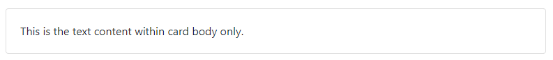
The above card is useful when you want to create a content with border and extra padding.
Card with Title, Subtitle, Text, and Links
A card title of the card can be created using the class .card-title inside the card body. You can also create subtitle with class .card-subtitle, text content with class .card-text, and links using the class .card-link as given below:
|
1 2 3 4 5 6 7 8 9 |
<div class="card"> <div class="card-body"> <h5 class="card-title">Card Title</h5> <h6 class="card-subtitle text-muted">Card Subtitle</h6> <p class="card-text">This is the example card text content.</p> <a href="#" class="card-link">Card Link</a> <a href="#" class="card-link">Another Card Link</a> </div> </div> |
Output
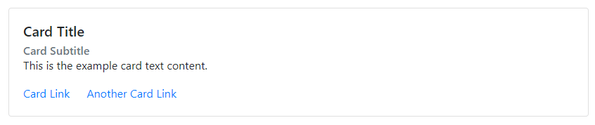
The above output shows the card with card title, subtitle, text content, and two links. You can make light text content for subtitle using the class .text-muted.
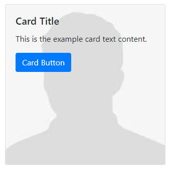
Image and Text in Cards in Bootstrap 4
A card can contain image and text content inside the body part. You can add an image to the card using the class .card-img-top to the <img> element. After that, place the text content using the class .card-text inside the card body as given below:
|
1 2 3 4 5 6 |
<div class="card" style="width: 18rem;"> <img src="https://tutorialdeep.com/images/user1.jpg" class="card-img-top" alt=""> <div class="card-body"> <p class="card-text">This is the example text content card. The card contains images and body text only.</p> </div> </div> |
Output
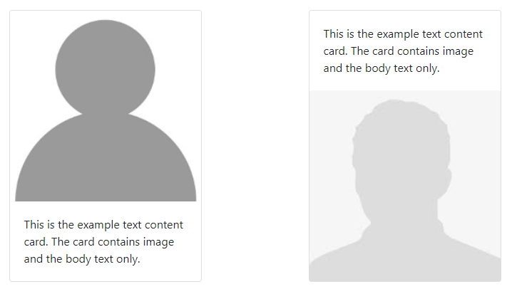
The above output shows the card that contains an image and the text content. You can change the position of the image by placing it before and after the card body with the classes .card-img-top and .card-img-bottom to the <img> element.
List Group in a Card
You can create a list group content and place it inside the card to create a list list of content inside the card.
Flush List Group
To create a list group content inside the card, you have to use the flush list group as given below:
|
1 2 3 4 5 6 7 |
<div class="card" style="width: 18rem;"> <ul class="list-group list-group-flush"> <li class="list-group-item">First item</li> <li class="list-group-item">Second item</li> <li class="list-group-item">Third item</li> </ul> </div> |
Output
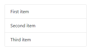
The above example shows that there are 3 list group items inside the card.
Header in a List Group
You can add a header to the card using the class .card-header to the <div> element. After the header, you can place the list group items that can be related to the heading of the card as given below:
|
1 2 3 4 5 6 7 8 |
<div class="card" style="width: 18rem;"> <div class="card-header">Card List Group Header</div> <ul class="list-group list-group-flush"> <li class="list-group-item">First item</li> <li class="list-group-item">Second item</li> <li class="list-group-item">Third item</li> </ul> </div> |
Output
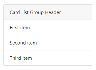
The above example shows the heading of the card and the list group items after it.
Footer in a List Group
In addition to the above examples, you can also place the footer to the card after the list group element. To add the footer, you have to use the class .card-footer to the <div> element as given below:
|
1 2 3 4 5 6 7 8 |
<div class="card" style="width: 18rem;"> <ul class="list-group list-group-flush"> <li class="list-group-item">First item</li> <li class="list-group-item">Second item</li> <li class="list-group-item">Third item</li> </ul> <div class="card-footer">Card List Group Footer</div> </div> |
Output
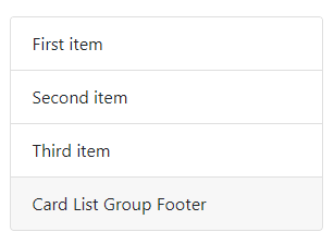
You can test the above example live to check the example that contains the list group item followed by the footer of the card.
Create Card with Multiple Content Types
You can mix content together to create multiple content types in a card. A card can contain an image, title, text content, list group, and links as given below:
|
1 2 3 4 5 6 7 8 9 10 11 12 13 14 15 16 |
<div class="card" style="width: 18rem;"> <img src="https://tutorialdeep.com/images/user1.jpg" class="card-img-top" alt=""> <div class="card-body"> <h5 class="card-title">Roger Binny</h5> <p class="card-text">He is a Bootstrap designer who designs responsive websites. The website can resize itself according to the screen sizes.</p> </div> <ul class="list-group list-group-flush"> <div class="card-header">Qualifications and Experience</div> <li class="list-group-item">B.Tech (CSE) Graduate</li> <li class="list-group-item">7 Year Designing Experience</li> <li class="list-group-item">6 Years Blogging Experience</li> </ul> <div class="card-body"> <a href="#" class="btn btn-primary">View Full Profile</a> </div> </div> |
Output

The card can be of fixed width or full-width size. The above example is a fixed-width size container that contains multiple content types.
Create Header and Footer in Cards
When you want to create a card with a header, content, and footer. You have to use the class .card-header to add header and .card-footer to add a footer to the card. The header is above the card body content and the footer is below the body content as given below:
|
1 2 3 4 5 6 7 8 9 |
<div class="card"> <div class="card-header">Card Header</div> <div class="card-body"> <h5 class="card-title">Card Title</h5> <p class="card-text">This is the text content within the card.</p> <a href="#" class="btn btn-primary">Read More</a> </div> <div class="card-footer">Card Footer</div> </div> |
Output
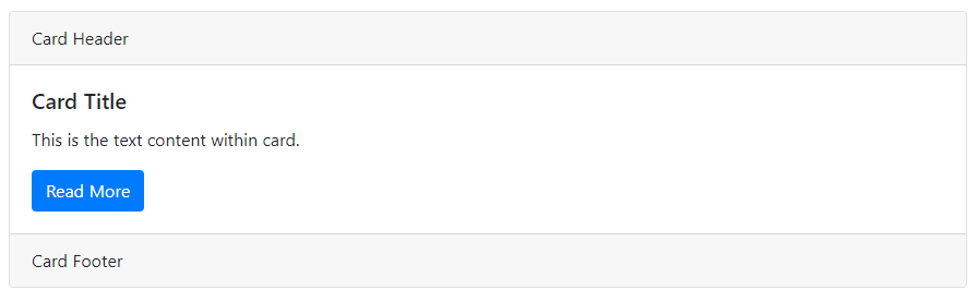
The example shows that the card contains the header part, content part, and footer part in sequence.
You can create a beautiful looking blockquote by placing it inside the card with a header as given below:
|
1 2 3 4 5 6 7 8 9 |
<div class="card"> <div class="card-header">Quotes</div> <div class="card-body"> <blockquote class="blockquote"> <p>Many of life's failures are people who did not realize how close they were to success when they gave up.</p> <footer class="blockquote-footer">by <cite>Thomas A. Edison</cite></footer> </blockquote> </div> </div> |
Output
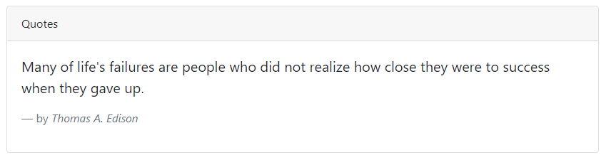
The above example shows the heading for the blockquote. The heading shows that the content is a quote said by some famous person.
Sizing Cards in Bootstrap 4
By default, cards have no width and it is 100% wide with the parent element size. The size of the cards can be created using the grid columns, size utilities, and CSS width property. You can learn the methods with the examples given below.
Using Grid Columns to Set Size
You can use the grid columns to create a size for the card. To create a size for the cards, you have to wrap the cards inside the rows and grid columns as given below:
|
1 2 3 4 5 6 7 8 9 10 11 12 13 14 15 16 17 18 19 20 |
<div class="row"> <div class="col-sm-6"> <div class="card"> <div class="card-body"> <h5 class="card-title">Card Title</h5> <p class="card-text">This is the example card text content.</p> <a href="#" class="btn btn-primary">Card Button</a> </div> </div> </div> <div class="col-sm-6"> <div class="card"> <div class="card-body"> <h5 class="card-title">Card Title</h5> <p class="card-text">This is the example card text content.</p> <a href="#" class="btn btn-primary">Card Button</a> </div> </div> </div> </div> |
Output
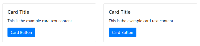
The above example shows the two grid columns with cards inside them. The card size changes according to the grid columns that resize themselves according to the screen sizes.
Using Size Utilities
You can use the size utility classes to set the size of the cards. To set the size of the cards, you have to add the size utility class and other classes (like .w-50, .w-75, etc) as given below:
|
1 2 3 4 5 6 7 8 9 10 11 12 13 14 15 16 17 18 19 20 21 |
<div class="card w-50"> <div class="card-body"> <h5 class="card-title">Card Title</h5> <p class="card-text">This is the example card text content.</p> <a href="#" class="btn btn-primary">Card Button</a> </div> </div> <div class="card w-75 mt-2"> <div class="card-body"> <h5 class="card-title">Card Title</h5> <p class="card-text">This is the example card text content.</p> <a href="#" class="btn btn-primary">Card Button</a> </div> </div> <div class="card w-100 mt-2"> <div class="card-body"> <h5 class="card-title">Card Title</h5> <p class="card-text">This is the example card text content.</p> <a href="#" class="btn btn-primary">Card Button</a> </div> </div> |
Output
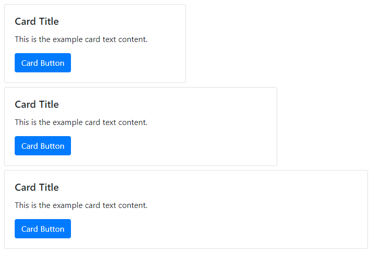
The above example shows three cards with the first card covers 50%, the second card covers 75%, and the third card covers 100% of the parent element.
Adding Custom CSS to Set Width
The style attribute can also be used to set the size using the CSS property to the cards as given below:
|
1 2 3 4 5 6 7 |
<div class="card" style="width:25rem;"> <div class="card-body"> <h5 class="card-title">Card Title</h5> <p class="card-text">This is the example card text content.</p> <a href="#" class="btn btn-primary">Card Button</a> </div> </div> |
Output
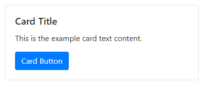
The above example shows a card with a width set using the style attribute.
Card Text Alignment in Bootstrap 4
The card text alignment aligns all the text content of the cards in Bootstrap 4. You have to use the text alignment class .text-center for center alignment and .text-right for right alignment with the .card class as given below:
|
1 2 3 4 5 6 7 8 9 10 11 12 13 14 15 16 17 18 19 20 21 |
<div class="card" style="width:18rem;"> <div class="card-body"> <h5 class="card-title">Card Title</h5> <p class="card-text">This is the example card text content.</p> <a href="#" class="btn btn-primary">Card Button</a> </div> </div> <div class="card text-center mt-2" style="width:18rem;"> <div class="card-body"> <h5 class="card-title">Card Title</h5> <p class="card-text">This is the example card text content.</p> <a href="#" class="btn btn-primary">Card Button</a> </div> </div> <div class="card text-right mt-2" style="width:18rem;"> <div class="card-body"> <h5 class="card-title">Card Title</h5> <p class="card-text">This is the example card text content.</p> <a href="#" class="btn btn-primary">Card Button</a> </div> </div> |
Output
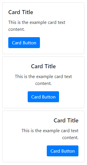
The above example shows that the first card shows the default alignment, the second card shows the center alignment, and the last card shows the right alignment of the text content.
Navigation Links in a Card Header
The navigation links are the anchor links that appear as menus in a card. You can add navigation links to the card header either using the nav tabs or using the nav pills.
Cards with Nav Tabs
To add navigation links using the nav tabs, you have to place the nav tabs inside the .card-header content as given below:
|
1 2 3 4 5 6 7 8 9 10 11 12 13 14 15 16 17 18 19 20 |
<div class="card"> <div class="card-header"> <ul class="nav nav-tabs card-header-tabs"> <li class="nav-item"> <a href="#" class="nav-link active">Active Link</a> </li> <li class="nav-item"> <a href="#" class="nav-link">Link</a> </li> <li class="nav-item"> <a href="#" class="nav-link disabled">Disabled Link</a> </li> </ul> </div> <div class="card-body"> <h5 class="card-title">Card Title</h5> <p class="card-text">This is the text content within the card.</p> <a href="#" class="btn btn-primary">Read More</a> </div> </div> |
Output
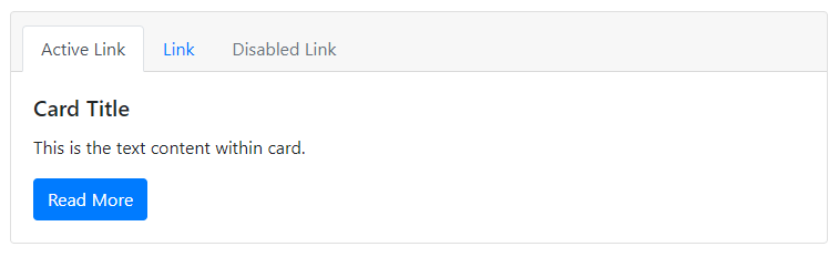
The above example shows three menu items in nav tabs that display inside the header of the card.
Cards with Nav Pills
You can also add the nav pills for navigation links in the header of the card. Place the nav pills inside the class .card-header as given below:
|
1 2 3 4 5 6 7 8 9 10 11 12 13 14 15 16 17 18 19 20 |
<div class="card"> <div class="card-header"> <ul class="nav nav-pills card-header-pills"> <li class="nav-item"> <a href="#" class="nav-link active">Active Link</a> </li> <li class="nav-item"> <a href="#" class="nav-link">Link</a> </li> <li class="nav-item"> <a href="#" class="nav-link disabled">Disabled Link</a> </li> </ul> </div> <div class="card-body"> <h5 class="card-title">Card Title</h5> <p class="card-text">This is the text content within the card.</p> <a href="#" class="btn btn-primary">Read More</a> </div> </div> |
Output
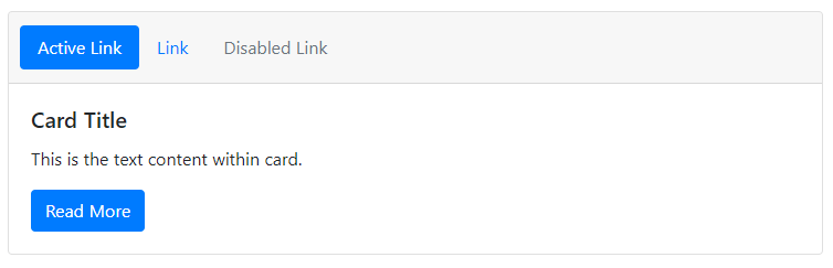
The above example shows the nav pills with 3 link items in the card header.
Image Overlay Card Text Content
Image overlay card text content is the overlay of the text content over the image in a card. The image in a card convert into a card background with the content appears at the top of the image. For image overlay, you have to use the image in a card and replace the class .card-body with the class .card-img-overlay as given below:
|
1 2 3 4 5 6 7 8 |
<div class="card" style="width:20rem;"> <img src="https://tutorialdeep.com/images/user4.jpg" class="card-img" alt=""> <div class="card-img-overlay"> <h5 class="card-title">Card Title</h5> <p class="card-text">This is the example card text content.</p> <a href="#" class="btn btn-primary">Card Button</a> </div> </div> |
Output
The above output shows that the image is the background of the card with content at top of it. You can test the above example live to check the image overlay effect.
Horizontal Cards in Bootstrap 4
A horizontal card contains images and the content part on a side-by-side basis. The image can be to the left-hand side or to the right-hand side of the card body. You can create a horizontal card using the grid and utility classes of Bootstrap 4.
To create a horizontal card, you have to place the image and the card body inside the row and grid columns (like .col-sm-* and others). You can remove the grid gutters using the class .no-gutters as given below:
|
1 2 3 4 5 6 7 8 9 10 11 12 13 14 |
<div class="card"> <div class="row no-gutters"> <div class="col-sm-4"> <img src="https://tutorialdeep.com/images/user4.jpg" class="card-img" alt=""> </div> <div class="col-sm-8"> <div class="card-body"> <h5 class="card-title">Card Title</h5> <p class="card-text">This is the example card text content.</p> <a href="#" class="btn btn-primary">Card Button</a> </div> </div> </div> </div> |
Output

You can test the above example live to check the horizontal cards. The above example shows the side-by-side image and the body content in a card.
Cards Contextual Background and Color Styles
You can style and customize the cards using the Bootstrap 4 contextual background and color classes. To customize the cards and change the appearance, you have to use the Bootstrap 4 text utility classes (like .text-white) and background utility classes (like .bg-primary) with the class .card as given below:
|
1 2 3 4 5 6 7 8 9 10 11 12 13 14 15 16 17 18 19 20 21 22 23 24 25 26 27 28 29 30 31 32 33 34 35 36 37 38 39 40 41 42 43 44 45 46 47 48 49 50 51 52 53 54 55 56 57 58 59 60 61 62 63 64 |
<div class="card bg-primary text-white" style="width:18rem;"> <div class="card-header">Card Header</div> <div class="card-body"> <h5 class="card-title">Primary Card Title</h5> <p class="card-text">This is the text content within the card.</p> </div> <div class="card-footer">Card Footer</div> </div> <div class="card bg-secondary text-white mt-3" style="width:18rem;"> <div class="card-header">Card Header</div> <div class="card-body"> <h5 class="card-title">Secondary Card Title</h5> <p class="card-text">This is the text content within the card.</p> </div> <div class="card-footer">Card Footer</div> </div> <div class="card bg-success text-white mt-3" style="width:18rem;"> <div class="card-header">Card Header</div> <div class="card-body"> <h5 class="card-title">Success Card Title</h5> <p class="card-text">This is the text content within the card.</p> </div> <div class="card-footer">Card Footer</div> </div> <div class="card bg-danger text-white mt-3" style="width:18rem;"> <div class="card-header">Card Header</div> <div class="card-body"> <h5 class="card-title">Danger Card Title</h5> <p class="card-text">This is the text content within the card.</p> </div> <div class="card-footer">Card Footer</div> </div> <div class="card bg-warning text-white mt-3" style="width:18rem;"> <div class="card-header">Card Header</div> <div class="card-body"> <h5 class="card-title">Warning Card Title</h5> <p class="card-text">This is the text content within the card.</p> </div> <div class="card-footer">Card Footer</div> </div> <div class="card bg-info text-white mt-3" style="width:18rem;"> <div class="card-header">Card Header</div> <div class="card-body"> <h5 class="card-title">Info Card Title</h5> <p class="card-text">This is the text content within the card.</p> </div> <div class="card-footer">Card Footer</div> </div> <div class="card bg-light mt-3" style="width:18rem;"> <div class="card-header">Card Header</div> <div class="card-body"> <h5 class="card-title">Light Card Title</h5> <p class="card-text">This is the text content within the card.</p> </div> <div class="card-footer">Card Footer</div> </div> <div class="card bg-dark text-white mt-3" style="width:18rem;"> <div class="card-header">Card Header</div> <div class="card-body"> <h5 class="card-title">Dark Card Title</h5> <p class="card-text">This is the text content within the card.</p> </div> <div class="card-footer">Card Footer</div> </div> |
Output
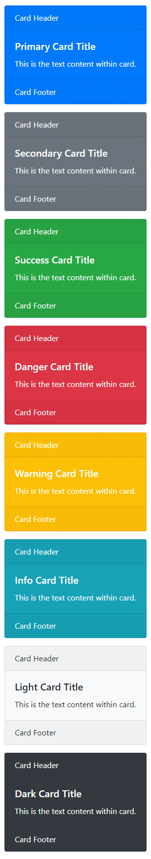
The above example shows the 8 different Bootstrap 4 cards contextual styles that you can create.
Cards Border Color and Styles in Bootstrap 4
You can also create and customize card style using the border utility classes (like .border-primary) and text utility classes (like .text-primary) to the class .card as given below:
|
1 2 3 4 5 6 7 8 9 10 11 12 13 14 15 16 17 18 19 20 21 22 23 24 25 26 27 28 29 30 31 32 33 34 35 36 37 38 39 40 41 42 43 44 45 46 47 48 49 50 51 52 53 54 55 56 57 58 59 60 61 62 63 64 |
<div class="card border-primary text-primary" style="width:18rem;"> <div class="card-header">Card Header</div> <div class="card-body"> <h5 class="card-title">Primary Card Title</h5> <p class="card-text">This is the text content within the card.</p> </div> <div class="card-footer">Card Footer</div> </div> <div class="card border-secondary text-secondary mt-3" style="width:18rem;"> <div class="card-header">Card Header</div> <div class="card-body"> <h5 class="card-title">Secondary Card Title</h5> <p class="card-text">This is the text content within the card.</p> </div> <div class="card-footer">Card Footer</div> </div> <div class="card border-success text-success mt-3" style="width:18rem;"> <div class="card-header">Card Header</div> <div class="card-body"> <h5 class="card-title">Success Card Title</h5> <p class="card-text">This is the text content within the card.</p> </div> <div class="card-footer">Card Footer</div> </div> <div class="card border-danger text-danger mt-3" style="width:18rem;"> <div class="card-header">Card Header</div> <div class="card-body"> <h5 class="card-title">Danger Card Title</h5> <p class="card-text">This is the text content within the card.</p> </div> <div class="card-footer">Card Footer</div> </div> <div class="card border-warning text-warning mt-3" style="width:18rem;"> <div class="card-header">Card Header</div> <div class="card-body"> <h5 class="card-title">Warning Card Title</h5> <p class="card-text">This is the text content within the card.</p> </div> <div class="card-footer">Card Footer</div> </div> <div class="card border-info text-info mt-3" style="width:18rem;"> <div class="card-header">Card Header</div> <div class="card-body"> <h5 class="card-title">Info Card Title</h5> <p class="card-text">This is the text content within the card.</p> </div> <div class="card-footer">Card Footer</div> </div> <div class="card border-light mt-3" style="width:18rem;"> <div class="card-header">Card Header</div> <div class="card-body"> <h5 class="card-title">Light Card Title</h5> <p class="card-text">This is the text content within the card.</p> </div> <div class="card-footer">Card Footer</div> </div> <div class="card border-dark text-dark mt-3" style="width:18rem;"> <div class="card-header">Card Header</div> <div class="card-body"> <h5 class="card-title">Dark Card Title</h5> <p class="card-text">This is the text content within the card.</p> </div> <div class="card-footer">Card Footer</div> </div> |
Output
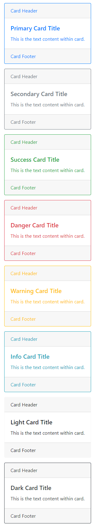
The above example shows that there can be 8 different border styles you can create for cards in Bootstrap 4.
Cards Layout Options
In addition to the above examples of customizing and styling the cards, there are also several options in Bootstrap 4 for laying out the series of cards. However, these layout options in Bootstrap 4 are not yet responsive
Card Groups
Card groups are the series of cards render as a single, attached element that has equal height and width for columns. It uses the display: flex to get attached cards with the same dimensions. You have to use the class .card-group to the <div> element and place a series of cards inside it as given below:
|
1 2 3 4 5 6 7 8 9 10 11 12 13 14 15 16 17 18 19 20 21 22 23 |
<div class="card-group"> <div class="card"> <img src="https://tutorialdeep.com/images/user1.jpg" class="card-img" alt=""> <div class="card-body"> <h5 class="card-title">Card Title</h5> <p class="card-text">This is the text content within the card.</p> </div> </div> <div class="card"> <img src="https://tutorialdeep.com/images/user1.jpg" class="card-img" alt=""> <div class="card-body"> <h5 class="card-title">Card Title</h5> <p class="card-text">This is the text content within the card.</p> </div> </div> <div class="card"> <img src="https://tutorialdeep.com/images/user1.jpg" class="card-img" alt=""> <div class="card-body"> <h5 class="card-title">Card Title</h5> <p class="card-text">This is the text content within the card.</p> </div> </div> </div> |
Output
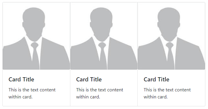
The above example contains the series of 3 cards that are grouped and attached as a single element.
Card Decks
Card decks are the series of cards with equal width and height as of the above card groups. However, the cards are not attached to one another. To create a card deck, you have to use the class .card-deck to the <div> element and place a series of cards inside it as given below:
|
1 2 3 4 5 6 7 8 9 10 11 12 13 14 15 16 17 18 19 20 21 22 23 |
<div class="card-deck"> <div class="card"> <img src="https://tutorialdeep.com/images/user1.jpg" class="card-img" alt=""> <div class="card-body"> <h5 class="card-title">Card Title</h5> <p class="card-text">This is the text content within the card.</p> </div> </div> <div class="card"> <img src="https://tutorialdeep.com/images/user1.jpg" class="card-img" alt=""> <div class="card-body"> <h5 class="card-title">Card Title</h5> <p class="card-text">This is the text content within the card.</p> </div> </div> <div class="card"> <img src="https://tutorialdeep.com/images/user1.jpg" class="card-img" alt=""> <div class="card-body"> <h5 class="card-title">Card Title</h5> <p class="card-text">This is the text content within the card.</p> </div> </div> </div> |
Output
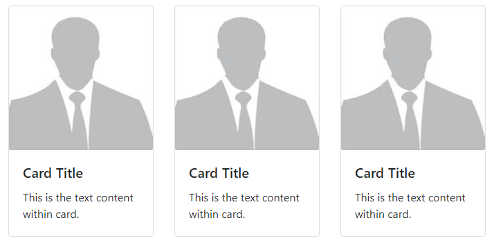
The above example shows 3 card elements that are not attached to one another.
Card Grid Columns
You can also use the grid columns for the card layout. The most simple way of creating the card grid columns is to use the Bootstrap class .col with a card inside it. You can control the number of columns by using the .row-cols-* and .row-cols-sm-* classes with the .row class as given below:
|
1 2 3 4 5 6 7 8 9 10 11 12 13 14 15 16 17 18 19 20 21 22 23 24 25 26 27 28 29 30 31 32 33 34 35 36 37 38 |
<div class="row row-cols-1 row-cols-sm-2"> <div class="col mb-3"> <div class="card"> <img src="https://tutorialdeep.com/images/user1.jpg" class="card-img" alt=""> <div class="card-body"> <h5 class="card-title">Card Title</h5> <p class="card-text">This is the text content within the card.</p> </div> </div> </div> <div class="col mb-3"> <div class="card"> <img src="https://tutorialdeep.com/images/user1.jpg" class="card-img" alt=""> <div class="card-body"> <h5 class="card-title">Card Title</h5> <p class="card-text">This is the text content within the card.</p> </div> </div> </div> <div class="col mb-3"> <div class="card"> <img src="https://tutorialdeep.com/images/user1.jpg" class="card-img" alt=""> <div class="card-body"> <h5 class="card-title">Card Title</h5> <p class="card-text">This is the text content within the card.</p> </div> </div> </div> <div class="col mb-3"> <div class="card"> <img src="https://tutorialdeep.com/images/user1.jpg" class="card-img" alt=""> <div class="card-body"> <h5 class="card-title">Card Title</h5> <p class="card-text">This is the text content within the card.</p> </div> </div> </div> </div> |
Output
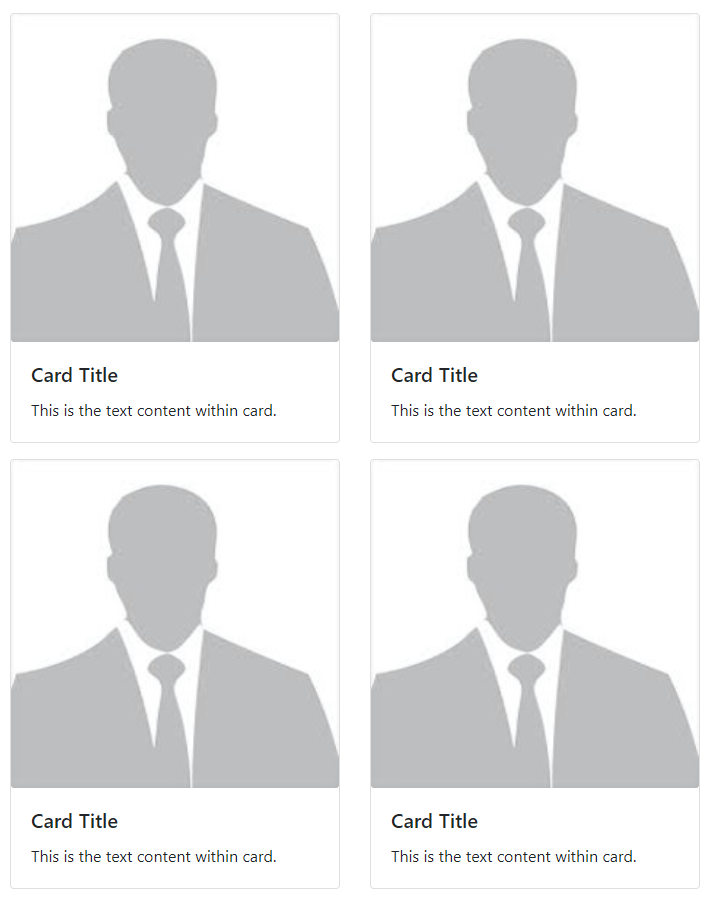
The above example shows two grid columns in each row for cards. Similarly, you can create other grid column types to create card layouts.
Card Grid Columns with Equal Height
In the above example, the cards in a grid column are not of the same height. However, you can use the Bootstrap 4 class .h-100 to each card to create the same height cards as given below:
|
1 2 3 4 5 6 7 8 9 10 11 12 13 14 15 16 17 18 19 20 |
<div class="row row-cols-1 row-cols-sm-2"> <div class="col mb-3"> <div class="card h-100"> <img src="https://tutorialdeep.com/images/user2.jpg" class="card-img" alt=""> <div class="card-body"> <h5 class="card-title">Card Title</h5> <p class="card-text">This is the text content within the card.</p> </div> </div> </div> <div class="col mb-3"> <div class="card h-100"> <img src="https://tutorialdeep.com/images/user2.jpg" class="card-img" alt=""> <div class="card-body"> <h5 class="card-title">Card Title</h5> <p class="card-text">This is the text content within the card. This is the text content within the card. This is the text content within the card. This is the text content within the card. This is the text content within the card.</p> </div> </div> </div> </div> |
Output
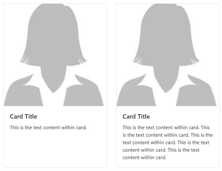
The above example shows the 2 cards in a row with each card takes the height of the larger height card.
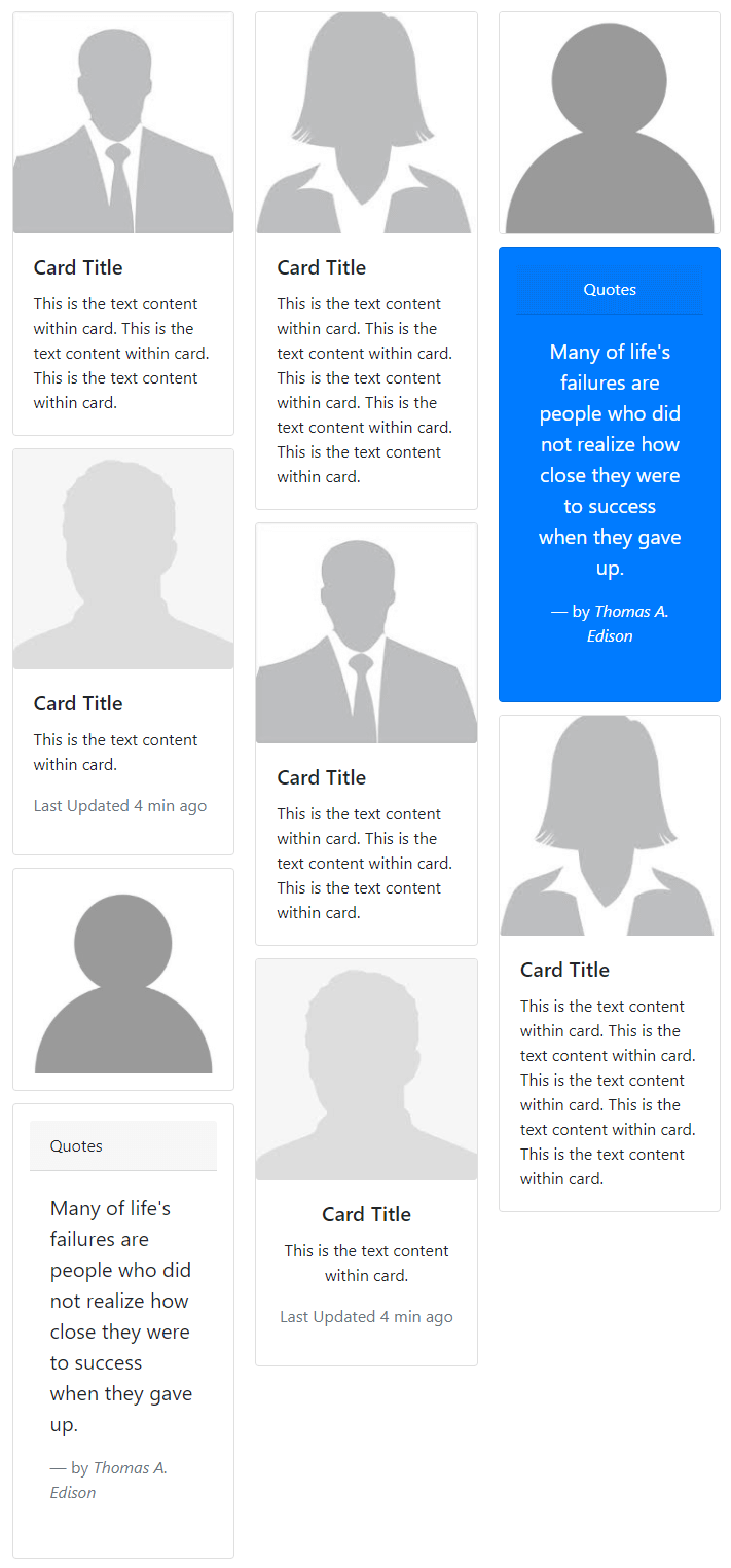
Card Columns in Bootstrap 4
You can create a card grid layout in which cards are placed in optimal positions based on the available vertical spaces. To create the layout, you have to use the class .card-columns and wrap all your cards inside i. The cards are automatically ordered according to the available vertical spaces as given below:
|
1 2 3 4 5 6 7 8 9 10 11 12 13 14 15 16 17 18 19 20 21 22 23 24 25 26 27 28 29 30 31 32 33 34 35 36 37 38 39 40 41 42 43 44 45 46 47 48 49 50 51 52 53 54 55 56 57 58 59 60 61 62 63 64 65 66 67 68 69 70 |
<div class="card-columns"> <div class="card"> <img src="https://tutorialdeep.com/images/user1.jpg" class="card-img" alt=""> <div class="card-body"> <h5 class="card-title">Card Title</h5> <p class="card-text">This is the text content within the card. This is the text content within the card. This is the text content within the card.</p> </div> </div> <div class="card"> <img src="https://tutorialdeep.com/images/user4.jpg" class="card-img" alt=""> <div class="card-body"> <h5 class="card-title">Card Title</h5> <p class="card-text">This is the text content within the card.</p> <p class="text-muted">Last Updated 4 min ago</p> </div> </div> <div class="card p-3"> <img src="https://tutorialdeep.com/images/user3.jpg" class="card-img" alt=""> </div> <div class="card p-3"> <div class="card-header">Quotes</div> <div class="card-body"> <blockquote class="blockquote"> <p>Many of life's failures are people who did not realize how close they were to success when they gave up.</p> <footer class="blockquote-footer">by <cite>Thomas A. Edison</cite></footer> </blockquote> </div> </div> <div class="card"> <img src="https://tutorialdeep.com/images/user2.jpg" class="card-img" alt=""> <div class="card-body"> <h5 class="card-title">Card Title</h5> <p class="card-text">This is the text content within the card. This is the text content within the card. This is the text content within the card. This is the text content within the card. This is the text content within the card.</p> </div> </div> <div class="card"> <img src="https://tutorialdeep.com/images/user1.jpg" class="card-img" alt=""> <div class="card-body"> <h5 class="card-title">Card Title</h5> <p class="card-text">This is the text content within the card. This is the text content within the card. This is the text content within the card.</p> </div> </div> <div class="card text-center"> <img src="https://tutorialdeep.com/images/user4.jpg" class="card-img" alt=""> <div class="card-body"> <h5 class="card-title">Card Title</h5> <p class="card-text">This is the text content within the card.</p> <p class="text-muted">Last Updated 4 min ago</p> </div> </div> <div class="card"> <img src="https://tutorialdeep.com/images/user3.jpg" class="card-img" alt=""> </div> <div class="card bg-primary text-white text-center p-3"> <div class="card-header">Quotes</div> <div class="card-body"> <blockquote class="blockquote"> <p>Many of life's failures are people who did not realize how close they were to success when they gave up.</p> <footer class="blockquote-footer text-white">by <cite>Thomas A. Edison</cite></footer> </blockquote> </div> </div> <div class="card"> <img src="https://tutorialdeep.com/images/user2.jpg" class="card-img" alt=""> <div class="card-body"> <h5 class="card-title">Card Title</h5> <p class="card-text">This is the text content within the card. This is the text content within the card. This is the text content within the card. This is the text content within the card. This is the text content within the card.</p> </div> </div> </div> |
Output