Bootstrap 4 buttons are custom-styled buttons to add to forms for submitting and reset. You can create button links, increase/decrease sizes, add outlines, change the status to active, and disabled using Bootstrap 4.
Let’s learn with the examples given below to customize your button.
Bootstrap 4 Button Styles
There are 9 predefined style classes for buttons in Bootstrap 4. Each button style has its own purpose to serve in the web pages. You can add these classes to <button>, <a>, and <input> elements to create buttons. The classes are useful to create different types of buttons in Bootstrap 4.
To create a button in Bootstrap 4, you have to use the .btn with any one of the class .btn-* given below:
|
1 2 3 4 5 6 7 8 9 |
<button type="button" class="btn btn-primary">Primary</button> <button type="button" class="btn btn-secondary">Secondary</button> <button type="button" class="btn btn-success">Success</button> <button type="button" class="btn btn-danger">Danger</button> <button type="button" class="btn btn-warning">Warning</button> <button type="button" class="btn btn-info">Info</button> <button type="button" class="btn btn-light">Light</button> <button type="button" class="btn btn-dark">Dark</button> <button type="button" class="btn btn-link">Link</button> |
Output

The above buttons are different Bootstrap 4 button styles that you can use on forms, links, and many input-type elements.
Make Buttons with Anchor, Button, and Input Elements
You can use the above classes of Bootstrap to create buttons using the <button>, <a>, and <input> elements as given below:
|
1 2 3 4 |
<a href="#" class="btn btn-primary" role="button">Link Button</a> <button type="button" class="btn btn-primary">Button</button> <input type="button" class="btn btn-primary" value="Input Button"> <input type="submit" class="btn btn-primary" value="Submit Button"> |
Output
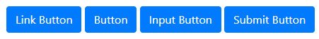
The appearance of above all elements is same as the buttons. However, when you click the link button given above, it will take you to a different page when contains page links.
Bootstrap 4 Outline Buttons
The outline button is the button with border color and displays the background on hover. You can create an outline button using the base class .btn with the outline classes (like .btn-outline-*) as given below:
|
1 2 3 4 5 6 7 8 9 |
<button type="button" class="btn btn-outline-primary">Primary</button> <button type="button" class="btn btn-outline-secondary">Secondary</button> <button type="button" class="btn btn-outline-success">Success</button> <button type="button" class="btn btn-outline-danger">Danger</button> <button type="button" class="btn btn-outline-warning">Warning</button> <button type="button" class="btn btn-outline-info">Info</button> <button type="button" class="btn btn-outline-light">Light</button> <button type="button" class="btn btn-outline-dark">Dark</button> <button type="button" class="btn btn-outline-link">Link</button> |
Output

The above example shows the text and the border color of the button. You can test the above example live to check the appearance of the outine buttons in Bootstrap 4.
Button Sizes
You can make the larger size and smaller size buttons using Bootstrap 4. To create a large size button, you have to use the button base class .btn with class .btn-lg. For smaller size buttons, you have to use the main button class .btn with the small button class .btn-sm as given below:
|
1 2 3 |
<button type="button" class="btn btn-primary btn-lg">Large Button</button> <button type="button" class="btn btn-primary">Default Button</button> <button type="button" class="btn btn-primary btn-lg">Small Button</button> |
Output
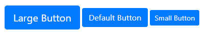
The above example contains the large size button, default size button, and smaller size button.
Create Block Level Buttons in Bootstrap 4
The block-level button is a full-width button that covers the full size of the parent element. To create a block-level button, you have to use the Bootstrap 4 class .btn-block to <button> elements as given below:
|
1 2 3 |
<button type="button" class="btn btn-primary btn-block btn-lg">Large Block Level Button</button> <button type="button" class="btn btn-primary btn-block">Default Block Level Button</button> <button type="button" class="btn btn-primary btn-block btn-sm">Small Block Level Button</button> |
Output
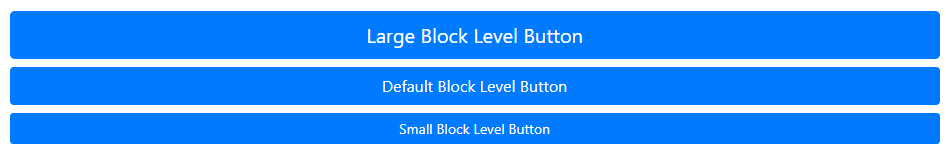
The above example shows the block level button with large, default, and small sizes.
Active State Buttons
The active state of the button shows that the button is in pressed condition. You can create an active state button in Bootstrap 4 using the class .active as given below:
|
1 2 |
<button type="button" class="btn btn-primary active">Active Primary Button</button> <a href="#" class="btn btn-secondary active">Active Secondary Link Button</a> |
Output
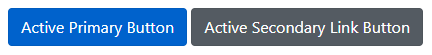
The above example contains the <button> and the <a> element in an active state.
Disabled State Buttons
The disabled state of the button shows that the button does not allow users to click on it. This is useful when you want to get all user inputs and allow users to click the button only when they completed filling the forms.
You can create a disabled button in Bootstrap 4 using the class .disabled in <a> element and attribute disabled in <button> elementas given below:
|
1 2 |
<button type="button" class="btn btn-primary" disabled>Disabled Primary Button</button> <a href="#" class="btn btn-secondary disabled">Disabled Secondary Link Button</a> |
Output
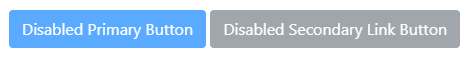
The above example contains the <button> and the <a> element in a disabled state.
Spinner Buttons
The spinner buttons are useful when you want to indicated that the process is in a loading state. To create a circular loading button, you have to add the class .spinner-border and .spinner-border-sm to the <span> element.
You can also create a blink loading button using the Bootstrap 4 class .spinner-grow and .spinner-grow-sm to the <span> element as given below:
|
1 2 3 4 5 6 7 8 9 10 11 12 13 14 15 16 17 18 |
<button type="button" class="btn btn-primary"> <span class="spinner-border spinner-border-sm"></span> Loading... </button> <button type="button" class="btn btn-primary"> <span class="spinner-grow spinner-grow-sm"></span> Loading... </button> <button type="button" class="btn btn-primary active"> <span class="spinner-border spinner-border-sm"></span> Loading... </button> <button type="button" class="btn btn-primary active"> <span class="spinner-grow spinner-grow-sm"></span> Loading... </button> <button type="button" class="btn btn-primary" disabled> <span class="spinner-border spinner-border-sm"></span> Loading... </button> <button type="button" class="btn btn-primary" disabled> <span class="spinner-grow spinner-grow-sm"></span> Loading... </button> |
Output
The above example shows the live loading buttons with circular and blinks animated icons.