Bootstrap 4 Button Group is a series of buttons grouped together in a single line. You can create a horizontal group button, vertical group button, button toolbar, resizing buttons, and nesting buttons with the examples given below.
Basic Button Group in Bootstrap 4
The basic button group are the set of buttons wrapped inside a <div> element. To create a basic button group, you have to use the Bootstrap 4 class .btn-group to the <div> element with the button placed inside it as given below:
|
1 2 3 4 5 6 |
<div class="btn-group"> <button type="button" class="btn btn-primary">First</button> <button type="button" class="btn btn-primary">Second</button> <button type="button" class="btn btn-primary">Third</button> <button type="button" class="btn btn-primary">Forth</button> </div> |
Output

The above example shows the 4 button items grouped together in a single line. You can add as many buttons as you want to create a button group.
Button Toolbar Using Button Group in Bootstrap 4
You can combine Bootstrap 4 button groups into a button toolbar to create more complex components. Toolbars are useful to display the navigations to other pages or page numbers to visit the pages on a website.
To create a button toolbar, you need to add the Bootstrap 4 class .btn-toolbar to the <div> element with the group buttons placed inside it as given below:
|
1 2 3 4 5 6 7 8 9 10 11 12 13 14 15 16 17 18 19 20 21 |
<div class="btn-toolbar"> <div class="btn-group mr-2"> <button type="button" class="btn btn-primary"><<</button> </div> <div class="btn-group mr-2"> <button type="button" class="btn btn-primary">1</button> <button type="button" class="btn btn-primary">2</button> <button type="button" class="btn btn-primary">3</button> </div> <div class="btn-group mr-2"> <button type="button" class="btn btn-primary">4</button> <button type="button" class="btn btn-primary">5</button> </div> <div class="btn-group mr-2"> <button type="button" class="btn btn-primary">6</button> <button type="button" class="btn btn-primary">7</button> </div> <div class="btn-group mr-2"> <button type="button" class="btn btn-primary">>></button> </div> </div> |
Output

The above example shows the toolbar that contains the numbers and arrows to visit next and previous pages on a website.
Sizing Button in a Group
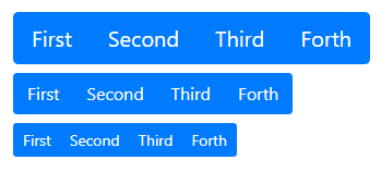
It is easier in Bootstrap 4 to resize buttons by just adding a single class to it. You can add class .btn-group-lg or .btn-group-sm to the <div> element that contains the class .btn-group as given below:
|
1 2 3 4 5 6 7 8 9 10 11 12 13 14 15 16 17 18 19 20 |
<div class="btn-group btn-group-lg mb-2"> <button type="button" class="btn btn-primary">First</button> <button type="button" class="btn btn-primary">Second</button> <button type="button" class="btn btn-primary">Third</button> <button type="button" class="btn btn-primary">Forth</button> </div> <br> <div class="btn-group mb-2"> <button type="button" class="btn btn-primary">First</button> <button type="button" class="btn btn-primary">Second</button> <button type="button" class="btn btn-primary">Third</button> <button type="button" class="btn btn-primary">Forth</button> </div> <br> <div class="btn-group btn-group-sm mb-2"> <button type="button" class="btn btn-primary">First</button> <button type="button" class="btn btn-primary">Second</button> <button type="button" class="btn btn-primary">Third</button> <button type="button" class="btn btn-primary">Forth</button> </div> |
Output

The Bootstrap 4 class .btn-group-lg is useful to make the group button large. While you can use the class .btn-group-sm to make the group button small.
Nesting Button Groups with Dropdown Menus
The nesting button group is the way of placing the button group inside another button group. You can also place the dropdown menu inside the button group to mix it with a series of buttons.
To create a nesting button group, you have to place .btn-group inside another .btn-group as given below:
|
1 2 3 4 5 6 7 8 9 10 11 12 |
<div class="btn-group"> <button type="button" class="btn btn-primary">First</button> <button type="button" class="btn btn-primary">Second</button> <button type="button" class="btn btn-primary">Third</button> <div class="btn-group"> <button type="button" class="btn btn-primary dropdown-toggle" data-toggle="dropdown">Dropdown</button> <div class="dropdown-menu"> <a class="dropdown-item" href="#">Link One</a> <a class="dropdown-item" href="#">Link Two</a> </div> </div> </div> |
Output

The above example contains 4 buttons with the last button in the dropdown menu. You can click the last button to check the dropdown menu with links.
Vertical Button Group with Dropdown
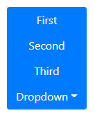
The above all button groups are horizontal button groups in Bootstrap 4. However, you can also create a vertical button group using the class .btn-group-vertical in place of the .btn-group as given below:
|
1 2 3 4 5 6 7 8 9 10 11 12 |
<div class="btn-group-vertical"> <button type="button" class="btn btn-primary">First</button> <button type="button" class="btn btn-primary">Second</button> <button type="button" class="btn btn-primary">Third</button> <div class="btn-group"> <button type="button" class="btn btn-primary dropdown-toggle" data-toggle="dropdown">Dropdown</button> <div class="dropdown-menu"> <a class="dropdown-item" href="#">Link One</a> <a class="dropdown-item" href="#">Link Two</a> </div> </div> </div> |
Output

The above example is the vertical button group that contains 4 buttons. The last button is the dropdown menu that shows the menu on click.
