Bootstrap 4 Badges is used to add useful information to content like notification counters, the number of messages on your email inbox, and others.
In this tutorial, you will learn all types of badges you can create using Bootstrap 4. Below are useful examples of notification counters, badges contextual classes, rounded shape badges, and badges with links.
Use Bootstrap 4 Badges
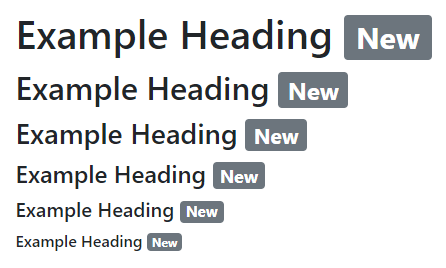
You can add badges to headings that scale according to the size of the specified element. To create badges, add the class .badge with the contextual class (like .badge-secondary) to the <span> element as given below:
|
1 2 3 4 5 6 |
<h1>Example Heading <span class="badge badge-secondary">New</span></h1> <h2>Example Heading <span class="badge badge-secondary">New</span></h2> <h3>Example Heading <span class="badge badge-secondary">New</span></h3> <h4>Example Heading <span class="badge badge-secondary">New</span></h4> <h5>Example Heading <span class="badge badge-secondary">New</span></h5> <h6>Example Heading <span class="badge badge-secondary">New</span></h6> |
Output

The above example showing the headings with rectangular shape badges that match the size of the element.
Buttons with Badges to Display Counter
You can add badges to buttons that are useful to create notification counters. Create a badge using class .badge with the contextual class (like .badge-light) to the <span> and add it inside the button as given below:
|
1 2 3 |
<button type="button" class="btn btn-primary"> Notification <span class="badge badge-light">7</span> </button> |
Output

The above example shows the button that contains a number as a counter to display a number of notifications on dashboards.
Contextual Classes to Change Appearance of Badges
You can change the appearance of badges using the Bootstrap 4 contextual classes. To change the appearance, add the base class .badge with any of the contextual classes (.badge-*) as given below:
|
1 2 3 4 5 6 7 8 |
<span class="badge badge-primary">Primary</span> <span class="badge badge-secondary">Secondary</span> <span class="badge badge-success">Success</span> <span class="badge badge-danger">Danger</span> <span class="badge badge-warning">Warning</span> <span class="badge badge-info">Info</span> <span class="badge badge-light">Light</span> <span class="badge badge-dark">Dark</span> |
Output

The above example shows that there is a total of 8 colors for each badge that you create in Bootstrap 4.
Pill Badges for More Rounded Shape in Bootstrap 4
Pill badges are useful to create rounded shape badges. To create pill badge, you have to add class .badge-pill with the base class .badge and any of the contextual classes (like .badge-primary) to the <span> element as given below:
|
1 2 3 4 5 6 7 8 |
<span class="badge badge-pill badge-primary">Primary</span> <span class="badge badge-pill badge-secondary">Secondary</span> <span class="badge badge-pill badge-success">Success</span> <span class="badge badge-pill badge-danger">Danger</span> <span class="badge badge-pill badge-warning">Warning</span> <span class="badge badge-pill badge-info">Info</span> <span class="badge badge-pill badge-light">Light</span> <span class="badge badge-pill badge-dark">Dark</span> |
Output

The above example shows the different appearance with rounded shapes using the pill badge class .badge-pill.
Badges with Links in Bootstrap 4
In addition to the above all badge types, you can also add links to each badge in Bootstrap 4. To create a badge with links, you have to add the base class .badge with the contextual class (like .badge-primary) to the anchor (<a>) element as given below:
|
1 2 3 4 5 6 7 8 |
<a href="#" class="badge badge-primary">Primary</a> <a href="#" class="badge badge-secondary">Secondary</a> <a href="#" class="badge badge-success">Success</a> <a href="#" class="badge badge-danger">Danger</a> <a href="#" class="badge badge-warning">Warning</a> <a href="#" class="badge badge-info">Info</a> <a href="#" class="badge badge-light">Light</a> <a href="#" class="badge badge-dark">Dark</a> |
Output

