Bootstrap 4 Alerts are the most useful and attention-grabbing messages to display information to users related to the actions they have taken. there are many flexible alert options that you can use to show different types of alerts to users.
You can also add dismiss buttons in alert message boxes to close the alert message after reading the purpose. Let’s find out alerts that you can easily create using Bootstrap 4.
Simple Bootstrap 4 Alerts
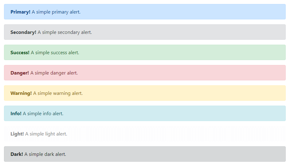
A simple alert box is useful to display any size alert messages to users. There is a total of 8 alert box types in Bootstrap 4. You can create alerts using the base class alert with the contextual class .alert-primary and others as given below:
|
1 2 3 4 5 6 7 8 9 10 11 12 13 14 15 16 17 18 19 20 21 22 23 24 |
<div class="alert alert-primary"> <strong>Primary!</strong> A simple primary alert. </div> <div class="alert alert-secondary"> <strong>Secondary!</strong> A simple secondary alert. </div> <div class="alert alert-success"> <strong>Success!</strong> A simple success alert. </div> <div class="alert alert-danger"> <strong>Danger!</strong> A simple danger alert. </div> <div class="alert alert-warning"> <strong>Warning!</strong> A simple warning alert. </div> <div class="alert alert-info"> <strong>Info!</strong> A simple info alert. </div> <div class="alert alert-light"> <strong>Light!</strong> A simple light alert. </div> <div class="alert alert-dark"> <strong>Dark!</strong> A simple dark alert. </div> |
Output

The alert boxes given above are of different colors to display types of information to users. You can test them live to see the look and feel of alert boxes.
Matching Link Color Alerts in Bootstrap 4
You can add a link to alert boxes that match the specified contextual class color. To create an alert with the link, you have to add the class .alert-link to the anchor (<a>) link element as given below:
|
1 2 3 |
<div class="alert alert-primary"> <strong>Primary!</strong> A simple primary alert with <a href="#" class="alert-link">an example link</a>. Click to check. </div> |
Output

The above example shows the clickable link that points to a page. You add the links to your alerts to describe the message given in the alert box.
Additional HTML Elements Inside Alerts in Bootstrap 4
You can add more HTML elements to the alert box to display more content that match the specified alert contextual color. The content can be paragraphs, headings, dividers, and others as given below:
|
1 2 3 4 5 6 |
<div class="alert alert-success"> <h4><i class="fa fa-check" aria-hidden="true"></i> Success!</h4> <p>This is a success alert message to display a confirmation of success related to your selected topic. It helps users to find whether the action is successful or not.</p> <hr> <p class="mb-0">Whenever you need more information, this alert will help you to get</p> </div> |
Output

Dismissing Alert Boxes
Dismissal alerts are useful to display alerts that contain a button to click and close alert boxes. It gets disappeared immediately on click on the close button.
You need to first create an alert box using the base class .alert with contextual class and .alert-dismissible class to the div element. After that, add a button inside the alert box with the class .close and attribute data-dismiss="alert" as given below:
|
1 2 3 4 |
<div class="alert alert-warning alert-dismissible fade show"> <strong>Warning!</strong> A simple warning alert with dismissal. <button type="button" class="close" data-dismiss="alert">×</button> </div> |
Output

The animation effect can be added to the alert boxes by adding the class .fade to the <div> element. You can test the above example live to see other alert boxes using all the contextual classes.
