
A dropdown that won’t open — or opens incorrectly — is almost always caused by a CSS conflict, a missing JavaScript event, or an overflow issue hiding the menu. This guide covers every real cause with working fixes.
If your HTML dropdown menu is not opening properly, you are dealing with one of the most common UI bugs in web development.
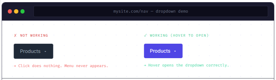
The dropdown might not open at all, it might flash briefly and disappear, it might open but get cut off by a parent element, or it might work on desktop but refuse to work on mobile. Each symptom points to a different cause — and each cause has a clear fix.
This guide covers every real reason an HTML dropdown menu fails to open, from simple CSS mistakes to JavaScript event issues to overflow clipping problems that confuse even experienced developers.
The :hover rule is missing or written incorrectly
CSS Issue
If you’re building a pure CSS dropdown, the most common reason it doesn’t open is a missing or incorrectly written :hover selector. The dropdown menu exists in the HTML but stays hidden because the CSS rule to reveal it is either absent, misspelled, or targets the wrong element.
A pure CSS dropdown works by hiding the menu by default and showing it when the parent is hovered. This requires exact selector structure:
Wrong — hover targets the menu itself, not the parent
|
1 2 3 4 5 |
/* This only shows the menu when you hover the menu itself */ /* — impossible to trigger since it's hidden by default */ .dropdown-menu:hover { display: block; } |
Correct — hover the parent, show the child menu
|
1 2 3 4 5 6 7 8 9 |
/* Hide menu by default */ .dropdown .dropdown-menu { display: none; } /* Show menu when the parent .dropdown is hovered */ .dropdown:hover .dropdown-menu { display: block; } |
And the matching HTML structure:
|
1 2 3 4 5 6 7 8 |
<div class="dropdown"> <button class="dropdown-toggle">Menu ▾</button> <ul class="dropdown-menu"> <li><a href="#">Option 1</a></li> <li><a href="#">Option 2</a></li> <li><a href="#">Option 3</a></li> </ul> </div> |
✓ Quick diagnostic
Right-click the dropdown button in your browser, choose Inspect, and look for the .dropdown-menu element in the HTML panel. In the Styles panel, check whether display: none is applied and whether hovering the parent toggles it. If the rule shows as crossed out, something is overriding it.
CSS Issue
A parent element has overflow: hidden or overflow: auto
This is one of the trickiest dropdown bugs because everything looks correct in your code — the CSS hover rule works, the JavaScript fires, the menu technically opens — but you can’t see it because a parent container is clipping it.
overflow: hidden on any ancestor will clip absolutely-positioned children, even when they sit outside the container’s visible bounds.
The dropdown menu appears to not open at all, when in reality it’s opening but being immediately cropped to zero height.
Causes clipping
|
1 2 3 4 5 6 7 8 |
.navbar { overflow: hidden; /* ✗ clips dropdown */ } .dropdown-menu { position: absolute; /* gets cut off by parent */ } |
Fixed
|
1 2 3 4 5 6 7 8 9 |
.navbar { overflow: visible; /* ✓ allows overflow */ /* Use padding instead of overflow for inner spacing */ } .dropdown-menu { position: absolute; } |
To diagnose this, open DevTools, select the dropdown menu element, and check the Computed styles for overflow. Then go up through each parent element in the HTML tree checking their overflow values. The culprit is usually a wrapper div you didn’t write yourself — like one added by a CSS framework.
⚠ overflow: auto causes the same problem
Both overflow: hidden and overflow: auto clip absolutely-positioned children. overflow: auto adds a scrollbar inside the container rather than clipping, but the dropdown menu still can’t escape the container’s bounds. overflow: scroll has the same effect.
CSS Issue
The dropdown opens but appears behind other elements
A z-index conflict is what happens when the dropdown opens correctly — it’s there, it has the right display value — but another element on the page is rendered on top of it, making it invisible or partially hidden. This commonly happens with sticky headers, modals, image sliders, or any positioned element with a higher z-index.
Dropdown hidden behind a sticky header
|
1 2 3 4 5 6 7 8 9 10 |
.sticky-header { position: sticky; z-index: 1000; top: 0; } .dropdown-menu { position: absolute; z-index: 10; /* Lower than header — hidden behind it */ } |
Give the dropdown a higher z-index
|
1 2 3 4 5 6 7 8 9 |
.dropdown-menu { position: absolute; z-index: 9999; /* Higher than everything else */ } /* Also ensure the parent has position set */ .dropdown { position: relative; } |
ℹ z-index only works on positioned elements
z-index has no effect unless the element also has a position value of relative, absolute, fixed, or sticky. Setting z-index: 9999 on an element with position: static does nothing — add position: relative to the dropdown menu first.
JavaScript Issue
JavaScript click handler is not attached to the button
If your dropdown relies on JavaScript to toggle open and close (which it should, for better accessibility and mobile support), a missing or incorrectly attached event listener means clicking the button does nothing at all.
Wrong — selector typo, listener never attaches
|
1 2 3 4 5 |
// HTML has class="dropdown-toggle" // JavaScript queries wrong class name const btn = document.querySelector('.dropdown-btn'); // ✗ null btn.addEventListener('click', toggleMenu); // TypeError: Cannot read properties of null |
Correct — with null check to prevent errors
|
1 2 3 4 5 6 7 8 9 10 11 12 13 14 15 |
const btn = document.querySelector('.dropdown-toggle'); const menu = document.querySelector('.dropdown-menu'); if (btn && menu) { btn.addEventListener('click', () => { menu.classList.toggle('is-open'); }); } /* Close when clicking outside */ document.addEventListener('click', (e) => { if (!btn.contains(e.target) && !menu.contains(e.target)) { menu.classList.remove('is-open'); } }); |
|
1 2 |
.dropdown-menu { display: none; } .dropdown-menu.is-open { display: block; } |
⚠ Script placement matters
If your <script> tag is in the <head> without a defer attribute, the JavaScript runs before the HTML elements exist in the DOM — so querySelector returns null and the event listener never attaches. Either move the script just before </body>, or add defer to the script tag: <script src="app.js" defer>.
JavaScript Issue
A JavaScript error is preventing the dropdown from working
If there’s a JavaScript error anywhere on your page — even in a completely unrelated script — it can stop the rest of your JavaScript from executing. This means your dropdown’s event listeners might never get attached, even if the dropdown code itself is perfectly correct.
Open the browser console (F12 → Console tab). If you see any red errors, those need to be fixed first. Common errors that silently kill dropdown functionality:
Uncaught TypeError: Cannot read properties of null— aquerySelectorreturned null and the code tried to use itUncaught ReferenceError: X is not defined— a variable or function is used before it’s definedUncaught SyntaxError— a typo in JavaScript syntax stops the entire script from parsing
✓ Debugging step
Open DevTools → Console. Reload the page. Any red errors that appear on load are candidates for breaking your dropdown. Fix them top-to-bottom — often one root error causes a cascade of others, and fixing the first one clears everything.
CSS Issue
The dropdown container is missing position: relative
When a dropdown menu uses position: absolute to appear below the trigger button, it positions itself relative to the nearest positioned ancestor — an ancestor with position set to anything other than static. If no positioned ancestor exists, the menu positions itself relative to the whole page and appears in a completely unexpected location.
Menu flies to a random position on the page
|
1 2 3 4 5 6 7 8 9 10 |
.dropdown { /* No position set — defaults to static */ display: inline-block; } .dropdown-menu { position: absolute; top: 100%; /* 100% of what? Not the dropdown — the page */ left: 0; } |
Add position: relative to the parent
|
1 2 3 4 5 6 7 8 9 10 11 |
.dropdown { position: relative; /* ✓ establishes positioning context */ display: inline-block; } .dropdown-menu { position: absolute; top: 100%; /* now relative to .dropdown — correct */ left: 0; min-width: 200px; } |
Mobile Issue
CSS :hover dropdowns don’t work on touchscreens
A dropdown that works perfectly on desktop but refuses to open on a phone or tablet almost always means the menu is triggered by CSS :hover alone. Touchscreens don’t have a hover state — a tap either fires a click event or triggers a brief hover that immediately closes when the finger lifts.
| Trigger method | Desktop mouse | Touchscreen | Keyboard |
|---|---|---|---|
| CSS :hover only | ✓ Works | ✗ Doesn’t work | ✗ Doesn’t work |
| JS click event | ✓ Works | ✓ Works | ✗ Needs extra work |
| JS click + focus | ✓ Works | ✓ Works | ✓ Works |
The fix is to switch from CSS-only hover to a JavaScript click-toggled approach, which works on all devices. The click handler example in section 4 covers this exactly. If you need to keep hover for desktop, you can combine both approaches:
|
1 2 3 4 5 6 7 8 9 |
/* CSS hover for desktop */ @media (hover: hover) { .dropdown:hover .dropdown-menu { display: block; } } /* JavaScript handles click/tap for touch devices */ /* (code from section 4) */ |
CSS Issue
The CSS class toggle works but display: none is overridden
Your JavaScript correctly adds and removes an is-open class on the dropdown menu. You can see the class appearing in DevTools when you click the button. But the menu still doesn’t show. The likely cause: a more specific CSS rule is keeping display: none active even when the class is present.
Specificity conflict — .is-open rule loses
|
1 2 3 4 5 6 7 8 9 |
/* More specific — wins over .is-open */ nav ul.dropdown-menu { display: none !important; /* ✗ !important blocks toggle */ } /* Less specific — loses */ .dropdown-menu.is-open { display: block; /* never applies */ } |
Match specificity or use !important on the open state
|
1 2 3 4 5 6 7 8 9 10 11 12 13 14 |
/* Option 1: Match the specificity */ nav ul.dropdown-menu { display: none; } nav ul.dropdown-menu.is-open { display: block; } /* Option 2: Use visibility instead of display */ .dropdown-menu { visibility: hidden; opacity: 0; transition: opacity 0.2s; } .dropdown-menu.is-open { visibility: visible; opacity: 1; } |
HTML / Accessibility
Keyboard focus and accessibility issues
If your dropdown opens with mouse hover or click but is inaccessible via keyboard — Tab key, Enter, Escape — it’s not technically broken, but it’s effectively broken for a significant portion of users. Proper ARIA attributes and keyboard handling are what separate a working dropdown from a good dropdown.
|
1 2 3 4 5 6 7 8 9 10 11 12 13 14 15 16 17 18 19 20 21 22 23 24 25 26 27 28 29 30 |
<!-- Accessible dropdown structure --> <div class="dropdown"> <button class="dropdown-toggle" aria-expanded="false" aria-haspopup="true" aria-controls="nav-menu"> Products ▾ </button> <ul id="nav-menu" class="dropdown-menu" role="menu"> <li role="none"><a href="#" role="menuitem">Web Design</a></li> <li role="none"><a href="#" role="menuitem">Development</a></li> </ul> </div> <script> // JavaScript: update aria-expanded on toggle btn.addEventListener('click', () => { const isOpen = menu.classList.toggle('is-open'); btn.setAttribute('aria-expanded', isOpen); }); // Close on Escape key document.addEventListener('keydown', (e) => { if (e.key === 'Escape') { menu.classList.remove('is-open'); btn.setAttribute('aria-expanded', 'false'); btn.focus(); } }); </script> |
Quick cause-and-fix reference
| Symptom | Most Likely Cause | Fix Difficulty |
|---|---|---|
| Nothing happens on hover | Wrong :hover selector or missing CSS rule |
Easy |
| Nothing happens on click | JS event listener not attached or selector typo | Easy |
| Menu opens but is cut off | overflow: hidden on a parent element |
Medium |
| Menu opens but hides behind content | z-index too low or missing |
Easy |
| Menu appears in wrong location | Parent missing position: relative |
Easy |
| Works on desktop, broken on mobile | CSS :hover only — no touch support |
Medium |
| Class toggles but menu stays hidden | CSS specificity conflict overriding open state | Medium |
| Everything broken after adding script | JS error earlier in page blocking execution | Debug |
Troubleshooting checklist
Work through this when your HTML dropdown menu is not opening properly:
- Open DevTools → Console. Any red errors? Fix those first — a JS error anywhere on the page can stop your dropdown’s event listeners from attaching.
- Inspect the dropdown menu element. Is
display: noneapplied? When you hover or click, does it toggle todisplay: block? If not, the CSS hover rule or JS toggle isn’t working. - Check your CSS hover selector — it should be
.dropdown:hover .dropdown-menu, not.dropdown-menu:hover. - Inspect all parent elements for
overflow: hiddenoroverflow: auto— either will clip an absolutely-positioned dropdown menu. - Check
z-index— is the dropdown menu getting a high enough value? Does the parent haveposition: relative? - Test on a real mobile device or browser DevTools mobile emulation. If it fails on touch, switch from CSS :hover to a JavaScript click toggle.
- Check your
<script>tag placement — if it’s in<head>, adddeferor move it before</body>. - If JS toggles the class but the menu stays hidden, open DevTools Styles panel and look for a crossed-out rule — a more specific selector is overriding your open state.
Frequently Asked Questions
Why is my HTML dropdown menu not opening properly?
The most common causes are a missing or incorrect CSS :hover selector, a JavaScript event listener that isn’t attached to the button, a parent element with overflow: hidden clipping the menu, or a z-index conflict hiding it behind other elements. Open the browser console first — any red errors need to be fixed before diagnosing dropdown-specific issues.
My dropdown works on desktop but not on mobile. Why?
This almost always means the dropdown is triggered by CSS :hover only. Touchscreens don’t generate hover events — a tap either fires a click or triggers a brief hover that disappears immediately. Switch to a JavaScript click event handler to support all devices, or use the @media (hover: hover) media query to keep CSS hover for desktop while adding JS click handling for touch.
My dropdown opens but is cut off or hidden. What’s wrong?
A parent element has overflow: hidden or overflow: auto, which clips absolutely-positioned children. Open DevTools, inspect the dropdown menu element, then walk up through each parent checking for overflow values. Change the culprit to overflow: visible. If you added overflow to prevent content spillage, use padding instead.
My dropdown opens behind other elements. How do I fix z-index?
Set a high z-index on the dropdown menu — something like z-index: 9999 — and make sure the menu has a position value other than static (z-index only works on positioned elements). Also ensure the parent container has position: relative so the absolutely-positioned menu is anchored to it correctly.
My JavaScript class toggle works but the dropdown still doesn’t show. Why?
A CSS specificity conflict is probably overriding your open state. Open DevTools, click the dropdown menu element, and look at the Styles panel. If the display: block rule from your .is-open class appears crossed out, a more specific rule is winning. Either increase the specificity of your open-state selector, or switch from display to visibility and opacity for the toggle.
What is the correct HTML structure for a dropdown menu?
A reliable dropdown needs: a wrapper element with position: relative; a button (not a div) as the trigger with aria-expanded and aria-haspopup attributes; and a menu element with position: absolute and a high z-index. Use a <button> for the trigger, not a <div> or <span> — buttons are focusable by default, receive click events from keyboard Enter, and are properly announced by screen readers.
The bottom line
An HTML dropdown menu that isn’t opening properly is almost always a layering problem — either a CSS rule isn’t reaching the element, JavaScript isn’t wired up to the right element, or a parent container is visually blocking the menu from appearing where it should. The browser DevTools are your fastest diagnostic tool: check the console for JS errors first, then inspect the menu element’s computed styles to see exactly which CSS rules are winning.
The other important shift is moving away from CSS-only :hover dropdowns if you need mobile support. A JavaScript click toggle takes about ten extra lines of code and makes your navigation work correctly on every device, every input method, and every browser.