In this tutorial, learn all input type elements in HTML including the new elements introduced in HTML5. The elements are useful to create a meaningful form to get important data from users online.
Let’s find out these input type elements in detail given here below.
List of Form Input Type Elements in HTML with New Introduced in HTML5
The different types of input type elements in HTML and newly introduced elements from HTML5 are given below:
<input> elements in HTML
| Input Type Elements | Description | New in HTML5 |
|---|---|---|
<input type="button"> |
It defines a simple button element. | No |
<input type="checkbox"> |
It defines a checkbox to select multiple options. | No |
<input type="color"> |
It defines an input field to select a specific color. | Yes |
<input type="date"> |
It defines an input field to select a date. | Yes |
<input type="datetime-local"> |
It defines an input field to enter a date without a time zone. | Yes |
<input type="email"> |
It defines an input field to enter email addresses. | No |
<input type="file"> |
It defines an input field to select a file from the storage device. | No |
<input type="hidden"> |
It defines a hidden input field that is invisible to users. | No |
<input type="image"> |
It defines a graphical submit button in a form. | No |
<input type="month"> |
It defines an input box to select a month and a year. | Yes |
<input type="number"> |
It defines an input field to enter a number. | No |
<input type="password"> |
It defines an input box to enter a password. | No |
<input type="radio"> |
It defines a radio button that allows selecting a single option. | No |
<input type="range"> |
It defines a control to select a number. | Yes |
<input type="reset"> |
It defines a button to reset form values. | No |
<input type="search"> |
It defines an input field to enter a search string. | Yes |
<input type="submit"> |
It defines a submit button to submit the form. | No |
<input type="tel"> |
It defines an input field to enter a number. | Yes |
<input type="text"> |
It defines an input box to enter text content. | No |
<input type="time"> |
It allows users to select a time. | Yes |
<input type="url"> |
It defines a field to enter a URL. | Yes |
<input type="week"> |
It defines a field to select a week and year. | Yes |
Let’s learn these elements in detail with useful examples.
HTML Input Type Elements with Examples
Input Type Text
The <input type="text"> element is a single-line input text box to enter text content. It is useful to get user’s input like first name, last name, full name, address, and many more.
|
1 2 3 4 5 6 |
<form> <label>First Name</label><br> <input type="text" name="firstname"><br> <label>Last Name</label><br> <input type="text" name="lastname"> </form> |
Output
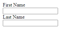
The above example contains the two input text boxes. The first box is for the first name and the second input box is for the last name.
Input Type Email
<input type="email"> is single-line input box to get email addresses from users. The users need to enter the text in the form of an email address to allow submit the form. If the users do not enter an email address, it will not allow them to submit the form.
|
1 2 3 4 |
<form> <label>Your Email</label><br> <input type="email" name="email"> </form> |
Output
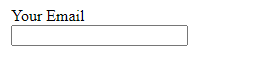
The above example contains the single input box that takes the email id as an input.
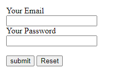
Input Type Password
<input type="password"> creates a single-line textbox to enter passwords. It is useful to create a login form online for users with a password field. It shows hidden content or dot(.) to users when they enter some value on it. The entered content is not visible to users.
|
1 2 3 4 5 6 |
<form> <label>Your Email</label><br> <input type="email" name="email"><br> <label>Your Password</label><br> <input type="password" name="password"> </form> |
Output
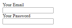
You can enter your content on the above input box to get the result in the password text box.
Input Type Submit
<input type="submit"> create a button that is useful to submit a form. It appears like a button with some text visible inside it. When the users click the submit button, it performs some action given in the action attribute of <form> element. The text contained in the button is the text you specify in the value attribute.
|
1 2 3 4 5 6 7 |
<form action="filename"> <label>Your Email</label><br> <input type="email" name="email"><br> <label>Your Password</label><br> <input type="password" name="password"><br><br> <input type="submit" value="submit"> </form> |
Output
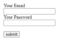
The above example shows the button created using these input type elements. When the users submit the form, it performs some action and gives results according to the script in a file.
Input Type Reset
<input type="reset"> creates a button that reset the form to its initial condition on click. It is useful in a form to allow users to easily get the initial condition of the form. You don’t need to give it a text as ‘reset’ is the default text for this. However, you can change the text content using value attribute.
|
1 2 3 4 5 6 7 8 |
<form> <label>Your Email</label><br> <input type="email" name="email"><br> <label>Your Password</label><br> <input type="password" name="password"><br><br> <input type="submit" value="submit"> <input type="reset"> </form> |
Output
You can fill the above form and click the reset button to change it to its initial condition.
Input Type Radio Elements
<input type="radio"> is used in radio groups that is a collection of the radio buttons to display options. It is useful when you want to give choices to your users to select one. You will be able to select a single option from the radio button choices.
|
1 2 3 4 5 6 |
<form> <input type="radio" name="gender" value="male"> <label>Male</label><br> <input type="radio" name="gender" value="female"> <label>Female</label><br> </form> |
Output

The above example contains two radio buttons to select gender. You can click on your choice to select a single option.
Input Type Checkbox
<input type="checkbox"> create a group of square-shaped boxes to give options to users. You can allow users to select single or multiple options together. To activate the option, you have to click on it to make the checkbox checked. When you click on the checkbox, it adds a tick () mark that indicates the checkbox option is selected or activated.
|
1 2 3 4 5 6 7 8 9 10 |
<form> <input type="checkbox" name="php" value="php"> <label>PHP</label><br> <input type="checkbox" name="html" value="html"> <label>HTML</label><br> <input type="checkbox" name="bootstrap" value="bootstrap"> <label>Bootstrap</label><br> <input type="checkbox" name="jquery" value="jquery"> <label>jQuery</label><br> </form> |
Output
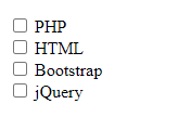
You can select a single option or multiple options from the choices given above. Checkboxes give more flexibility to users to select choices according to their requirements.
Input Type Button
<input type="button"> creates a button element that can be useful to execute a script on click. You can add your script or function inside the onclick attribute of this input type element. It contains a text that you can change or modify using the value attribute on it.
|
1 2 3 |
<form> <input type="button" onclick="alert('Welcome to TutorialDeep!')" value="Click me!"> </form> |
Output

The above example shows a button that displays an alert box on click. Similarly, you can add any other scripts or function that contains script somewhere else in the content.
Input Type Color Elements
<input type="color"> creates an input field that looks like a color picker where users can select a color. It allows users to easily specify a color with visualize interface.
|
1 2 3 4 |
<form> <label>Select your color:</label> <input type="color" name="mycolor"> </form> |
Output
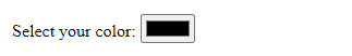
You can click the above color picker to select a color of your choice. It makes it easier for users to specify a color without entering the color codes.
Input Type Date
<input type="date"> is input type elements in HTML5 that allow users to enter a date. It contains a calendar icon that you click to get a date picker and select a date of your choice. You can add this field to make it easier enter a date in the input field using the date picker.
|
1 2 3 4 |
<form> <label>Select a Date:</label> <input type="date" name="date"> </form> |
Output
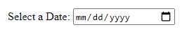
The above example contains the date format and a calendar icon. When you click the calendar icon, it displays a calendar to select and enter any date.
Input Type Datetime-local Elements
<input type="datetime-local"> are input type elements in HTML5 that allow users to select dates and times with no time zone. It contains a date format and a calendar icon that you click to get a DateTime picker. The field makes it easier to enter a date and time with no time zone using the date-time picker.
|
1 2 3 4 |
<form> <label>Select a Date (Date and Time):</label> <input type="datetime-local" name="datentime"> </form> |
Output
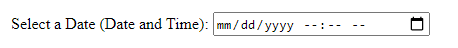
The above example contains the date format and time fill in the blanks with a calendar icon. When you click the calendar icon, it displays a calendar to select any date and time of your choice.
Input Type File
<input type="file"> creates a browse button that contains the text ‘Choose File’ inside it and ‘No file chosen’ outside it. When you click on the button, it browses the storage directory files to select one for file upload. It is useful to get files as input from users in a form.
|
1 2 3 4 |
<form> <label>Select a File:</label> <input type="file" name="myfile"> </form> |
Output
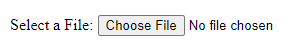
You can click the above browse button that browses the storage directory file to select for uploading.
Input Type Hidden Elements
<input type="hidden"> is an input field that is hidden and not visible to users in a form. It is useful to add a hidden value or data in a form to get on form submission. The users are not able to see the hidden data or modify it.
|
1 2 3 4 5 6 |
<form> <label>Name:</label><br> <input type="text" name="name"><br> <input type="hidden" name="userid" value="1234"> <input type="submit" value="submit"> </form> |
Output
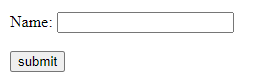
The above example contains a hidden input field in a form with a customer id stored in it. However, users are not able to see the hidden data that is tracked and updated in a database.
Input Type Image
<input type="image"> is the submit button that appears as an image. You can add an image in place of a submit button in a form. When the users click on the image, the form gets submitted. It requires to specify the path of the image to display as given below:
|
1 2 3 4 5 6 7 |
<form> <label>Your Email</label><br> <input type="email" name="email"><br> <label>Your Password</label><br> <input type="password" name="password"><br><br> <input type="image" src="button-tick.png" alt="Submit button image" width="50" height="50"> </form> |
Output
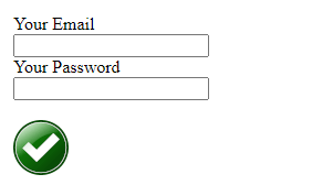
The above example shows an image in place of submit button in a form. You can click on the image to submit the above form.
Input Type Month
<input type="month"> are input type elements in HTML5 that allow users to select month and year. It contains a fill in the blank and a calendar icon to fill that with the month and year picker. The field makes it easier to enter a month and year without the need for manual entry.
|
1 2 3 4 |
<form> <label>Select a Date (Month and Year):</label> <input type="month" name="monthnyear"> </form> |
Output
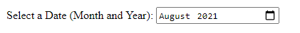
You can click the above calendar icon to select the month and year of your choice.
Input Type Number
<input type="number"> is single-line input field that takes input as a numeric value. You can specify the minimum and maximum numbers allow in the input box using the min and max attributes.
|
1 2 3 4 |
<form> <label>Enter a Number (Between 1 to 10):</label> <input type="number" name="mynumber" min="1" max="10"> </form> |
Output
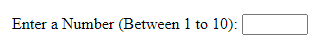
The above example contains an input box where users are allowed to enter numbers between 1 to 10.
Input Type Range Elements
<input type="range"> creates a control to enter a number using the number slider. The default range is from 0 to 100 and you can change the minimum and maximum value using min and max attributes. However, the exact value is not important in this number slider. Users can use this input field only when they know that the exact value is not important.
|
1 2 3 4 |
<form> <label>Select a Number:</label> <input type="range" name="mynum" min="1" max="20"> </form> |
Output
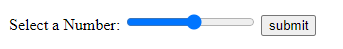
The above example contains the range slider to select a number between ranges 1 to 20.
Input Type Search
<input type="search"> is single-line input box where users have to enter a search queries. It can be useful for site search in a website. You can use it on your website to allow users to enter a search term. It performs a search on the site for search engines (like Google search and others).
|
1 2 3 4 |
<form> <label>Enter Search Term:</label> <input type="search" name="mysearch"> </form> |
Output
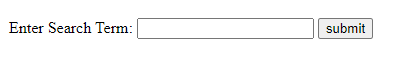
You can enter a search term on the above text box to check the input field.
Input Type Tel Elements
<input type="tel"> are input type elements in HTML5 that take mobile phone numbers as input. You can add a placeholder attribute to guide users to enter the correct format of mobile numbers.
|
1 2 3 4 |
<form> <label>Enter Your Mobile Number:</label> <input type="tel" name="mobilenumber" placeholder="0123-45-678"> </form> |
Output
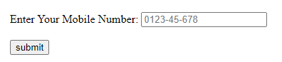
The above example shows an input box that shows the format of the mobile number to enter in the input box. You can change the format and specify your required format in the placeholder attribute.
Input Type Time
<input type="time"> creates input type elements in HTML5 where users can specify time using a time calendar. The input box contains fill in blanks and a calendar icon to get a time calendar. You can click the time calendar icon and select your time you want to enter in the input box.
|
1 2 3 4 |
<form> <label>Select a Time:</label> <input type="time" name="mytime"> </form> |
Output
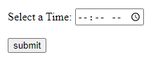
When you click the calendar icon, it displays time in an hour and minutes and PM or AM.
Input Type URL Elements
<input type="url"> is a single-line input field to enter the URL of a website. When you make this input field required, it will not allow users to submit the form until they fill the URL format on it.
|
1 2 3 4 |
<form> <label>Enter Your Website URL:</label> <input type="url" name="myurl"> </form> |
Output
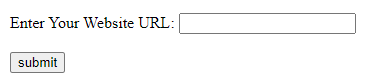
You can make the above field required and enter the content to check the working of the input field.
Input Type Week
<input type="week"> creates input type elements in HTML5 to select week and year. It contains a fill in the blank and a calendar icon to get a week calendar. You have to click the calendar icon to fill the week and the year in the input box.
|
1 2 3 4 |
<form> <label>Select a Week:</label> <input type="week" name="myweek"> </form> |
Output
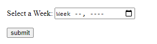
You can click the above calendar icon to fill the week and year in the input box.