A responsive contact form in Bootstrap can resize itself to any screen size. It can help you gain more customers from any size device and anywhere for your business.
If you want to collect more customers and their queries, you cannot depend only on the desktop. More and more users are using mobiles today and remain active every time on their mobile phones.
If you want to create beautiful responsive contact forms without coding required? Signup JotForm and Start Creating beautiful-looking contact forms.
You must consider using responsive contact forms to make your contact form mobile-friendly. A mobile-friendly contact form can bring more customers to your business online.
So, how you can easily create a contact form with less coding required?
You can use Bootstrap which comes with pre-defined CSS classes to easily use and create a responsive contact form. It just requires a CSS file to include on your code to quickstart using CSS classes.
In this post, you learn a step-by-step process for creating a responsive contact form. You will also learn to collect customers’ data via emails using PHP. So, let’s get started.
How to Create a Responsive Contact Form in Bootstrap 5
Here is the step-by-step process to create a responsive contact form using Bootstrap:-
Step 1: Create Responsive Contact Form Design Using Bootstrap 5
To create a responsive contact form design, you can use Bootstrap. I am going to use Bootstrap version 5 with its CDN URL as given below. You have to include it in your HTML code’s <head> tag to start using its responsive classes.
Bootstrap 5 CDN
|
1 |
<link href="https://cdn.jsdelivr.net/npm/[email protected]/dist/css/bootstrap.min.css" rel="stylesheet"> |
Now, you can start using the Bootstrap classes to create the contact form structure as shown in the below code. It contains the form field Name, Email, and Message. These fields are enough to collect customers’ queries and make personal communication with them.
Responsive Contact Form Design Using Bootstrap 5
|
1 2 3 4 5 6 7 8 9 10 11 12 13 14 15 16 17 18 19 20 21 22 23 24 25 26 27 28 29 30 31 32 33 34 35 36 37 38 39 40 |
<!doctype html> <html lang="en"> <head> <title>Responsive Contact Form Design in Bootstrap 5</title> <meta charset="utf-8"> <meta name="viewport" content="width=device-width, initial-scale=1"> <link href="https://cdn.jsdelivr.net/npm/[email protected]/dist/css/bootstrap.min.css" rel="stylesheet"> </head> <body> <div class="container"> <div class="row"> <div class="col-md-6 offset-md-3 mt-3 bg-light p-3 border border-secondary"> <!-- Bootstrap main form start --> <form class="row g-3" method="POST"> <div class="col-md-6"> <label for="Name" class="form-label">Your Name</label> <input type="text" class="form-control" name="name" placeholder="Enter name" required> </div> <div class="col-md-6"> <label for="Email" class="form-label">Your Email</label> <input type="email" class="form-control" name="email" placeholder="Enter email" required> </div> <div class="col-md-12"> <label for="message" class="form-label">Message</label> <textarea class="form-control" name="message" placeholder="Enter your message" rows="5" required></textarea> </div> <div class="col-md-12"> <input type="submit" class="btn btn-primary" name="submit" value="Submit"> </div> </form><br> <!-- Bootstrap main form end --> <!-- Place PHP Code Here Start--> <!-- Place PHP Code Here End--> </div> </div> </div> </body> </html> |
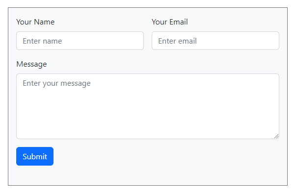
When you run the above code on your browser, you will get a responsive design as shown in the image below. It gives a different view on desktop and mobile.
Desktop View of Contact Form
On the desktop, you will get your Name and Email in the same row. However, the message field is added in the next single row to help customers enter queries description.
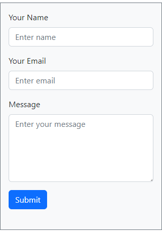
Mobile Responsive View of Contact Form
Now, open the above code on your mobile phone browsers. You will get the mobile view as shown in the image below. The email field automatically moves to the next row to make a responsive view. The desktop view is a 3-row design while the mobile view is a 4-row design.
You can also check the design on other devices like tablets and iPhones to find out its responsive design on them.
Explanations of Bootstrap 5 Classes in the above Code
Let’s find out what are the uses of the Bootstrap 5 classes I have used in the above code:-
container: It is the main box where the main content code will come.row: Create a 12-column row to define 12 grid columns in Bootstrap.col-md-6: It covers half of the total 12 grid columns in Bootstrap.col-md-12: Covers the full of the total 12 grid columns in Bootstrap.offset-md-3: Move your div 3 columns ahead using this Bootstrap offset class.mt-5: Give margin-top with pre-defined Bootstrap margin CSS class. It means margin-top with 2em as its value.bg-light: If you want to give light background color to the div element, you can use this predefined background class.p-3: Give padding to the element using the Bootstrap padding class. It means 3em padding to the element specified.border: To give borders to the element using Bootstrap, you can use this pre-defined class.border-secondary: When you want to give color to the border of the element, you can use this Bootstrap border, contextual predefined class. It gives secondary color to the border of the specified element.mb-3: As you have given margin-top using mt-5. Similarly, you can use this class to give a 3em margin-bottom to the element.g-3: If you want to give column padding or gaps among columns, you can use this gutter class of Bootstrap. It gives 3em padding to the columns.form-label: If you want to define the label for input, you can use this class in the label tag.form-control: To create a beautiful form element, you can use this Bootstrap class.btn: It defines the button element in Bootstrap.btn-primary: It is the contextual button class of Bootstrap to give color to the button.
Now, you know all the classes of Bootstrap we are using in the above form design code.
Step 2: Get Data with Email Validation and Send Emails Using PHP
You cannot say a contact form is complete without sending emails on submission. To send emails from it, you will have to add some PHP code as given below.
The code first gets the form data using $_POST a global variable. After that, it validates the email address. You just have to change [email protected] with the email address of the recipient. When everything goes ok, the recipient will get an email containing the user’s submitted form data.
|
1 2 3 4 5 6 7 8 9 10 11 12 13 14 15 16 17 18 19 20 21 22 23 24 25 26 27 28 29 30 31 32 33 34 35 36 37 38 39 40 41 42 43 44 45 46 47 48 49 50 51 52 53 54 55 56 |
<?php if(isset($_POST['submit'])){ //Get form data $name = $_POST['name']; $email = $_POST['email']; $message = $_POST['message']; $email_exp = '/^[A-Za-z0-9._%-]+@[A-Za-z0-9.-]+\.[A-Za-z]{2,4}$/'; if (!preg_match($email_exp, $email)) { ?> <div class="alert alert-danger alert-dismissible fade show"> <strong>The Email address you entered is not valid.</strong> <button type="button" class="btn-close" data-bs-dismiss="alert" aria-label="Close"></button> </div> <?php exit; } $subject = "Contact Form"; //Subject of the email //Message content to send in an email $message = "Name: ".$name."<br>Email: ".$email."<br> Message: ".$message; //Email headers $headers = "From:".$email."\r\n"; //Send email in HTML format $headers .= "Content-type:text/html;charset=UTF-8" . "\r\n"; //$headers = "CC: [email protected]"; $headers .= "Reply-To:".$email."\r\n"; $headers .= "X-Mailer: PHP/".phpversion(); //Send email $sendmail = mail($to, $subject, $message, $headers); // If mail sent if($sendmail == true){ ?> <div class="alert alert-success alert-dismissible fade show"> <strong>Message has been sent successfully.</strong> <button type="button" class="btn-close" data-bs-dismiss="alert" aria-label="Close"></button> </div> <?php }else { ?> <div class="alert alert-danger alert-dismissible fade show"> <strong>Message could not be sent. Please try again.</strong> <button type="button" class="btn-close" data-bs-dismiss="alert" aria-label="Close"></button> </div> <?php } } ?> |
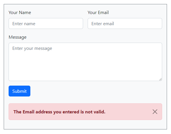
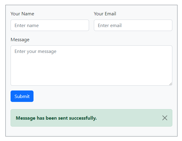
I have added some validation messages to display using Bootstrap design. Below are the screenshots of the error and success messages I have added.
Email Validation Bootstrap Error Message
Email Sent Bootstrap Success Message
The above PHP code is self-explanatory as it is well-commented to explain each line of code. However, if you want to learn the code with more explanations, I am going to add explanations below.
Explanation of PHP code to send emails
To understand each variable of the code, read the below details of the PHP code:-
$to: Enter the email address of the recipient who wants to receive emails.$subject: The main subject of the contact form.$message: Message description of the email to collect the required query of the customer via email.$headers:- ‘From’ email is the email address of the website owner. It should be domain specific to identify where the email comes from.
- ‘CC’ is the email address of the second person who also wants to receive the email.
- “Reply-To’ is the email address of your customer or user who fills in and submits the contact form.
mail(): It is the built-in PHP function to send emails. It requires 4 variables as an argument to pass to be able to send emails on execution.
So, now you know how to create a responsive contact form in Bootstrap. You also know how to send emails from your form using PHP.
You May Also Like to Read
- PHP Contact Form
- Ajax Contact Form with Attachment in PHP (Using Mail() or PHP Mailer)
- HP Ajax Contact Form with Captcha and Validation
If you have any queries regarding this post, you can comment below.