
More than half of all web traffic now comes from phones. That means a large share of the people who open your contact form, order form or registration form are doing it with one thumb, on a small screen, often while doing something else.
If your form is awkward on mobile, people simply leave. Tiny buttons, endless scrolling and the wrong keyboard popping up each cost you submissions.
The good news is that making a form mobile-friendly isn’t hard. This guide covers what makes a form work well on a phone, the exact steps to build one, and the mistakes to avoid.

What Is a Mobile-Friendly Form?
A mobile-friendly form is easy to read, tap and complete on a smartphone, without pinching, zooming or sideways scrolling. It adjusts to the screen size automatically (this is called responsive design), uses large tap targets, and asks for information in a way that suits a touchscreen.
10 Best Practices for Mobile-Friendly Forms
1. Keep it short
Every extra field is another chance for someone to quit, and typing on a phone is slower than on a keyboard. Ask only for what you truly need. A contact form often needs just a name, email and message.
2. Use a single-column layout
Side-by-side fields get squeezed on small screens. A single column, with fields stacked top to bottom, is easier to follow and harder to get wrong.
3. Make buttons and fields big enough to tap
Fingers are less precise than a mouse cursor. Aim for tap targets around 44 to 48 pixels high, with enough spacing between fields to avoid mis-taps. Make your submit button obvious and easy to hit.
4. Use the right input type for each field
This is one of the easiest wins. When a field is set as an email, phone or number field, the phone shows the matching keyboard (an @ key for email, a number pad for phone numbers). That saves people a lot of tapping.
5. Put labels above fields, not inside them
Placeholder text disappears when someone starts typing, so people forget what a field was for. Keep clear labels above each field and use placeholders only for short examples.
6. Reduce typing wherever possible
Use dropdowns, multiple-choice buttons, checkboxes, date pickers and toggles instead of free text when you can. Where it makes sense, enable autofill so the phone can fill in names, emails and addresses.
7. Consider showing one question at a time
For longer forms, a conversational layout with one question per screen feels natural on a phone. It keeps people focused and makes progress feel quick.
8. Show progress on longer forms
If your form has several steps, add a progress bar or step indicator (“Step 2 of 4”). People are more likely to finish when they know how much is left.
9. Keep it fast to load
Slow forms lose people before they start. Avoid heavy images and unnecessary scripts, and don’t pile a lot of embedded content onto the same page.
10. Test on real devices
A preview on your computer isn’t the same as a real phone. Test on at least one iPhone and one Android device, in both portrait and landscape.
How to Create a Mobile-Friendly Form in Jotform (Step by Step)
You can follow the practices above with almost any form builder. Here’s how it looks in Jotform, which creates responsive forms by default, so a form you build on your computer adapts to phones and tablets without extra work. It takes about ten minutes.
Step 1: Start with a template
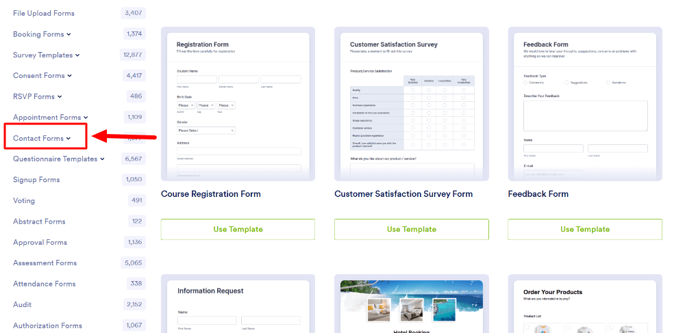
Log in to Jotform, click Create, and choose a template that matches your purpose (contact, registration, order, feedback). Templates are already laid out sensibly, so you start from a good base.
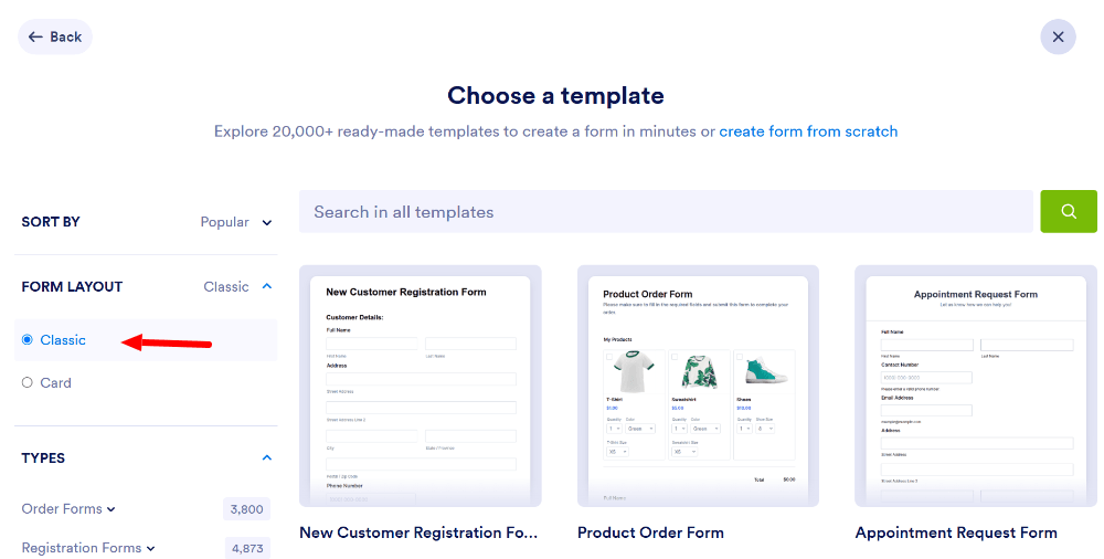
Step 2: Choose the right layout
- Classic Form: all questions on one page. Good for short forms.
- Card Form: one question at a time. Often the better choice for longer forms on phones.
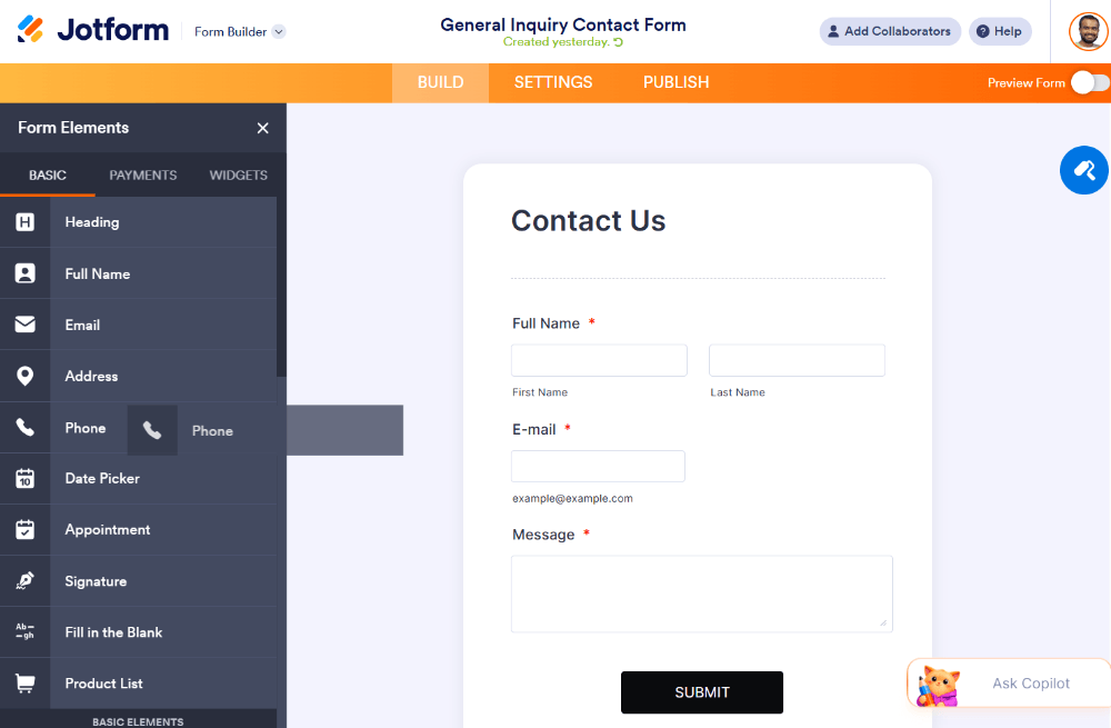
Step 3: Trim the fields
Delete anything you don’t need. Click a field and use the trash icon, or drag fields into a sensible order with the most important ones first.
Step 4: Use the right field types
Add dedicated Email, Phone and Number fields rather than plain text boxes, so phones show the right keyboard. Use Dropdown, Multiple Choice, Date Picker and Toggle elements to cut down on typing.
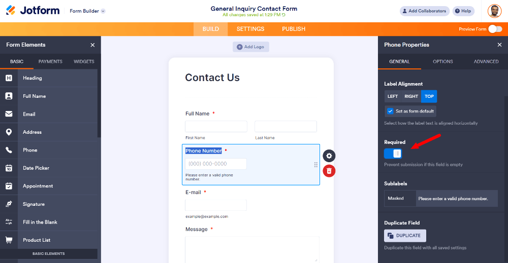
Step 5: Mark only the essentials as required
Click a field and switch on Required only for what you really need. Fewer required fields means fewer frustrated people.
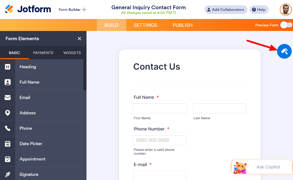
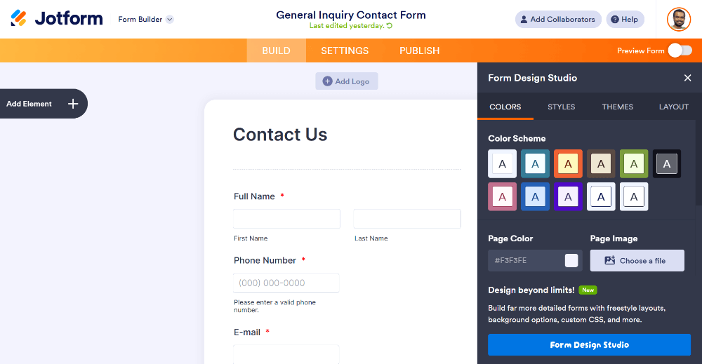
Step 6: Improve readability in the Form Designer
Open the Form Designer (paint roller icon) and check that:
- Font size is large enough to read comfortably
- Text and background have strong contrast
- Spacing between fields is generous
- Your logo and colors match your brand
Step 7: Add a progress indicator for longer forms
If your form has multiple pages, use the page and progress options so people can see how far along they are.
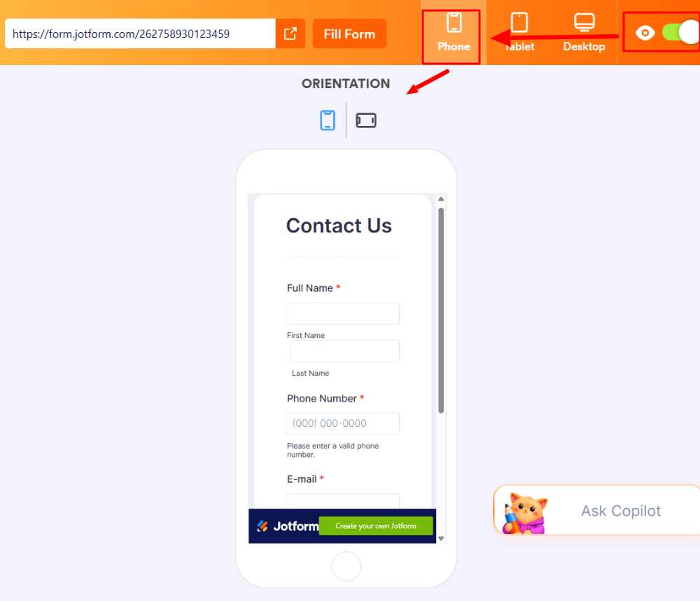
Step 8: Preview on mobile
Before you publish, use the preview option in the builder to see how your form looks on a phone. Check that nothing is cut off, text is readable and buttons are easy to tap.
Step 9: Test on a real phone
Open the published form link on your own phone and submit a test response. Check that the right keyboards appear and that the confirmation email arrives.
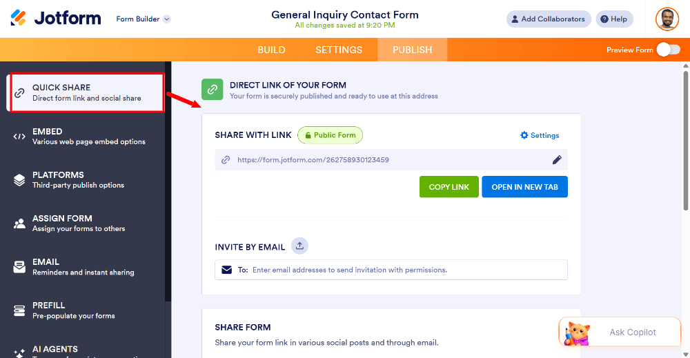
Step 10: Publish and share
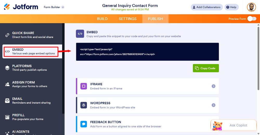
Go to the Publish tab. Share the link by message, email or social media, or embed the form on your website. If you embed it, check it on your site as well as on the standalone link, because a form can behave differently inside a page layout.
Build your own mobile-friendly form with Jotform →
Common Mobile Form Mistakes to Avoid
- Too many fields. Long forms hurt completion rates, especially on phones.
- Tiny buttons and links. If it’s hard to tap, people give up.
- Using placeholders as labels. People forget what to enter.
- Wrong input types. Making users hunt for the @ symbol or numbers is a needless obstacle.
- Forcing users to zoom or scroll sideways. This usually means the form isn’t responsive.
- Not testing. Many problems only show up on a real device.
- CAPTCHAs that are hard to solve on a phone. Use simpler spam protection where you can.
- Unclear error messages. Say exactly what went wrong and where (“Please enter a valid email address”).
Quick Mobile Form Checklist
- Under 10 fields (fewer if possible)
- Single-column layout
- Large, clear submit button
- Correct input types (email, phone, number)
- Labels above fields
- Dropdowns and buttons instead of typing where possible
- Progress indicator for multi-step forms
- Fast loading
- Tested on iPhone and Android
- Confirmation message and email working
Frequently Asked Questions
What makes a form mobile-friendly?
A mobile-friendly form adapts to small screens, uses large tap targets, a single-column layout and the right keyboard for each field, and asks for as little typing as possible.
How do I make my form responsive?
Use a form builder that creates responsive forms automatically, such as Jotform. Then preview on mobile, keep the layout simple and test on real devices.
How many fields should a mobile form have?
As few as you can manage. Ask only for information you actually need. For many forms, 3 to 6 fields is enough.
Should I use a one-question-at-a-time layout?
It is worth trying for longer forms, since it feels natural on a phone. For very short forms, a classic single-page layout is fine.
Can I embed a mobile-friendly form on my website?
Yes. Embed it with the code from your form builder, then check it on your live site on a phone to make sure it fits properly.
Do mobile-friendly forms help SEO?
Indirectly. A fast, easy-to-use page keeps visitors engaged, and Google rewards pages that work well on mobile. The main benefit is more completed submissions.
Final Thoughts
Mobile-friendly forms come down to simplicity: fewer fields, bigger buttons, the right keyboard, and testing on a real phone. A responsive builder like Jotform handles the technical side, so you can focus on asking the right questions. Build one, test it on your phone, and you’ll likely see a difference in how many people finish it.