
One of CSS’s oldest and most frustrating problems — making columns the same height regardless of content — is solved by Flexbox in a single line. This guide explains exactly how, why, and when to use it.
The Equal Height Problem
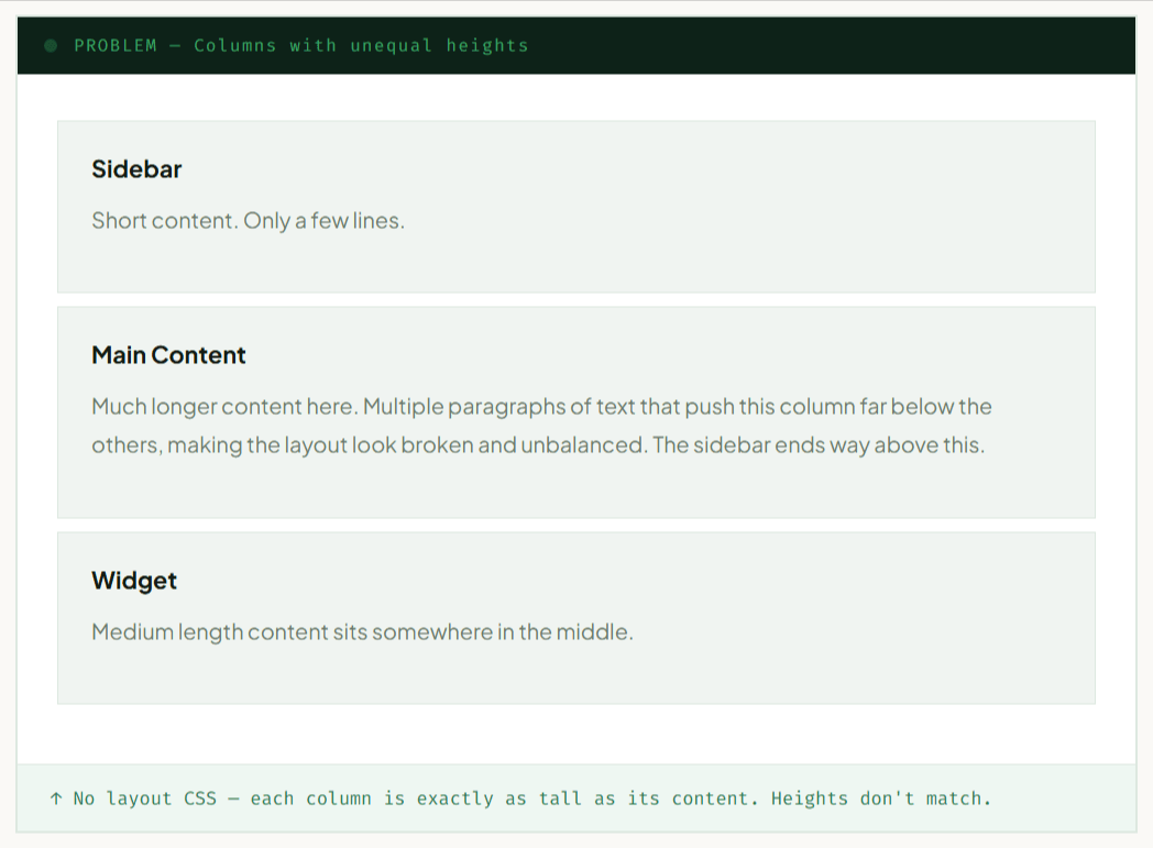
Imagine a three-column layout: a sidebar, a main content area, and a widget panel. The content in each column is different — the main area has three paragraphs, the sidebar has a short menu, the widget just has a search box. Without any layout magic, each column is only as tall as its own content.
This creates a ragged bottom edge — columns end at different heights, background colors don’t line up, and borders look broken. Visually, it feels unfinished.
The Old Solutions (and Why They Failed)
Before Flexbox, developers used three hacky approaches to fake equal heights:
| Old Technique | How It Worked | The Problem |
|---|---|---|
| faux columns | Background image on parent repeating column colors | Inflexible — breaks on any content change |
| table-cell | display: table-cell on columns |
Semantic disaster; breaks responsiveness |
| JavaScript | Measure tallest column, set height on all others | Brittle, slow, breaks on resize |
| padding + negative margin | Huge padding with overflow hidden | Clips content; unusable with borders |
Flexbox made all of these obsolete.
Why Flexbox Solves It
Flexbox has a concept called the cross axis. When items are laid out in a row (flex-direction: row), the main axis runs left-to-right and the cross axis runs top-to-bottom.
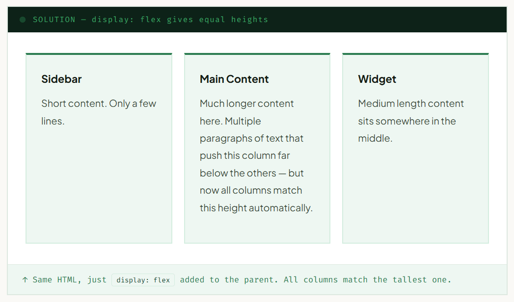
The property align-items controls how flex items are positioned along the cross axis. Its default value is stretch — which means every flex item stretches to fill the full cross-axis size of the container. In a row layout, that means every column stretches to the height of the tallest column.
Equal height columns are the default Flexbox behavior.
You don’t need to add any special property.
Just display: flex on the parent and you get equal heights
automatically because align-items: stretch is already active.
The One-Line Fix
Here is the complete solution. One CSS property on the parent element:
|
1 2 3 4 5 6 7 8 9 10 11 12 |
/* That's it. This is the entire solution. */ .columns { display: flex; /* Equal heights enabled automatically */ } /* Under the hood, this is also active (it's the default): align-items: stretch; You don't need to write it — but it's useful to know it exists. */ |
|
1 2 3 4 5 6 7 8 9 10 11 12 |
.columns { /* No layout = broken heights */ /* Old workaround: */ .column { display: table-cell; /* ? semantic mess */ } |
|
1 2 3 4 5 6 7 |
.columns { display: flex; /* That's it. align-items: stretch is the default. */ } |
How align-items Works
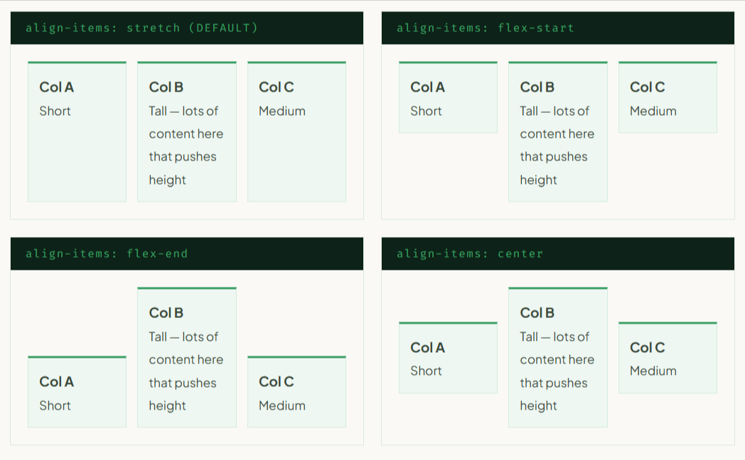
While stretch is the default and gives you equal heights, it helps to understand all the values so you can make an intentional choice:
| Value | Effect on Columns | Use When |
|---|---|---|
| stretch | All columns = height of tallest (default) | Almost always — equal height columns |
| flex-start | Each column = its own content height, top-aligned | Independent columns, card rows |
| flex-end | Each column = its own content height, bottom-aligned | Rarely used for columns |
| center | Each column = its own content height, vertically centered | Centering a single item in a row |
Interactive Height Demo
Drag the slider to add content to the middle column and watch the other columns stretch to match — automatically, with no JavaScript involved in the layout itself.
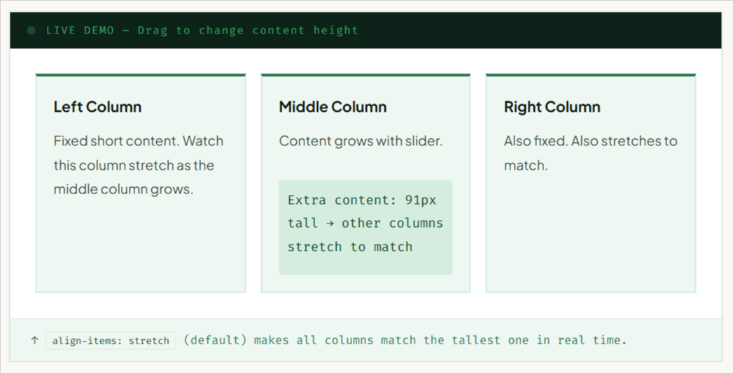
display: flex on the parent. The JavaScript only changes the height of the middle column’s content div. The equal-height behaviour is entirely handled by Flexbox.
Two, Three & Four Columns
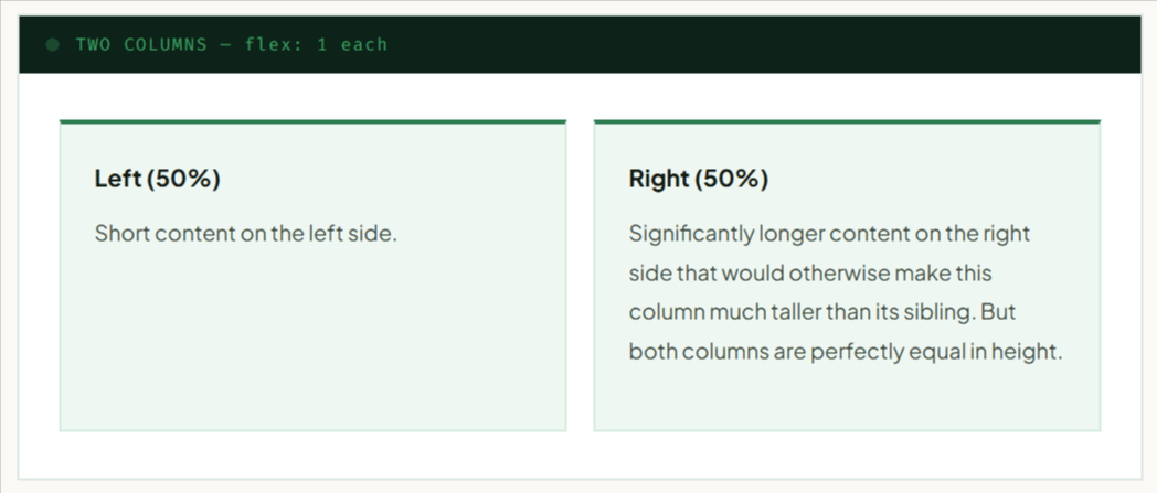
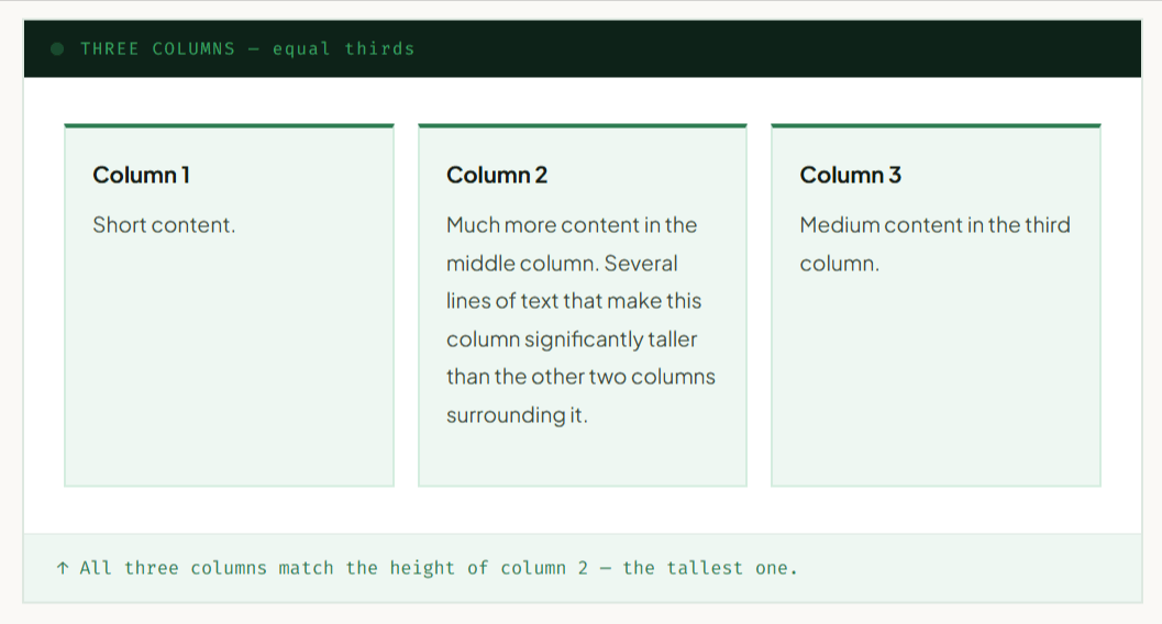
Equal height columns work with any number of columns. The HTML structure and CSS pattern stays the same — you just control column widths differently.
Two Columns (50/50)
|
1 2 3 4 5 6 7 |
.two-col { display: flex; gap: 24px; } .two-col .col { flex: 1; /* Each takes 50% */ } |
Three Columns (33/33/33)
|
1 2 3 4 5 6 7 |
.three-col { display: flex; gap: 20px; } .three-col .col { flex: 1; /* Each takes 1/3 */ } |
Unequal Columns (custom widths)
|
1 2 3 4 5 6 7 8 9 10 |
.asymmetric { display: flex; gap: 20px; } .col-wide { flex: 3; } /* 3/5 = 60% */ .col-narrow{ flex: 2; } /* 2/5 = 40% */ /* Or use explicit percentages: */ .col-main { flex: 0 0 65%; } .col-sidebar { flex: 0 0 35%; } |
Sidebar + Main Layout
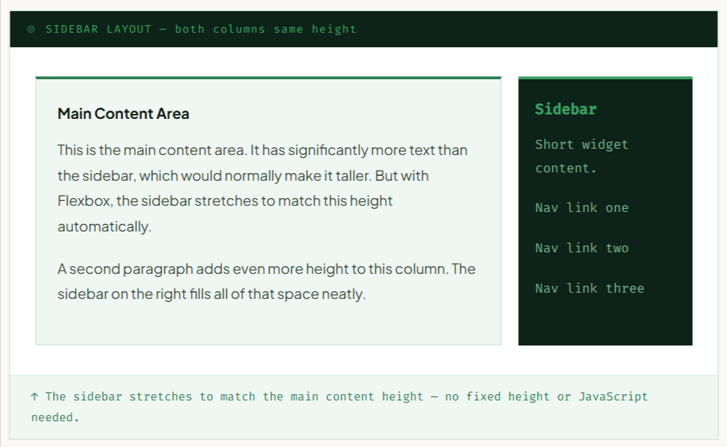
The most common use case for equal height columns — a content area with a sidebar. Both should share the same height so backgrounds, borders, and shadows look consistent.
|
1 2 3 4 5 6 7 8 |
.layout { display: flex; gap: 24px; /* align-items: stretch is implicit — equal heights */ } .main { flex: 3; } /* Takes 3/4 of width */ .sidebar { flex: 1; } /* Takes 1/4 of width */ |
Making it Responsive
|
1 2 3 4 5 6 7 8 9 10 11 12 13 |
.layout { display: flex; flex-direction: column; /* Stack on mobile */ gap: 20px; } @media (min-width: 768px) { .layout { flex-direction: row; /* Side by side on desktop */ } .main { flex: 3; } .sidebar { flex: 1; } } |
Pricing Cards (Real Example)
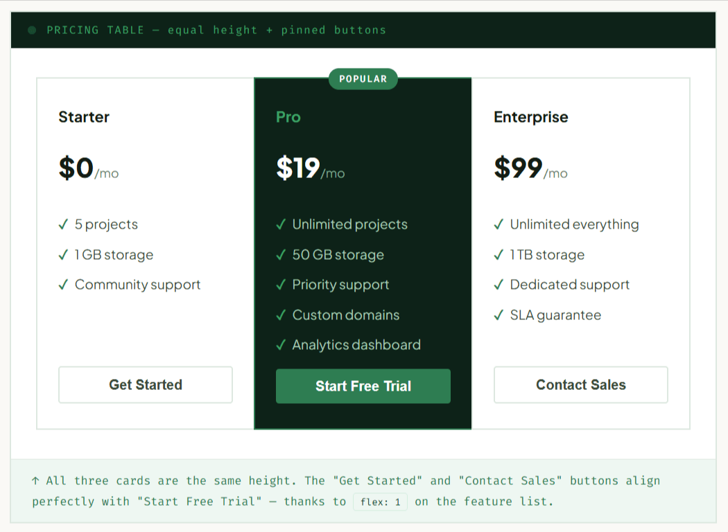
Pricing tables are a perfect real-world case for equal height columns. Each tier has different amounts of feature text, but the cards must look uniform — same height, buttons aligned at the bottom.
|
1 2 3 4 5 6 7 8 9 10 11 12 13 14 15 16 17 |
.pricing { display: flex; /* Equal heights: automatic */ } .pricing-card { flex: 1; display: flex; /* Nested flex for footer pinning */ flex-direction: column; } .card-features { flex: 1; /* Grows ? pushes button to bottom */ } .card-button { margin-top: auto; /* Alternative to flex: 1 on features */ } |
Common Mistakes
Mistake 1 — Setting a fixed height
If you manually set height on columns, you override Flexbox’s natural stretching. Content will overflow or get clipped.
|
1 2 3 4 5 |
/* ? Wrong — kills equal-height behaviour */ .col { height: 300px; } /* ? Right — let Flexbox handle it */ .col { min-height: 200px; } /* Use min-height if needed */ |
Mistake 2 — Using align-items: flex-start accidentally
If you explicitly set align-items: flex-start to fix something else, you lose equal heights. Remember: stretch is the equal-height value.
align-items and align-self. Either one set to a non-stretch value will break column height matching.
Mistake 3 — Forgetting flex-wrap can break rows
When flex-wrap: wrap is enabled, equal heights apply per row, not across all items. Cards in row 1 match each other, cards in row 2 match each other — but row 1 and row 2 can have different heights. This is usually what you want.
Mistake 4 — Nesting without flex-direction: column
When you put a flex container inside a flex column (for footer pinning), you must set flex-direction: column on the inner element. Forgetting this makes child elements run horizontally instead of vertically.
|
1 2 3 4 5 6 7 8 |
.card { flex: 1; display: flex; flex-direction: column; /* ? Don't forget this! */ } .card-body { flex: 1; /* Pushes footer down */ } |
Mistake 5 — Using equal heights on wrapping rows of cards
If you want a card grid where each card in the same row matches height, but cards across different rows don’t need to match — that’s exactly what Flexbox gives you with flex-wrap: wrap. Don’t fight this behaviour; it’s correct.
align-items: stretch does not make every card in a wrapping grid the same height globally. It makes items within the same flex line (row) equal. For truly uniform heights across all rows, you need CSS Grid with grid-auto-rows.
Quick Cheatsheet
Flexbox Equal Height Columns — Reference
| Flexbox Property | Description |
|---|---|
display: flex |
Apply on the parent container. Activates Flexbox layout and makes equal-height columns possible because align-items: stretch is the default. |
align-items: stretch |
The default value. All columns in the same row automatically stretch to match the tallest column’s height. |
flex: 1 |
Apply on each column to make all columns share the available width equally. |
flex: 3 / flex: 1 |
Creates unequal column widths. A column with flex: 3 becomes three times wider than one with flex: 1, while both remain equal in height. |
flex-direction: column |
Apply on the card or column itself to stack its internal content vertically. |
flex: 1 (on card body) |
Allows the card body to grow and fill available space, keeping the footer aligned at the bottom. |
gap: 20px |
Adds consistent spacing between columns without adding extra space before the first or after the last column. |
flex-wrap: wrap |
Allows columns to wrap onto new rows. Equal-height behavior applies independently to each row. |
min-height (not height) |
Use min-height when you need a minimum column height. A fixed height can override Flexbox stretching. |
align-self: flex-start |
Apply on a single column to opt it out of equal-height stretching. Overrides the parent’s align-items value. |