Cards are everywhere — product listings, blog posts, dashboards, portfolios. Flexbox makes building responsive, equal-height, reusable card grids surprisingly elegant. This guide walks you through every technique, from a plain row of cards to complex asymmetric featured layouts.
What is a Card Grid?
A card grid is a UI pattern where content is organized into discrete, visually contained units — cards — arranged in a repeating row-and-column structure. You see them everywhere: Netflix thumbnails, Airbnb listings, GitHub repositories, Medium article feeds, e-commerce product pages.
Each card typically contains the same type of content (an image, a title, a description, a call-to-action), making them inherently list-like and a natural fit for CSS Flexbox’s row layout model.
Flexbox vs Grid for Cards
Both Flexbox and CSS Grid can build card grids. Flexbox is ideal when cards should size based on content or fit fluidly into available space. CSS Grid is better when you need strict, pixel-perfect column control regardless of content. This guide focuses on the Flexbox approach — more flexible, less rigid, and excellent for responsive use cases.
The Problem Without Flexbox
Before we build, let’s see what a card grid looks like with no layout CSS at all — just raw block-level <div> elements:
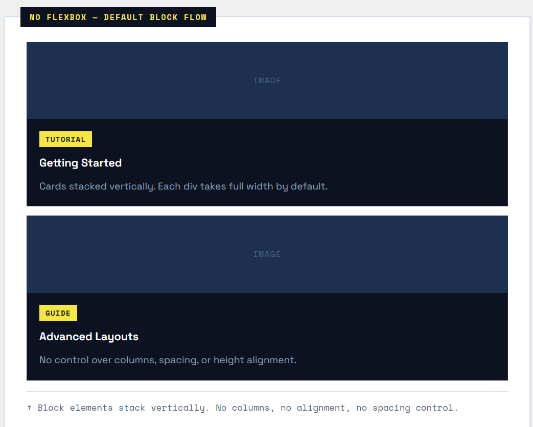
The classic pre-Flexbox fix was float: left — which required clearfixes, broke height calculation, and fell apart on different screen sizes. Flexbox eliminates all of that.
Core Properties for Card Grids
| Property | Where Applied | Role in Card Grids |
|---|---|---|
display: flex |
Grid container | Turns the wrapper into a flex container; cards become flex items |
flex-wrap: wrap |
Grid container | Allows cards to spill onto new rows instead of overflowing |
gap |
Grid container | Adds consistent gutter between cards (row + column gap) |
flex: 1 1 250px |
Each card | Cards grow/shrink freely, but never smaller than 250px |
align-items: stretch |
Grid container | Forces all cards in a row to the same height (default behavior) |
flex-direction: column |
Each card | Stacks content inside the card vertically (image, body, footer) |
flex: 1 on card body |
Card body element | Grows to fill space, pushing the footer to the bottom |
max-width |
Each card | Prevents cards from growing too wide on large screens |
Step 1 — Basic Row of Cards
The foundation: three cards in a horizontal row. Just two CSS properties get us 90% of the way there.
|
1 2 3 4 5 |
<div class="card-grid"> <div class="card">...</div> <div class="card">...</div> <div class="card">...</div> </div> |
|
1 2 3 4 5 6 7 8 9 10 |
.card-grid { display: flex; /* Line up cards horizontally */ gap: 20px; /* Space between cards */ } .card { flex: 1; /* All cards share space equally */ background: #fff; border: 1px solid #ddd; } |
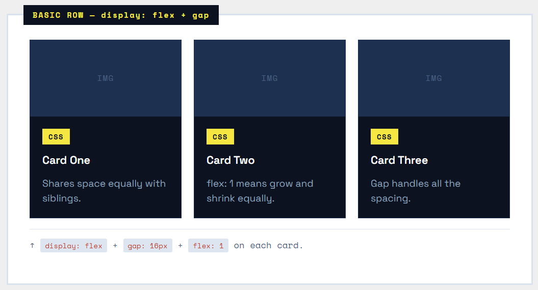
Tip — gap vs margin
Always prefer gap over margin for spacing between flex items. Unlike margin, gap never adds space before the first item or after the last — no more subtracting margin on edge items.
Step 2 — Wrapping Cards Responsively
A fixed three-card row breaks on mobile. The solution is flex-wrap: wrap combined with a flex-basis minimum size. Cards will fill the row and wrap to the next line when they can’t fit.
|
1 2 3 4 5 6 7 8 9 10 11 12 13 14 |
.card-grid { display: flex; flex-wrap: wrap; /* Allow rows to wrap */ gap: 20px; } .card { flex: 1 1 240px; /* grow | shrink | minimum width */ /* 1 = can grow to fill row 1 = can shrink if needed 240px = minimum width before wrapping */ } |
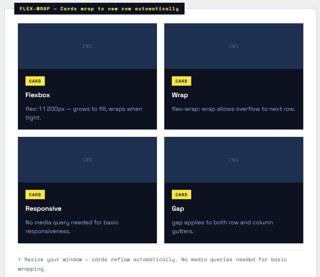
How flex: 1 1 240px works
This shorthand sets three values at once:
|
1 2 3 4 5 6 |
flex-grow: 1; /* Card CAN grow beyond 240px */ flex-shrink: 1; /* Card CAN shrink below 240px */ flex-basis: 240px; /* Card STARTS at 240px wide */ /* Shorthand: */ flex: 1 1 240px; |
When the container is wide enough, cards grow past 240px and share the row. When it’s too narrow, each card wraps to its own row — responsive behavior with zero media queries.
The Last-Row Problem
When your last row has fewer cards than the rest, those cards stretch to fill the full row width (because of flex-grow: 1). To prevent this, add max-width: calc(33.33% - 14px) to cards for a 3-column layout, or use an invisible filler element. CSS Grid handles this more elegantly with auto-fill.
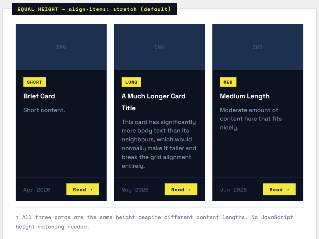
Step 3 — Equal-Height Cards
The most common card grid pain point: cards with different amounts of content end up different heights. Flexbox solves this with align-items: stretch (the default) on the grid container, which forces all cards in the same row to the same height.
|
1 2 3 4 5 6 7 8 9 10 11 12 13 |
.card-grid { display: flex; flex-wrap: wrap; gap: 20px; align-items: stretch; /* DEFAULT — all cards same row height */ } /* INSIDE the card — make it a flex column too */ .card { flex: 1 1 220px; display: flex; /* Card itself is a flex container */ flex-direction: column; /* Stack content vertically */ } |
Step 4 — Pinning the Card Footer
With equal-height cards, you’ll notice footers (like “Read more” buttons) can sit at different vertical positions. The fix: make the card body flex: 1 so it grows to push the footer down.
|
1 2 3 4 5 6 7 8 9 10 11 12 13 14 15 |
.card { display: flex; flex-direction: column; } .card-body { flex: 1; /* Grows to fill all available space */ /* This pushes the footer to the bottom */ } .card-footer { /* No special positioning needed — it just sits at the bottom */ padding: 12px 16px; border-top: 1px solid #eee; } |
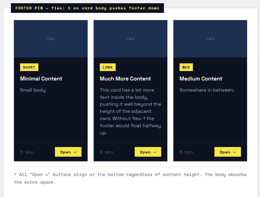
The Key Insight
Nested flex is the secret weapon here. The grid container is a flex row. Each card is a flex column. The card body has flex: 1. This two-level nesting pattern is extremely powerful and reusable across many UI components.
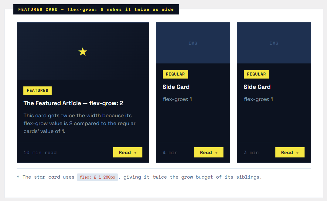
Step 5 — Asymmetric Featured Card
Not all cards need to be the same size. A featured card (hero post, promoted product) should be larger. Use different flex-grow values to give one card more space.
|
1 2 3 4 5 6 7 8 9 10 11 12 13 |
.card-grid { display: flex; flex-wrap: wrap; gap: 20px; } .card--featured { flex: 2 1 300px; /* grow factor 2 = twice as wide */ } .card--regular { flex: 1 1 180px; /* grow factor 1 = normal width */ } |
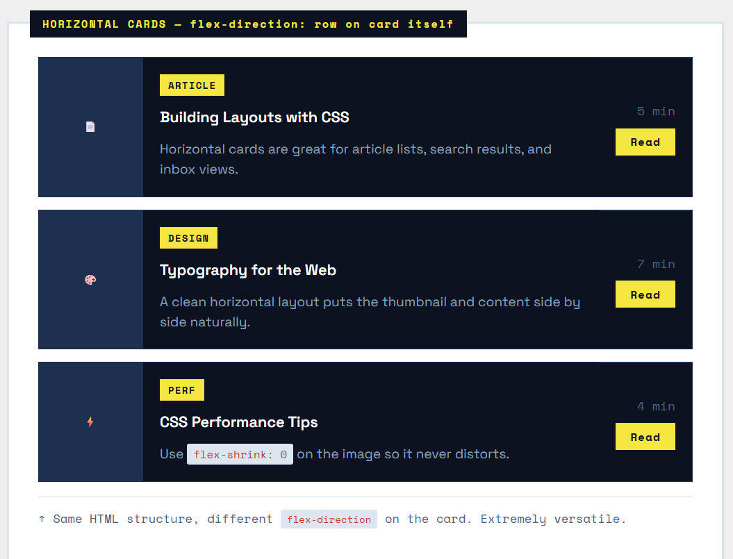
Step 6 — Horizontal Card Variant
Sometimes cards should be horizontal — image on the left, content on the right. This is the same display: flex trick, but applied to the card itself instead of the grid.
|
1 2 3 4 5 6 7 8 9 10 11 12 13 14 15 16 17 18 19 |
.card-grid { display: flex; flex-direction: column; /* Stack cards vertically */ gap: 16px; } .card { display: flex; flex-direction: row; /* Card content goes horizontal */ } .card-image { width: 120px; flex-shrink: 0; /* Image never squishes */ } .card-body { flex: 1; /* Body fills remaining space */ } |
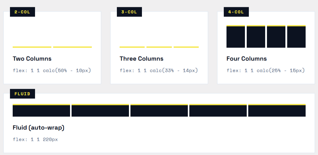
Common Layout Patterns
Here are the most-used Flexbox card grid patterns with their CSS shorthand at a glance:
|
1 2 3 4 5 6 7 8 9 10 11 |
/* 2-column layout */ .card { flex: 1 1 calc(50% - 10px); max-width: calc(50% - 10px); } /* 3-column layout */ .card { flex: 1 1 calc(33.33% - 14px); max-width: calc(33.33% - 14px); } /* 4-column layout */ .card { flex: 1 1 calc(25% - 15px); max-width: calc(25% - 15px); } /* Fluid — wraps automatically based on min width */ .card { flex: 1 1 220px; } /* No max-width; cards grow freely */ |
Final Production Card Grid
Here’s everything combined — equal heights, pinned footers, hover effects, and a responsive wrap — all in under 40 lines of CSS.

|
1 2 3 4 5 6 7 8 9 10 11 12 13 14 15 16 17 18 19 20 21 22 23 24 25 26 27 28 29 30 31 32 33 34 35 36 37 38 39 40 41 42 43 44 45 46 47 48 49 50 51 52 53 |
/* -- Grid Container -- */ .card-grid { display: flex; flex-wrap: wrap; gap: 20px; align-items: stretch; /* Equal height rows */ } /* -- Card -- */ .card { flex: 1 1 220px; /* Fluid: grows, shrinks, min 220px */ display: flex; flex-direction: column; background: #fff; border: 1px solid #e2e8f0; overflow: hidden; transition: transform .2s, box-shadow .2s; } .card:hover { transform: translateY(-4px); box-shadow: 0 12px 32px rgba(0,0,0,0.1); } /* -- Card Image -- */ .card-image { height: 180px; object-fit: cover; width: 100%; } /* -- Card Body -- */ .card-body { padding: 20px; flex: 1; /* Grows ? pins footer to bottom */ display: flex; flex-direction: column; gap: 8px; } /* -- Card Footer -- */ .card-footer { padding: 14px 20px; border-top: 1px solid #e2e8f0; display: flex; align-items: center; justify-content: space-between; } /* -- Responsive: 1 column on mobile -- */ @media (max-width: 480px) { .card { flex-basis: 100%; } } |
Summary — Cheatsheet
The complete mental model for a Flexbox card grid in one reference block:
| CSS Property | Purpose | CSS Property | Purpose |
|---|---|---|---|
display: flex |
On the grid wrapper. Turns children (cards) into flex items lined up horizontally. | flex-wrap: wrap |
Allows cards to break onto new rows when they run out of space. |
gap: 20px |
Sets both row and column gutter. Cleaner than using margin hacks. | flex: 1 1 220px |
On each card. Grow freely, shrink freely, with a minimum width of 220px. |
align-items: stretch |
Default behavior. Forces all cards in a row to have the same height automatically. | flex-direction: column |
On the card itself. Stacks image ? body ? footer vertically inside the card. |
flex: 1 (card body) |
Makes the card body grow to fill available space, keeping the footer pinned to the bottom of every card. | flex: 2 1 300px |
Featured card. grow: 2 means it takes twice the width of a normal flex: 1 card. |
flex-shrink: 0 |
On card images in horizontal cards. Prevents the image from squishing. | max-width: calc(...) |
Use with fixed-column layouts (2-column, 3-column) to prevent the last row from stretching. |