Navbars are one of the most common UI patterns on the web — and Flexbox is the perfect tool for building them. In this tutorial, you’ll go from a blank <nav> to a fully responsive, production-ready navigation bar, step by step.
1. What is CSS Flexbox?
CSS Flexbox (Flexible Box Layout) is a one-dimensional layout model that distributes space along a single axis — either horizontally (row) or vertically (column). It was designed to solve the classic alignment and distribution problems that plagued CSS for years.
Before Flexbox, building a navbar meant wrestling with float, inline-block, clearfixes, and vertical centering hacks. With Flexbox, all of that becomes a few clean lines of CSS.
?? Note
Flexbox controls layout in one dimension at a time. For two-dimensional layouts (rows AND columns simultaneously), use CSS Grid. For navbars, Flexbox is almost always the right choice.
2. Why Flexbox for Navbars?
Navbars have a naturally linear structure — items sit side by side on a horizontal axis. Flexbox excels here because it lets you:
- Vertically center items instantly with
align-items: center - Push groups apart (logo left, links right) with
justify-content: space-betweenormargin-left: auto - Distribute nav links evenly with
justify-content: space-evenly - Collapse to a column on mobile with
flex-direction: column - Control growth of individual items with
flex-grow,flex-shrink, andflex-basis
In short: Flexbox turns navbar layout from a fight into a conversation.
3. Essential Flexbox Properties
Before diving into code, here’s a quick-reference table of the properties we’ll use in this tutorial:
| Property | Applied To | What It Does |
|---|---|---|
display: flex |
Container | Activates Flexbox on the element |
flex-direction |
Container | Sets main axis: row (default) or column |
justify-content |
Container | Distributes items along the main axis |
align-items |
Container | Aligns items along the cross axis |
gap |
Container | Adds space between flex items |
flex: 1 |
Item | Makes item grow to fill available space |
margin-left: auto |
Item | Pushes item (and everything after it) to the far end |
flex-wrap |
Container | Allows items to wrap to next line if needed |
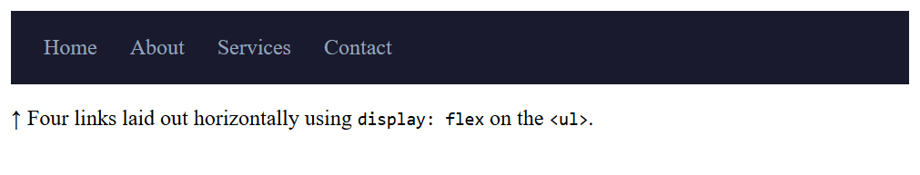
4. Step 1 — Basic Horizontal Navbar
Let’s start from absolute zero. Our first goal: get nav links to sit horizontally instead of stacking vertically.
|
1 2 3 4 5 6 7 8 9 10 11 12 13 14 15 16 17 18 19 20 21 22 23 24 25 26 27 28 29 30 31 32 33 34 35 36 37 38 39 |
<!DOCTYPE html> <html> <head> <title>Flexbox Basic Horizontal Navbar</title> <style> .navbar { background-color: #1a1a2e; padding: 0 24px; } .nav-links { display: flex; /* 1. Activate Flexbox */ list-style: none; /* 2. Remove bullet points */ gap: 24px; /* 3. Space between links */ padding: 0; margin: 0; } .nav-links a { color: #94a3b8; text-decoration: none; padding: 18px 0; /* Clickable height */ display: block; } </style> </head> <body> <nav class="navbar"> <ul class="nav-links"> <li><a href="#">Home</a></li> <li><a href="#">About</a></li> <li><a href="#">Services</a></li> <li><a href="#">Contact</a></li> </ul> </nav> </body> </html> |
Output
? Tip
Always apply display: flex to the container (the <ul> or <nav>), not to the individual items. The items (<li>) automatically become flex items.
5. Step 2 — Logo + Links + Button
Real navbars usually have three zones: a logo on the left, navigation links in the middle or right, and a call-to-action button on the far right. Let’s build that structure.
|
1 2 3 4 5 6 7 8 9 10 11 12 13 14 15 16 17 18 19 20 21 22 23 24 25 26 27 28 29 30 31 32 33 34 35 36 37 38 39 40 41 42 43 44 45 46 47 48 49 50 51 52 53 54 55 56 57 58 59 60 61 62 |
<!DOCTYPE html> <html> <head> <title>Flexbox Navbar with Logo + Links + Button</title> <style> .navbar { display: flex; align-items: center; /* Vertically center everything */ justify-content: space-between; /* Logo ?—————————? Button */ background: #1a1a2e; padding: 0 28px; height: 64px; } .logo { color: #fff; font-weight: 800; text-decoration: none; } .nav-links { display: flex; gap: 8px; list-style: none; padding: 0; margin: 0; } .nav-links a { color: #94a3b8; text-decoration: none; padding: 18px 0; /* Clickable height */ display: block; } .cta-btn { background: #e84d1c; color: #fff; border: none; padding: 9px 22px; cursor: pointer; font-weight: 700; } </style> </head> <body> <nav class="navbar"> <a href="#" class="logo">BrandName</a> <ul class="nav-links"> <li><a href="#">Home</a></li> <li><a href="#">About</a></li> <li><a href="#">Services</a></li> <li><a href="#">Blog</a></li> </ul> <button class="cta-btn">Get Started</button> </nav> </body> </html> |
Output
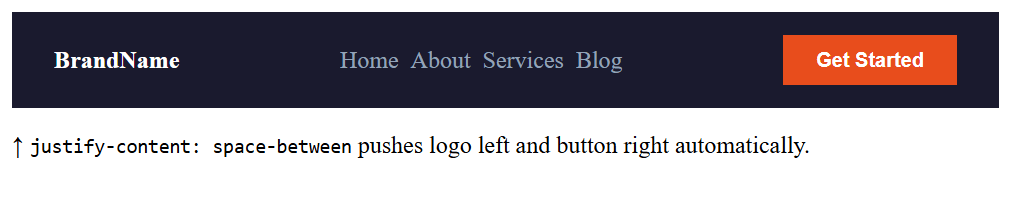
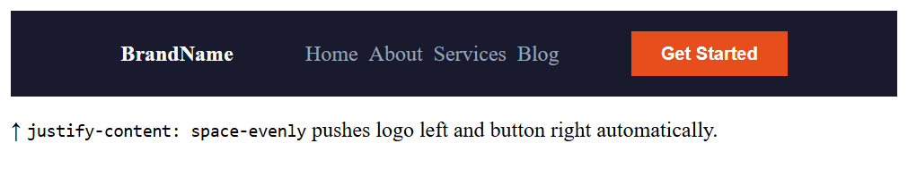
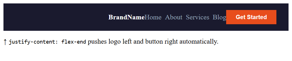
6. Step 3 — Spacing & Alignment Techniques
There are two main strategies for controlling how groups of items sit within a flex container:
Strategy A: justify-content
Use this when you want to distribute items relative to the container as a whole.
|
1 2 3 |
.navbar { justify-content: space-between; } /* logo — links — btn */ .navbar { justify-content: space-evenly; } /* equal spacing around all */ .navbar { justify-content: flex-end; } /* all items to the right */ |
Output
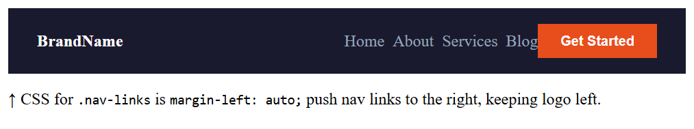
Strategy B: margin-left: auto (The Spacer Trick)
This is one of Flexbox’s most powerful patterns. Giving an item margin-left: auto makes it consume all remaining space on its left side — effectively shoving it to the far right.
|
1 2 3 4 5 6 7 8 9 |
/* Push the button to the far right */ .cta-btn { margin-left: auto; } /* Or push nav links to the right, keeping logo left */ .nav-links { margin-left: auto; } |
Output
The
margin-left: auto trick works because in Flexbox, auto margins absorb all available free space before the remaining justify-content distribution kicks in. It gives you precise, surgical control over grouping.
07Step 4 — Adding a Search Bar
Many navbars include a search input. Using flex: 1 lets the search bar grow fluidly to fill available space.
|
1 2 3 4 5 6 7 8 9 10 11 12 13 14 15 16 17 18 19 20 21 22 23 24 25 26 27 28 29 30 31 32 33 34 35 36 37 38 39 40 41 42 43 44 45 46 47 48 49 50 51 52 53 54 55 56 57 58 59 60 61 62 63 64 65 66 67 68 69 70 71 72 |
<!DOCTYPE html> <html> <head> <title>Flexbox Navbar with Logo + Links + Button and Adding a Search Bar</title> <style> .navbar { display: flex; align-items: center; /* Vertically center everything */ justify-content: space-between; /* Logo ?—————————? Button */ background: #1a1a2e; padding: 0 28px; height: 64px; } as per tally on date: .logo { color: #fff; font-weight: 800; text-decoration: none; } .nav-links { display: flex; gap: 8px; list-style: none; padding: 0; margin: 0; } .cta-btn { background: #e84d1c; color: #fff; border: none; padding: 9px 22px; cursor: pointer; font-weight: 700; } .nav-links a { color: #94a3b8; text-decoration: none; padding: 18px 0; /* Clickable height */ display: block; } .search-bar { flex: 1; /* Grows to fill available space */ max-width: 280px; /* But not too wide */ margin: 0 20px; /* Gap between links and button */ padding: 8px 14px; background: #1e293b; border: 1px solid #334155; color: #94a3b8; outline: none; } </style> </head> <body> <nav class="navbar"> <a href="#" class="logo">BrandName</a> <ul class="nav-links"> <li><a href="#">Home</a></li> <li><a href="#">About</a></li> <li><a href="#">Services</a></li> <li><a href="#">Blog</a></li> </ul> <input type="text" placeholder="Search..." style="flex:1; max-width:200px; background:#1e293b; border:1px solid #334155; color:#94a3b8; padding:7px 12px; font-size:0.82rem; outline:none; border-radius:3px;" /> <button class="cta-btn">Get Started</button> </nav> </body> </html> |
Output
08Step 5 — Responsive Mobile Navbar
On small screens, horizontal navbars break down. The solution: use a media query to switch the flex direction and hide/show a hamburger menu.
The Core Responsive Pattern
At mobile widths, we:
- Switch
flex-directionfromrowtocolumn - Hide the nav links by default (
display: none) - Show them when a class is toggled via JavaScript (
.open) - Show a hamburger icon (
?) via CSS
|
1 2 3 4 5 6 7 8 9 10 11 12 13 14 15 16 17 18 19 20 21 22 23 24 25 26 27 28 29 |
/* Default: hidden on mobile */ @media (max-width: 768px) { .navbar { flex-direction: column; align-items: flex-start; padding: 16px; } .nav-links { display: none; /* Hidden by default */ flex-direction: column; width: 100%; gap: 4px; margin-top: 12px; } .nav-links.open { display: flex; /* Shown when hamburger clicked */ } .hamburger { display: block; cursor: pointer; background: none; border: none; color: #fff; font-size: 1.5rem; } } |
|
1 2 3 4 5 6 |
const hamburger = document.querySelector('.hamburger'); const navLinks = document.querySelector('.nav-links'); hamburger.addEventListener('click', () => { navLinks.classList.toggle('open'); }); |
Add
aria-expanded to your hamburger button and toggle it with JavaScript. Also add aria-label="Toggle navigation" so screen readers can announce the button’s purpose.
Final Complete: Flexbox Responsive Navbar
Here’s everything combined — a complete, production-ready navbar with logo, links, search, and CTA button, all laid out with Flexbox:
|
1 2 3 4 5 6 7 8 9 10 11 12 13 14 15 16 17 18 19 20 21 22 23 24 25 26 27 28 29 30 31 32 33 34 35 36 37 38 39 40 41 42 43 44 45 46 47 48 49 50 51 52 53 54 55 56 57 58 59 60 61 62 63 64 65 66 67 68 69 70 71 72 73 74 75 76 77 78 79 80 81 82 83 84 85 86 87 88 89 90 91 92 93 94 95 96 |
<!DOCTYPE html> <html> <head> <title>Flexbox Navbar with Logo + Links + Button and Adding a Search Bar</title> <style> .navbar { display: flex; align-items: center; background: #0f172a; padding: 0 28px; height: 64px; position: sticky; top: 0; z-index: 100; } .logo { color: #fff; font-weight: 800; text-decoration: none; font-size: 1.2rem; margin-right: 40px; white-space: nowrap; } .nav-links { display: flex; gap: 4px; list-style: none; flex: 1; /* Expand to push right section away */ padding: 0; margin: 0; } .nav-links a { color: #94a3b8; text-decoration: none; padding: 8px 14px; transition: background .2s, color .2s; } .nav-links a:hover, .nav-links a.active { background: #1e293b; color: #fff; } .nav-right { display: flex; align-items: center; gap: 12px; } .search-bar { flex: 1; max-width: 200px; background: #1e293b; border: 1px solid #334155; color: #94a3b8; padding: 8px 14px; } .cta-btn { background: #e84d1c; color: #fff; border: none; padding: 9px 22px; font-weight: 700; cursor: pointer; white-space: nowrap; } @media (max-width: 768px) { .nav-links, .nav-right { display: none; } .navbar { justify-content: space-between; } .hamburger { display: block; } } </style> </head> <body> <nav class="navbar"> <a href="#" class="logo">BrandName</a> <ul class="nav-links"> <li><a href="#">Home</a></li> <li><a href="#">About</a></li> <li><a href="#">Services</a></li> <li><a href="#">Blog</a></li> </ul> <input type="text" placeholder="Search..." style="flex:1; max-width:200px; background:#1e293b; border:1px solid #334155; color:#94a3b8; padding:7px 12px; font-size:0.82rem; outline:none; border-radius:3px;" /> <button class="cta-btn">Get Started</button> </nav> <p>display: flex · align-items: center · justify-content: space-between · gap: 0 · flex: 1 on links</p> </body> </html> |
Output
10Summary & Best Practices
Always set display: flex on the container
Apply it to the <nav> or <ul> — the element whose children you want to lay out horizontally.
Use align-items: center for vertical centering
This single property eliminates the need for any height calculations or padding tricks to center items in the navbar height.
Master margin-left: auto for grouping
The most flexible spacing technique in Flexbox. Use it to push items or groups to one end without fixing widths.
Use gap instead of margins between links
gap only adds space between items — never before the first or after the last — making spacing much more predictable.
Plan your responsive strategy from the start
Decide on mobile behavior before writing desktop styles. A mobile-first approach (min-width media queries) often produces cleaner CSS.
Don’t forget white-space: nowrap on logos
Prevents the brand name from wrapping onto a second line when the viewport shrinks slightly before your breakpoint kicks in.
What You’ve Learned
- How to activate Flexbox with
display: flexand what flex items are - Using
align-items: centerto vertically center all navbar content instantly - Three ways to distribute space:
justify-content,gap, andmargin-left: auto - Building a three-zone navbar: logo · links · CTA button
- Integrating a fluid search bar with
flex: 1andmax-width - Making the navbar responsive with a media query + hamburger toggle
- A complete, copy-paste ready production navbar in pure CSS