
Picture this: you just spent a Saturday afternoon boosting a Facebook ad, tweaking your Google Ads budget, and refreshing your analytics dashboard every twenty minutes like it owes you money. And it worked – the traffic came. Forty, fifty, eighty visitors landed on your site this week.
And then… nothing. Your inbox is as quiet as it was before you spent a dime.
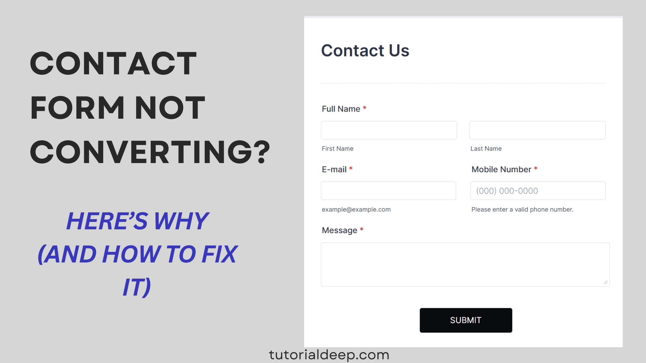
If you’ve lived this exact moment – staring at a healthy traffic graph next to an empty inbox – you already know the specific flavor of confusion it creates. Your content is fine. Your ad targeting is fine. So where did everyone go?
If your contact form is not converting despite decent traffic, the answer usually isn’t your marketing at all.
Nine times out of ten, they didn’t “go” anywhere. They got to your site, found your contact form, and quietly closed the tab.
A contact form is the last handshake in your entire marketing funnel, and it’s astonishing how often that handshake falls apart in ways nobody ever notices – because unlike a bad headline or a broken ad, a bad form fails silently. No error, no complaint. Just… nothing.
Let’s talk about why that happens, and more importantly, how to fix it.
1. You’re Asking Strangers to Overshare
Think about the last time you met someone at a networking event. Would you hand them your phone number, your job title, your annual budget, and your five-year plan in the first thirty seconds of talking to them? Of course not. You’d say your name, maybe swap a business card, and see where the conversation goes.
Yet that’s exactly what a lot of contact forms ask visitors to do – before any relationship has been built. Name, email, phone, company, budget, timeline, “how did you hear about us.” Ten fields deep, and you haven’t even said hello yet.
Here’s the uncomfortable truth: most of that information isn’t actually needed on the first ask. It’s needed eventually – just not now, not from someone who’s still deciding whether they trust you.
The fix: Treat your form like that first handshake, not a full interrogation. A name and an email is often enough to open the door.
If you’re worried about losing useful context, use conditional logic so extra questions only appear for visitors who are further along – rather than putting the whole questionnaire in front of everyone.
This is one of those small things a builder like Jotform handles without extra effort: conditional logic keeps the form short for most people, while still digging deeper with the visitors who are actually ready to go there.
2. Your Button Says “Submit.” That’s the Problem.
Here’s a small, almost silly-sounding detail that quietly matters more than it should: the word “Submit.”
Nobody gets excited about submitting anything. It sounds like paperwork. It sounds like a DMV form. Compare that feeling to a button that says “Get My Free Quote” or “Start My Project.” One of those makes you want to click. The other makes you want to double check you’re not signing up for jury duty.
The words around your form – the button, the little sentence above it – do more emotional work than most people give them credit for. A visitor who isn’t sure what happens after they click will often just… not click.
The fix: Tell people exactly what happens next. “We’ll reply within 24 hours.” “One of our team will call you this week.” And swap “Submit” for something that actually describes the outcome they’re getting, not the action they’re performing. It’s a five-minute edit, but it’s one of those five minutes that quietly pays for itself.
3. It Doesn’t Work Properly on the Phone in Their Hand
Here’s a scene that plays out constantly and almost nobody talks about: someone’s scrolling on their phone, genuinely interested, taps your “Contact Us” link – and the form loads sideways, or the submit button is hiding just off-screen, or the keyboard covers half the fields when they try to type. They fight with it for ten seconds, get mildly annoyed, and give up.
You’ll never see this happen. There’s no error message, no support ticket. They just leave, and your analytics quietly log it as “bounced” without ever telling you why.
Since a large chunk of your visitors are almost certainly browsing on a phone, this single issue can be responsible for more silent lead loss than anything else on this list.
The fix: Actually pull out your phone and fill out your own form, right now, before reading any further. If it’s even slightly annoying to you, it’s costing you leads.
This is one of the easiest problems to eliminate entirely by using a form platform that’s responsive by default, so you’re not relying on your own testing to catch every device out there.
4. It Looks Like Something You Wouldn’t Trust Either
Be honest with yourself for a second: if you landed on a website with a clunky, mismatched, slightly-off-looking contact form, would you type your email into it? Most people wouldn’t – not because they think you’re a scammer, but because something about it just feels unfinished, and unfinished reads as untrustworthy, even subconsciously.
Trust is fragile in that split second before someone decides to type. And a form that looks like an afterthought tells visitors, without a single word, that maybe the rest of the business is an afterthought too.
The fix: Make sure your form actually matches the quality of the rest of your site – same colors, same fonts, same level of polish. A single sentence about how their information will be used goes a long way too. If design isn’t your strength, starting from a clean, professionally-built template beats trying to style one from scratch.
5. They Hit Submit… and Then Wonder If Anything Happened
Here’s a moment of genuine empathy: imagine filling out a form, clicking submit, and the page just… sits there. No message. No “thank you.” Nothing changes. What would you do?
Some people submit again, just in case – congratulations, you now have a duplicate, slightly annoyed lead in your inbox. Others assume it didn’t work at all, shrug, and move on to whichever competitor’s site they had open in the next tab.
The fix: Show a clear confirmation the moment someone submits, and send a confirmation email if you can. It sounds almost too small to matter, but it directly answers the one question every visitor is silently asking: “did that actually work?”
6. The Lead Arrives… and Then Gets Buried
Sometimes the form works perfectly. The visitor fills it out, hits submit, gets a nice confirmation – and then the lead lands in an inbox that gets checked twice a week, sandwiched between newsletters and spam. By the time anyone notices it, the visitor has already moved on, or worse, already signed with someone who replied faster.
A conversion that nobody acts on isn’t really a conversion. It’s just a name sitting in a folder.
The fix: Route submissions directly into whatever you actually use to manage leads – a CRM, a shared spreadsheet, a Slack channel your team actually watches.
This is where a form builder with one-click integrations earns its keep: Jotform, for example, connects to tools like Google Sheets, Slack, and popular CRMs, so a lead lands exactly where someone will see it instead of getting lost in an inbox nobody’s watching closely.
7. Real Leads Are Hiding Behind a Wall of Spam
If you’ve ever opened your form submissions and found a pile of gibberish text, suspicious links, and clearly fake names, you already know this one. Bots find public forms constantly, and without protection, they’ll flood you with junk.
The real problem isn’t the annoyance – it’s that a genuine lead can slip by unnoticed while you’re scrolling past yet another spam entry.
The fix: Add basic bot protection – a CAPTCHA, a honeypot field, something. It’s a small setup step that saves you from sifting through junk every week.
8. Nobody’s Actually Watching How the Form Performs
Here’s a question worth sitting with: do you know how many people start filling out your form versus how many actually finish it? Most business owners don’t – the form was set up once, it “works,” and nobody’s looked at it since.
But forms leak quietly. Maybe it’s fine on desktop and terrible on mobile. Maybe one specific field – “budget,” say – is where half your visitors give up and leave. Without visibility into what’s happening, you’re optimizing your ads and your content while ignoring the one place where leads are actually disappearing.
The fix: Check in on your form’s performance every so often, not just its existence. Look for a platform that gives you basic view and submission analytics, so you can actually see where people are dropping off instead of guessing.
So Your Contact Form Is Not Converting — What’s Actually Going On?
None of these eight things are dramatic on their own. A slightly long form. A missing thank-you page. A form that’s a little clunky on mobile. Individually, they seem too small to matter.
But stacked together, they explain something a lot of business owners can’t quite put their finger on: why the traffic looks healthy, the ads seem to be working, and yet the leads just aren’t showing up the way they should.
It’s not usually one big, obvious problem. It’s a dozen small ones, quietly working together to lose you people who were, at one point, genuinely interested.
The good news – and it really is good news – is that fixing most of this doesn’t require a redesign, a developer, or a weekend of frustration.
It mostly requires a form that was built with these exact issues already solved: short by default, responsive on every device, protected from spam, confirmed the moment someone submits, and connected to wherever your leads actually need to go.
That’s the gap Jotform is built to close. Instead of guessing at what’s silently pushing people away, you start from a form that’s already designed around the things that actually cause drop-off – and you can usually see the difference in your submissions within days of switching.
Try Jotform free and see how many more leads a better form brings in
So before you spend another dollar chasing more traffic, it might be worth a five-minute detour: open your own contact form, fill it out like a stranger would, and just notice how it feels. If you hesitate anywhere along the way, so will they.