Learn how to add margin and padding in Bootstrap 5 and other versions. You can apply utility classes in Bootstrap 5 to add spacings without using CSS. Let’s find out with the examples.
Margin and Padding in Bootstrap 5
The simple syntax for margin and padding in Bootstrap 5 is given below:
Syntax
|
1 |
{property}{sides}-{size} |
Property in Bootstrap 5:
mfor marginpfor padding
Sides in Bootstrap 5:
tfor topbfor bottomsfor startefor endxfor horizontal (left and right)yfor vertical (top and bottom)- Blank (no side) – applies to all sides.
Sizes in Bootstrap 5:
0for no space1for 0.25rem (4px by default)2for 0.5rem (8px by default)3for 1rem (16 px by default)4for 1.5rem (24px by default)5for 3rem (48 px by default)autofor automatic margin
Margins in Bootstrap 5
To apply the margin in Bootstrap 5, use the property m with dash (-) and size after it. Add positions with the property without any space to give margins accordingly.
|
1 2 3 4 5 6 7 8 9 10 11 12 13 |
<div class="m-3">Margin on all sides</div> <div class="mt-4">Margin on top</div> <div class="mb-2">Margin on bottom</div> <div class="ms-5">Margin on start (left/right based on text direction)</div> <div class="me-auto">Margin on end (auto)</div> <div class="mx-2">Horizontal margin</div> <div class="my-1">Vertical margin</div> <!-- Responsive Margins --> <div class="m-md-4">Responsive margin for medium screens</div> <div class="mt-sm-2 mb-lg-5">Top margin for small screens and bottom margin for large screens</div> <!-- Negative Margins --> <div class="m-n1">Negative margin of 0.25rem on all sides</div> <div class="mt-n2">Negative margin of 0.5rem on top</div> |
Output
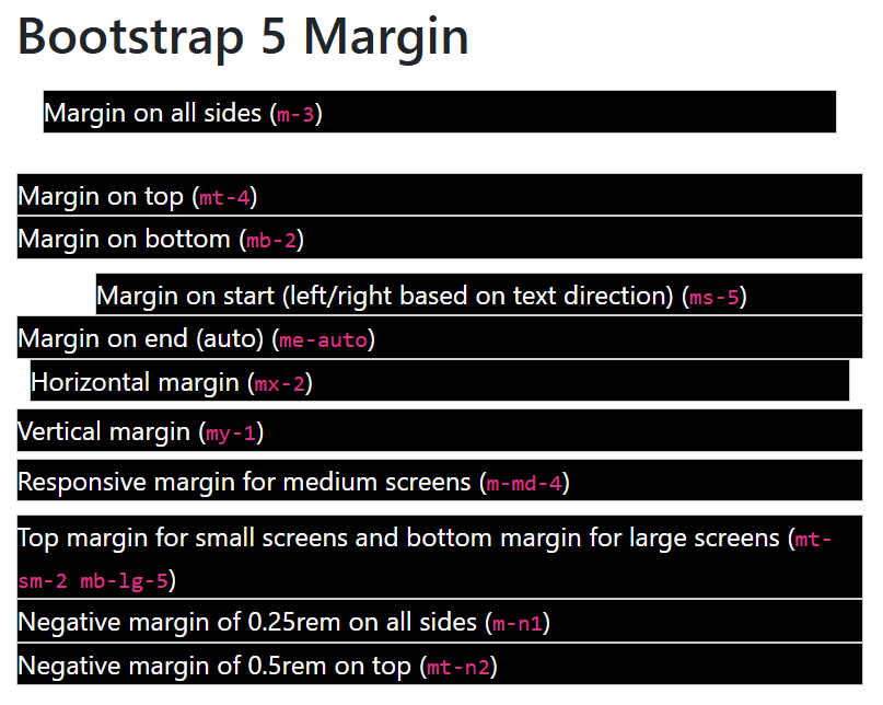
I have added a background to each div elements to easily analyze the margins given to them.
Paddings in Bootstrap 5
If you want to apply the padding in Bootstrap 5, use the property p with dash (-) and size. Add the position with the property without any spaces to give padding according to positions.
|
1 2 3 4 5 6 7 8 9 10 |
<div class="p-3">Padding on all sides</div> <div class="pt-4">Padding on top</div> <div class="pb-2">Padding on bottom</div> <div class="ps-5">Padding on start (left/right based on text direction)</div> <div class="pe-2">Padding on end</div> <div class="px-3">Horizontal padding</div> <div class="py-1">Vertical padding</div> <!-- Responsive Paddings --> <div class="p-md-4">Responsive padding for medium screens</div> <div class="pt-sm-2 mb-lg-5">Top padding for small screens and bottom padding for large screens</div> |
Output
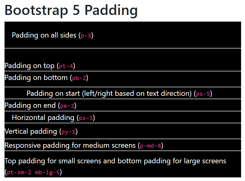
Backgrounds are added to div elements above to easily identify the paddings given to them.
Give Margin and Padding in Bootstrap 4
Syntax
|
1 |
{property}{sides}-{size} |
Property in Bootstrap 4:
mfor marginpfor padding
Sides in Bootstrap 4:
tfor topbfor bottomlfor startrfor endxfor horizontal (left and right)yfor vertical (top and bottom)- Blank (no side) – applies to all sides.
Sizes in Bootstrap 4:
0for no space1for 0.25rem (4px by default)2for 0.5rem (8px by default)3for 1rem (16 px by default)4for 1.5rem (24px by default)5for 3rem (48 px by default)autofor automatic margin
Margins in Bootstrap 4
For applying margin in Bootstrap 4, use the property m with a dash(-) after it followed by a size. Use positions with the property to give positionwise margins.
|
1 2 3 4 5 6 7 8 9 10 11 12 13 |
<div class="m-3">Margin on all sides (<code>m-3</code>)</div> <div class="mt-4">Margin on top (<code>mt-4</code>)</div> <div class="mb-2">Margin on bottom (<code>mb-2</code>)</div> <div class="ml-5">Margin on start (left/right based on text direction) (<code>ml-5</code>)</div> <div class="mr-auto">Margin on end (auto) (<code>mr-auto</code>)</div> <div class="mx-2">Horizontal margin (<code>mx-2</code>)</div> <div class="my-1">Vertical margin (<code>my-1</code>)</div> <!-- Responsive Margins --> <div class="m-md-4">Responsive margin for medium screens (<code>m-md-4</code>)</div> <div class="mt-sm-2 mb-lg-5">Top margin for small screens and bottom margin for large screens (<code>mt-sm-2 mb-lg-5</code>)</div> <!-- Negative Margins --> <div class="m-n1">Negative margin of 0.25rem on all sides (<code>m-n1</code>)</div> <div class="mt-n2">Negative margin of 0.5rem on top (<code>mt-n2</code>)</div> |
Output
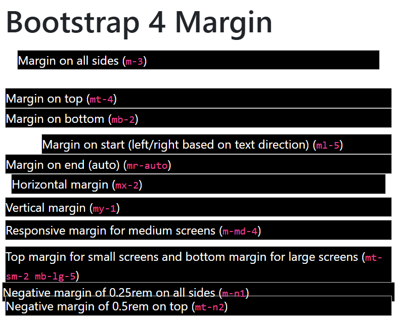
The above examples showing the backgrounds with each div elements to easily find the margins given.
Paddings in Bootstrap 4
Use the property p followed by dash(-) and size after it. Add positions with the property without any space as given below:
|
1 2 3 4 5 6 7 8 9 10 |
<div class="p-3">Padding on all sides (<code>p-3</code>)</div> <div class="pt-4">Padding on top (<code>pt-4</code>)</div> <div class="pb-2">Padding on bottom (<code>pb-2</code>)</div> <div class="pl-5">Padding on start (left/right based on text direction) (<code>pl-5</code>)</div> <div class="pr-2">Padding on end (<code>pr-2</code>)</div> <div class="px-3">Horizontal padding (<code>px-3</code>)</div> <div class="py-1">Vertical padding (<code>py-1</code>)</div> <!-- Responsive Paddings --> <div class="p-md-4">Responsive padding for medium screens (<code>p-md-4</code>)</div> <div class="pt-sm-2 mb-lg-5">Top padding for small screens and bottom padding for large screens (<code>pt-sm-2 mb-lg-5</code>)</div> |
Output
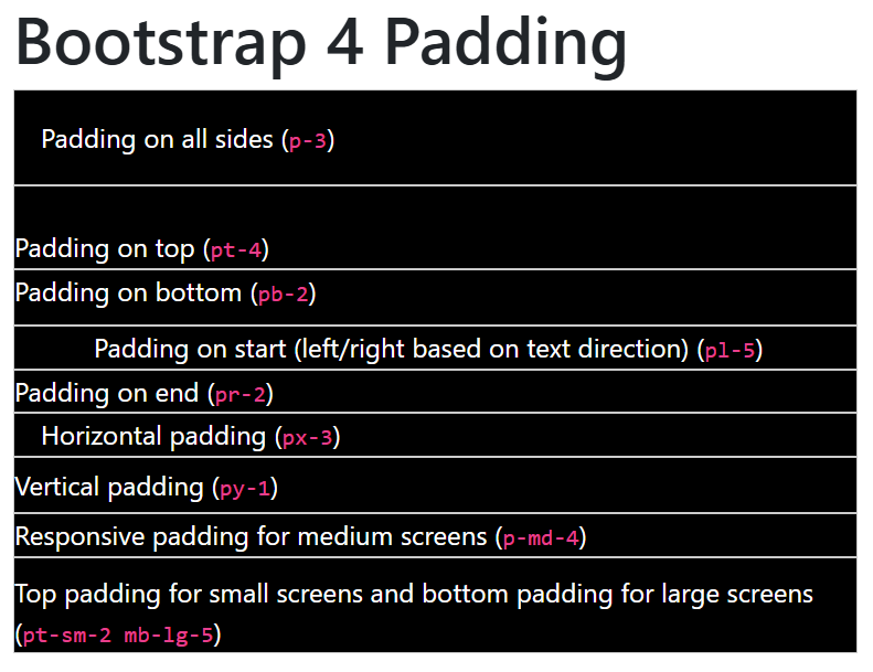
Added backgrounds to the examples to easily get the idea of how paddings are working.
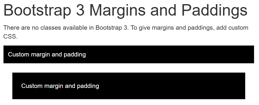
Applying Margins and Paddings in Bootstrap 3
There are no classes available for margin and padding in Bootstrap 3. However, you can add custom CSS for this as given below:-
|
1 2 3 4 5 6 |
<div style="padding: 10px;"> Custom margin and padding </div> <div style="margin: 20px; padding: 20px;"> Custom margin and padding </div> |
Output