Learn how to create a fullscreen modal in Bootstrap 5 and other versions. The short answer is to use the class .modal-fullscreen.
However, this only works in Bootstrap 5, and other versions require some CSS to make it full screen. Let’s find out with the examples given below.
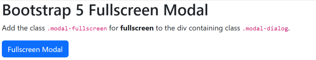
Fullscreen Modal in Bootstrap 5
To create a fullscreen modal in Bootstrap 5, you have to add the class .modal-fullscreen to the div element having class .modal-dialog is present.
|
1 2 3 4 5 6 7 8 9 10 11 12 13 14 15 16 17 18 19 20 21 22 23 24 |
<!-- FULLSCREEN Modal --> <button type="button" class="btn btn-primary" data-bs-toggle="modal" data-bs-target="#MyModalFullscreen"> Fullscreen Modal </button> <!-- Modal --> <div class="modal fade" id="MyModalFullscreen" tabindex="-1" aria-labelledby="MyModalFullscreenLabel" aria-hidden="true"> <!-- Add .modal-fullscreen for FULLSCREEN modal --> <div class="modal-dialog modal-fullscreen"> <div class="modal-content"> <div class="modal-header"> <h4 class="modal-title fs-5">FULLSCREEN Modal Heading</h4> <button type="button" class="btn-close" data-bs-dismiss="modal" aria-label="Close"></button> </div> <div class="modal-body"> Are you sure you want to continue? </div> <div class="modal-footer"> <button type="button" class="btn btn-secondary" data-bs-dismiss="modal">Close</button> <button type="button" class="btn btn-primary">Understood</button> </div> </div> </div> </div> |
Output
When you click the button given above, you will see a full-screen modal that covers the whole page or screen.
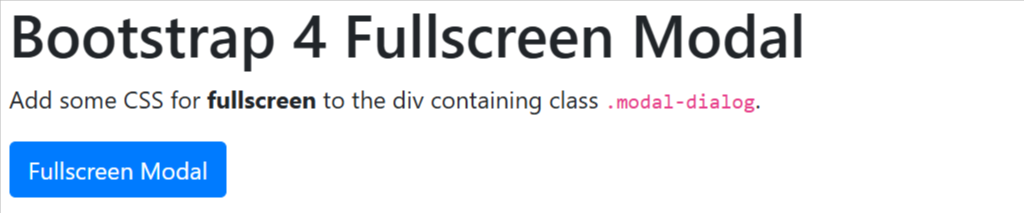
Create Fullscreen Modal in Bootstrap 4
Bootstrap 4 does not provide any CSS for making the models full-screen. However, you can add some CSS to the div containing class .modal-dialog as given below.
|
1 2 3 4 5 6 7 8 9 10 11 12 13 14 15 16 17 18 19 20 21 22 23 24 25 26 27 28 29 30 31 32 33 34 35 36 37 38 |
<!-- FULLSCREEN Modal --> <style> #MyModalFullscreen .modal-dialog { max-width: 100%; margin: 0; top: 0; bottom: 0; left: 0; right: 0; height: 100vh; display: flex; } </style> <button type="button" class="btn btn-primary" data-toggle="modal" data-target="#MyModalFullscreen"> Fullscreen Modal </button> <!-- Modal --> <div class="modal fade" id="MyModalFullscreen" tabindex="-1" aria-labelledby="MyModalFullscreenLabel" aria-hidden="true"> <!-- Add .modal-fullscreen for FULLSCREEN modal --> <div class="modal-dialog modal-fullscreen"> <div class="modal-content"> <div class="modal-header"> <h4 class="modal-title fs-5">FULLSCREEN Modal Heading</h4> <button type="button" class="close" data-dismiss="modal" aria-label="Close"> <span aria-hidden="true">×</span> </button> </div> <div class="modal-body"> Are you sure you want to continue? </div> <div class="modal-footer"> <button type="button" class="btn btn-secondary" data-dismiss="modal">Close</button> <button type="button" class="btn btn-primary">Understood</button> </div> </div> </div> </div> |
Output
Click the button given above to see the full screen in Bootstrap 4. It covers the entire screen with full width.
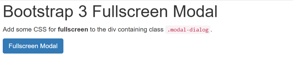
Full Screen in Bootstrap 3
Bootstrap 3 also does not have any CSS class to make the modal full-screen. It also requires adding some CSS to the div element with class .modal-dialog as given below.
|
1 2 3 4 5 6 7 8 9 10 11 12 13 14 15 16 17 18 19 20 21 22 23 24 25 26 27 28 29 30 31 |
<!-- FULLSCREEN Modal --> <style> #MyModalFullscreen .modal-dialog { width: 100%; max-width: none; margin: 0; } #MyModalFullscreen .modal-content { height: 100vh; /* Full viewport height */ } </style> <button type="button" class="btn btn-primary" data-target="#MyModalFullscreen" data-toggle="modal">Fullscreen err Modal</button> <!-- .modal --> <div class="modal fade" id="MyModalFullscreen"> <!-- Add .modal-lg for FULLSCREEN modal --> <div class="modal-dialog"> <div class="modal-content"> <div class="modal-header"> <button type="button" class="close" data-dismiss="modal">×</button> <h4 class="modal-title">Fullscreen Modal Heading</h4> </div> <div class="modal-body"> Are you sure you want to continue? </div> <div class="modal-footer"> <button type="button" class="btn btn-default" data-dismiss="modal">Close</button> </div> </div> </div> </div> |
Output
You can click the button given above to see the full screen in Bootstrap 3.