
Let’s be honest — a normal sidebar is easy to ignore.
But a sticky sidebar?
That’s always visible… always clickable… and way more powerful.
Whether you want more clicks, better engagement, or higher affiliate earnings, learning how to create a sticky sidebar for your website can make a real difference.
The good news? You don’t need to be a coding expert.
Let’s find out how to create a sticky sidebar step by step 👇
1. Use CSS position: sticky (Simplest Method)
If you want a quick and clean solution, this is it.
|
1 2 3 4 |
.sidebar { position: sticky; top: 20px; } |
This makes your sidebar “stick” as users scroll down.
👉 Best part:
No JavaScript needed, lightweight, and works in all modern browsers.
Complete example (CSS position: sticky)
|
1 2 3 4 5 6 7 8 9 10 11 12 13 14 15 16 17 18 19 20 21 22 23 24 25 26 27 28 29 30 31 32 33 34 35 36 37 38 39 40 41 42 43 |
<!DOCTYPE html> <html> <head> <style> body { margin: 0; font-family: Arial; } .container { display: flex; padding: 20px; } .content { flex: 3; height: 2000px; /* scroll ke liye */ } .sidebar { flex: 1; position: sticky; top: 20px; background: lightgray; height: 200px; } </style> </head> <body> <div class="container"> <div class="content"> <h2>Main Content</h2> </div> <div class="sidebar"> <h3>Sticky Sidebar</h3> </div> </div> </body> </html> |
2. Use position: fixed (Always Visible)
|
1 2 3 4 |
.sidebar { position: fixed; top: 20px; } |
This keeps your sidebar fixed on the screen at all times. In this case, the sidebar is not inside the container—it is positioned fixed to the screen. Therefore, you need to use right: 20px; or left; otherwise, its position will not be properly controlled.
👉 But be careful:
It can overlap your footer if not handled properly.
Complete example (CSS position: fixed)
|
1 2 3 4 5 6 7 8 9 10 11 12 13 14 15 16 17 18 19 20 21 22 23 24 25 26 27 28 29 30 31 32 33 34 35 36 37 38 |
<!DOCTYPE html> <html> <head> <style> body { margin: 0; } .content { width: 70%; margin-right: 30%; padding: 20px; } .sidebar { width: 25%; position: fixed; top: 20px; right: 20px; background: lightgray; padding: 10px; } </style> </head> <body> <div class="content"> <h2>Main Content</h2> <p style="height:2000px;">Scroll karo...</p> </div> <div class="sidebar"> <h3>Fixed Sidebar</h3> </div> </body> </html> |
Sometimes, a fixed sidebar overlaps the main content. That’s why a good solution is to add space for the sidebar—for example, by using margin-right: 32%; on the content area.
3. Add Sticky Behavior with JavaScript
Want more control? Use JavaScript.
|
1 2 3 4 5 6 7 8 |
window.addEventListener("scroll", function () { const sidebar = document.querySelector(".sidebar"); if (window.scrollY > 200) { sidebar.classList.add("sticky"); } else { sidebar.classList.remove("sticky"); } }); |
This allows you to control exactly when the sidebar becomes sticky.
👉 Useful for advanced layouts and animations.
Complete example (CSS position: sticky)
|
1 2 3 4 5 6 7 8 9 10 11 12 13 14 15 16 17 18 19 20 21 22 23 24 25 26 27 28 29 30 31 32 33 34 35 36 37 38 39 40 41 42 43 44 45 46 47 48 49 50 51 52 53 54 55 56 57 58 59 60 61 62 63 64 65 66 67 68 69 |
<!DOCTYPE html> <html> <head> <title>Sticky Sidebar - JS Method</title> <style> body { margin: 0; font-family: Arial; } .container { display: flex; padding: 20px; } .content { width: 70%; padding-right: 20px; height: 2000px; /* for scroll */ } .sidebar { width: 25%; background: lightgray; padding: 15px; height: 200px; } /* Sticky class */ .sticky { position: fixed; top: 20px; right: 20px; width: 25%; } </style> </head> <body> <div class="container"> <div class="content"> <h2>Main Content</h2> <p>Scroll down to see sidebar become sticky...</p> </div> <div class="sidebar"> <h3>Sidebar</h3> <p>I will become sticky after scrolling 200px</p> </div> </div> <script> window.addEventListener("scroll", function () { const sidebar = document.querySelector(".sidebar"); if (window.scrollY > 200) { sidebar.classList.add("sticky"); } else { sidebar.classList.remove("sticky"); } }); </script> </body> </html> |
How it works
- When the page scrolls
- If scroll is more than 200px → sidebar becomes sticky
- When you scroll back up → it returns to normal
Note: You must use right: 20px (or left). Otherwise, the sidebar position won’t be controlled properly.
Quick Tip
Make it sticky earlier:
|
1 |
if (window.scrollY > 100) |
Make it sticky later:
|
1 |
if (window.scrollY > 500) |
4. Use a Ready-Made Library
If you don’t want to deal with technical issues, a library can help.
One popular option is Sticky Sidebar.
It automatically handles:
- Spacing
- Footer overlap
- Responsive behavior
👉 Perfect for beginners who want a reliable solution.
Complete example (Ready made library)
|
1 2 3 4 5 6 7 8 9 10 11 12 13 14 15 16 17 18 19 20 21 22 23 24 25 26 27 28 29 30 31 32 33 34 35 36 37 38 39 40 41 42 43 44 45 46 47 48 49 50 51 52 53 54 55 56 57 58 59 60 61 62 63 64 65 |
<!DOCTYPE html> <html> <head> <title>Sticky Sidebar - Library Method</title> <style> body { margin: 0; font-family: Arial; } .container { display: flex; gap: 20px; padding: 20px; } .content { width: 70%; height: 2000px; /* for scroll */ } .sidebar { width: 30%; } .sidebar-inner { background: lightgray; padding: 15px; } </style> </head> <body> <div class="container"> <div class="content"> <h2>Main Content</h2> <p>Scroll down to see the sticky sidebar...</p> </div> <div class="sidebar"> <div class="sidebar-inner"> <h3>Sidebar</h3> <p>I will stay sticky while scrolling</p> </div> </div> </div> <!-- Sticky Sidebar Library --> <script src="https://cdn.jsdelivr.net/npm/[email protected]/dist/sticky-sidebar.min.js"></script> <script> var sidebar = new StickySidebar('.sidebar', { containerSelector: '.container', innerWrapperSelector: '.sidebar-inner', topSpacing: 20, bottomSpacing: 20 }); </script> </body> </html> |
What’s happening here?
- The library handles the sticky behavior automatically
- .sidebar-inner is the element that actually becomes sticky
- It prevents footer overlap and works smoothly on scroll
Important Notes
- Always use an inner wrapper (.sidebar-inner)
- Make sure container and sidebar structure is correct
- Add enough content to enable scrolling
Simple Summary
- Add HTML structure
- Include the library (CDN)
- Initialize with selectors
- Done — no complex coding needed ✅
5. Flexbox Layout + Sticky Sidebar
Modern websites often use Flexbox.
|
1 2 3 4 5 6 7 8 9 |
.container { display: flex; } .sidebar { position: sticky; top: 20px; align-self: flex-start; } |
👉 This keeps your layout clean and responsive.
Complete example (Flexbox Layout + sticky sidebar)
|
1 2 3 4 5 6 7 8 9 10 11 12 13 14 15 16 17 18 19 20 21 22 23 24 25 26 27 28 29 30 31 32 33 34 35 36 37 38 39 40 41 42 43 44 45 46 47 48 49 50 51 52 |
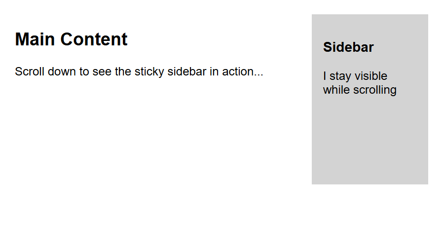
<!DOCTYPE html> <html> <head> <title>Flexbox Sticky Sidebar</title> <style> body { margin: 0; font-family: Arial; } .container { display: flex; gap: 20px; padding: 20px; } .content { flex: 3; height: 2000px; /* for scrolling */ } .sidebar { flex: 1; position: sticky; top: 20px; align-self: flex-start; background: lightgray; padding: 15px; height: 200px; } </style> </head> <body> <div class="container"> <div class="content"> <h2>Main Content</h2> <p>Scroll down to see the sticky sidebar in action...</p> </div> <div class="sidebar"> <h3>Sidebar</h3> <p>I stay visible while scrolling</p> </div> </div> </body> </html> |
What’s happening here?
- Flexbox creates a side-by-side layout
- position: sticky keeps the sidebar visible while scrolling
- align-self: flex-start prevents stretching (very important)
Important Notes
- Don’t use overflow: hidden on parent
- Make sure page has enough height (for scroll)
- Keep sidebar height smaller than viewport
Simple Summary
- Flexbox + Sticky = clean, modern, responsive sidebar
- No JavaScript needed
- Best method for most websites
6. CSS Grid Layout Approach
If you’re using CSS Grid:
|
1 2 3 4 5 6 7 8 9 |
.container { display: grid; grid-template-columns: 3fr 1fr; } .sidebar { position: sticky; top: 20px; } |
👉 Best for structured and modern designs.
Complete example (CSS Grid Layout Approach)
|
1 2 3 4 5 6 7 8 9 10 11 12 13 14 15 16 17 18 19 20 21 22 23 24 25 26 27 28 29 30 31 32 33 34 35 36 37 38 39 40 41 42 43 44 45 46 47 48 49 50 51 |
<!DOCTYPE html> <html> <head> <title>CSS Grid Sticky Sidebar</title> <style> body { margin: 0; font-family: Arial; } .container { display: grid; grid-template-columns: 3fr 1fr; gap: 20px; padding: 20px; } .content { height: 2000px; /* for scrolling */ } .sidebar { position: sticky; top: 20px; align-self: start; background: lightgray; padding: 15px; height: 200px; } </style> </head> <body> <div class="container"> <div class="content"> <h2>Main Content</h2> <p>Scroll down to see the sticky sidebar...</p> </div> <div class="sidebar"> <h3>Sidebar</h3> <p>I stay visible while scrolling</p> </div> </div> </body> </html> |
How it works
- display: grid → creates a layout
- 3fr 1fr → content is wider, sidebar is smaller
- position: sticky → keeps the sidebar visible while scrolling
- top: 20px → sets spacing from the top
Important
- Use align-self: start
- Otherwise, the sidebar may stretch and sticky won’t work properly ❌
Simple Summary
- Use CSS Grid for layout
- Apply sticky to the sidebar
- Add align-self: start
👉 Clean and modern layout ready ✅
7. Use WordPress Plugins (No Coding)
If your site is on WordPress, this is the easiest way.
You can use:
- Elementor (built-in sticky feature)
- Open your page in Elementor
- Click on the sidebar section/widget
- Go to Advanced tab
- Find Motion Effects
- Enable Sticky → Top
- Set offset (e.g., 20px). Done — your sidebar is now sticky ✅
- WP Sticky
- Go to Plugins → Add New
- Search for WP Sticky
- Install & Activate it
- Go to WP Sticky settings
- Add your sidebar CSS class (e.g., .sidebar)
- Set top spacing (20px)
- Save changes
👉 Just enable the sticky option — no coding required.
⚠️ Common Mistakes to Avoid
Before you go live, check these:
- ❌ Parent container has overflow: hidden
- ❌ Sidebar is taller than screen height
- ❌ Not tested on mobile
These small mistakes can break your sticky sidebar.
💡 Pro Tips (Increase CTR & Earnings)
A sticky sidebar is not just for design — it’s a conversion tool.
Use it for:
- Affiliate banners
- Email signup forms
- Call-to-action buttons
👉 Many bloggers see higher clicks just by making their sidebar sticky.
Final Thoughts
Creating a sticky sidebar isn’t complicated anymore.
Start with simple CSS.
Move to advanced methods only if needed.
Because at the end of the day —
- 👉 the goal is not just a sticky sidebar…
- 👉 it’s more engagement, more clicks, and more revenue.
Frequently Asked Questions (FAQs)
Q1. Does sticky sidebar improve SEO?
Indirectly, yes. It improves user engagement and time on site.
Q2. Is sticky sidebar mobile-friendly?
It can be — but you should disable or adjust it for smaller screens.
Q3. Which method is best for beginners?
CSS position: sticky is the easiest and most effective.