Centering elements in CSS is one of the most common tasks web developers face, yet it can be surprisingly tricky. In this tutorial, we’ll explore five reliable methods to center a div with complete code examples and clear explanations of when to use each approach.
Method 1: Flexbox (The Modern Standard)
The Code
|
1 2 3 4 5 6 7 8 9 10 11 12 13 14 15 16 17 18 19 20 21 22 23 24 25 26 27 28 29 30 31 32 |
<!DOCTYPE html> <html lang="en"> <head> <meta charset="UTF-8"> <meta name="viewport" content="width=device-width, initial-scale=1.0"> <title>Flexbox Centering</title> <style> .container { display: flex; justify-content: center; /* Horizontal centering */ align-items: center; /* Vertical centering */ height: 400px; background-color: #f0f0f0; border: 2px solid #333; } .centered-div { width: 200px; height: 100px; background-color: #4CAF50; color: white; text-align: center; line-height: 100px; } </style> </head> <body> <div class="container"> <div class="centered-div">Centered with Flexbox</div> </div> </body> </html> |
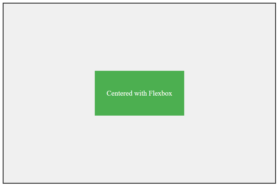
How It Works
- display: flex turns the container into a flex container
- justify-content: center centers child elements horizontally
- align-items: center centers child elements vertically
When to Use Flexbox
- Modern browsers (IE11+ with prefixes)
- When you need both horizontal and vertical centering
- Dynamic content (works regardless of element dimensions)
- Multiple centered elements in the same container
Pros and Cons
- ✅ Pros: Simple, clean, responsive, great browser support
- ❌ Cons: Not supported in IE10 and below without prefixes
Method 2: CSS Grid (The Powerful Alternative)
The Code
|
1 2 3 4 5 6 7 8 9 10 11 12 13 14 15 16 17 18 19 20 21 22 23 24 25 26 27 28 29 30 31 |
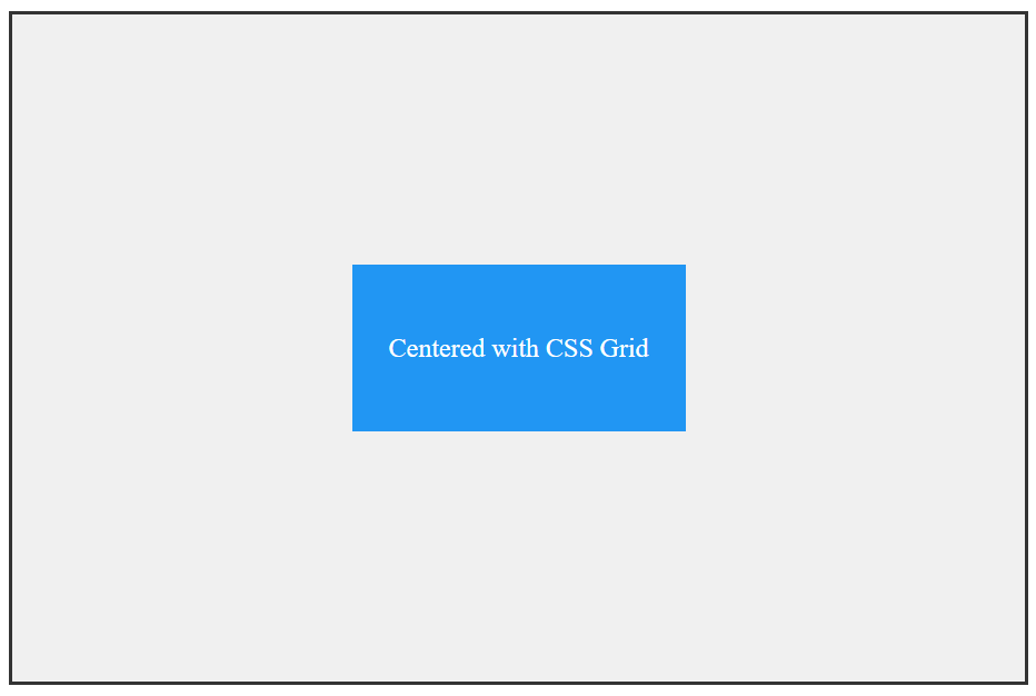
<!DOCTYPE html> <html lang="en"> <head> <meta charset="UTF-8"> <meta name="viewport" content="width=device-width, initial-scale=1.0"> <title>CSS Grid Centering</title> <style> .container { display: grid; place-items: center; /* Shorthand for align-items and justify-items */ height: 400px; background-color: #f0f0f0; border: 2px solid #333; } .centered-div { width: 200px; height: 100px; background-color: #2196F3; color: white; text-align: center; line-height: 100px; } </style> </head> <body> <div class="container"> <div class="centered-div">Centered with CSS Grid</div> </div> </body> </html> |
Alternative Grid Approach
|
1 2 3 4 5 |
.container { display: grid; justify-content: center; /* Horizontal */ align-content: center; /* Vertical */ } |
When to Use CSS Grid
- Complex layouts where you need grid capabilities
- Modern browsers (similar support to Flexbox)
- When you’re already using Grid for your layout
- Multiple items with precise positioning
Pros and Cons
- ✅ Pros: Extremely powerful, clean syntax, great for complex layouts
- ❌ Cons: Overkill for simple centering, similar browser support to Flexbox
Method 3: Absolute Positioning with Transform (The Classic Hack)
The Code
|
1 2 3 4 5 6 7 8 9 10 11 12 13 14 15 16 17 18 19 20 21 22 23 24 25 26 27 28 29 30 31 32 33 34 |
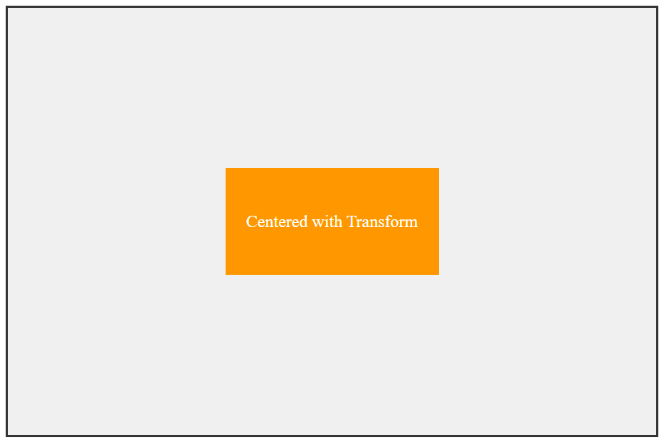
<!DOCTYPE html> <html lang="en"> <head> <meta charset="UTF-8"> <meta name="viewport" content="width=device-width, initial-scale=1.0"> <title>Transform Centering</title> <style> .container { position: relative; height: 400px; background-color: #f0f0f0; border: 2px solid #333; } .centered-div { position: absolute; top: 50%; left: 50%; transform: translate(-50%, -50%); width: 200px; height: 100px; background-color: #FF9800; color: white; text-align: center; line-height: 100px; } </style> </head> <body> <div class="container"> <div class="centered-div">Centered with Transform</div> </div> </body> </html> |
How It Works
top: 50%; left: 50%moves the element’s top-left corner to the centertransform: translate(-50%, -50%)shifts the element back by half its own dimensions
When to Use Transform Method
- Older browser support (IE9+)
- When you need to center within a specific parent
- Fixed or unknown dimensions of the centered element
- When Flexbox/Grid aren’t suitable
Pros and Cons
- ✅ Pros: Excellent browser support, works with dynamic content
- ❌ Cons: Can interfere with other transforms, absolute positioning removes from normal flow
Method 4: Margin: Auto (The Simple Horizontal Center)
The Code
|
1 2 3 4 5 6 7 8 9 10 11 12 13 14 15 16 17 18 19 20 21 22 23 24 25 26 27 28 29 30 31 32 33 34 35 36 37 38 39 40 41 |
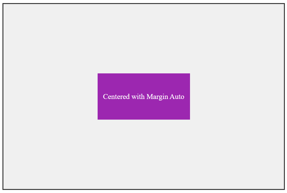
<!DOCTYPE html> <html lang="en"> <head> <meta charset="UTF-8"> <meta name="viewport" content="width=device-width, initial-scale=1.0"> <title>Margin Auto Centering</title> <style> .container { height: 400px; background-color: #f0f0f0; border: 2px solid #333; position: relative; } .centered-div { width: 200px; height: 100px; background-color: #9C27B0; color: white; text-align: center; line-height: 100px; /* Horizontal centering only */ margin: 0 auto; /* For vertical centering - requires known height */ position: absolute; top: 0; bottom: 0; left: 0; right: 0; margin: auto; } </style> </head> <body> <div class="container"> <div class="centered-div">Centered with Margin Auto</div> </div> </body> </html> |
When to Use Margin: Auto
- Simple horizontal centering of block elements
- Known dimensions for vertical centering
- Maximum browser compatibility (works everywhere)
- When you need minimal CSS
Pros and Cons
- ✅ Pros: Simplest method, best browser support, no fancy CSS required
- ❌ Cons: Limited to horizontal centering unless using absolute positioning with known dimensions
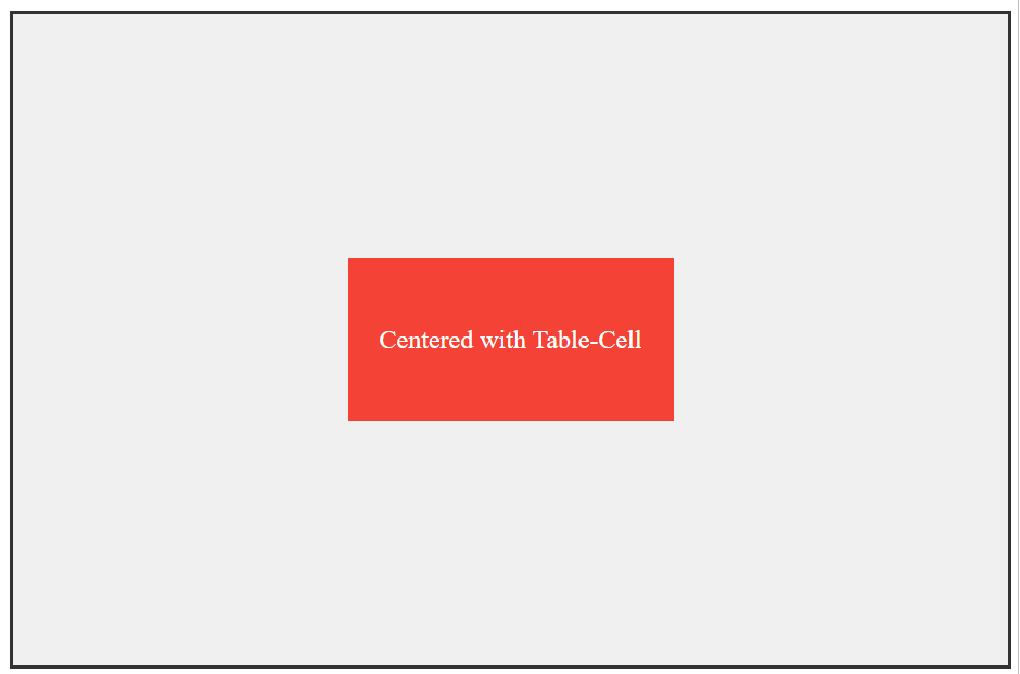
Method 5: Table-Cell Display (The Old)
The Code
|
1 2 3 4 5 6 7 8 9 10 11 12 13 14 15 16 17 18 19 20 21 22 23 24 25 26 27 28 29 30 31 32 33 34 35 36 37 38 39 40 |
<!DOCTYPE html> <html lang="en"> <head> <meta charset="UTF-8"> <meta name="viewport" content="width=device-width, initial-scale=1.0"> <title>Table-Cell Centering</title> <style> .container { display: table; width: 100%; height: 400px; background-color: #f0f0f0; border: 2px solid #333; } .center-wrapper { display: table-cell; text-align: center; /* Horizontal */ vertical-align: middle; /* Vertical */ } .centered-div { display: inline-block; width: 200px; height: 100px; background-color: #F44336; color: white; text-align: center; line-height: 100px; } </style> </head> <body> <div class="container"> <div class="center-wrapper"> <div class="centered-div">Centered with Table-Cell</div> </div> </div> </body> </html> |
When to Use Table-Cell Method
- Maximum browser compatibility (IE8+)
- Legacy projects where modern methods aren’t available
- When you need vertical centering without modern CSS
- Email templates (where CSS support is limited)
Pros and Cons
- ✅ Pros: Excellent browser support, reliable vertical centering
- ❌ Cons: Semantic misuse of table properties, requires extra markup
Quick Comparison Table for Different Methods
| Method | Browser Support | Use Case | Pros | Cons |
|---|---|---|---|---|
| Flexbox | IE11+ (with prefixes) | Modern layouts, dynamic content | Clean, responsive, powerful | Limited IE support |
| CSS Grid | IE11+ (partial) | Complex layouts, multiple items | Very powerful, clean syntax | Overkill for simple tasks |
| Transform | IE9+ | Older browsers, unknown dimensions | Great support, flexible | Interferes with other transforms |
| Margin: Auto | All browsers | Simple horizontal centering | Maximum compatibility, simple | Limited vertical centering |
| Table-Cell | IE8+ | Legacy support, email templates | Best legacy support | Semantic misuse, extra markup |
Real-World Scenarios: Which Method to Choose?
Scenario 1: Modern Web Application
Use Flexbox – It’s designed for modern layouts and has become the industry standard.
Scenario 2: Centering Unknown Content
Use Transform method or Flexbox – Both handle dynamic content beautifully.
Scenario 3: Legacy Website (IE Support)
Use Table-Cell or Transform – Best compatibility with older browsers.
Scenario 4: Simple Horizontal Center
Use Margin: Auto – The simplest solution for the job.
Scenario 5: Complex Layout with Multiple Items
Use CSS Grid – Perfect for sophisticated layout requirements.
Conclusion
Centering divs doesn’t have to be frustrating anymore! Each method has its place:
- For modern projects: Stick with Flexbox
- For maximum compatibility: Use Transform or Table-Cell
- For simple horizontal centering: Margin Auto is perfect
- For complex layouts: CSS Grid shines
The key is understanding the strengths and limitations of each approach. With these five methods in your toolkit, you’ll be able to handle any centering challenge that comes your way!
Pro Tip: Flexbox should be your go-to method for most centering tasks due to its excellent support and flexibility.