The responsive Bootstrap login form can resize itself according to the screen size. You can help users log in from any size device and from anywhere.
If you want to run your business online and provide data only to logged-in users. You should consider making your website and login form responsive.

Not only on the desktop, but your login form should open perfectly on mobile devices too. If your login form is not created for mobile devices, you may lose a customer with sales and revenue.
You can use Bootstrap which comes with pre-defined CSS classes to use and easily create a responsive login form. It only requires including a CSS file for a quick start.
In this post, you will learn how to create a responsive Bootstrap login form. You will also learn a step-by-step process for creating a login/logout system using your login form with PHP and MySQL.
So, let’s get started.
Create Responsive Login Form Design Using Bootstrap 5
To create a responsive login form, you can use Bootstrap. You can use the CDN to easily include Bootstrap and start using it to create a login form. Below is the CDN URL that you have to include in the <head> tag of your login form page.
Step 1: Include Bootstrap 5 CDN in the Head Section
|
1 |
<link href="https://cdn.jsdelivr.net/npm/[email protected]/dist/css/bootstrap.min.css" rel="stylesheet"> |
Now, after including the above URL of Bootstrap CDN, you can create your login form. You just have to use the class .form-control with the input field to apply the CSS of this Bootstrap class.
Step 2: Create Responsive Login Form Design Using Bootstrap 5
|
1 2 3 4 5 6 7 8 9 10 11 12 13 14 15 16 17 18 19 20 21 22 23 24 25 26 27 28 29 30 31 32 |
<!doctype html> <html lang="en"> <head> <title>Responsive Bootstrap Login Form</title> <meta charset="utf-8"> <meta name="viewport" content="width=device-width, initial-scale=1"> <link href="https://cdn.jsdelivr.net/npm/[email protected]/dist/css/bootstrap.min.css" rel="stylesheet"> </head> <body> <div class="container"> <div class="row"> <div class="col-md-6 offset-md-3 mt-3 bg-light p-3 border border-secondary"> <!-- Bootstrap main form start --> <form method="POST"> <div class="mb-3"> <label for="Username" class="form-label">Your Username</label> <input type="email" class="form-control" name="username" placeholder="Enter username" required> </div> <div class="mb-3"> <label for="Password" class="form-label">Your Password</label> <input type="password" class="form-control" name="password" placeholder="Enter password" required> </div> <div class="mb-3"> <input type="submit" class="btn btn-primary" name="submit" value="Submit"> </div> </form> <!-- Bootstrap main form end --> </div> </div> </div> </body> </html> |
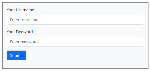
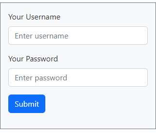
When you run the above code of the login form, you will get the responsive design view as shown in the image below. You will get a different view on desktop and mobile devices. Let’s see them below.
Desktop View of Login Form
In the desktop view, you will get the view as shown in the image below.

Mobile Responsive View of Login Form
The mobile view of the design is slightly smaller according to the screen size of the mobile. However, it can make it easier for users to use the login form on a mobile device.

You can also check the design and view of the login form on other devices like tablets and iPhones to find out its responsive design on them.
Explanations of Bootstrap 5 Classes Using in Login Form
Let’s find out what are the uses of the Bootstrap 5 classes we are using to create login form:-
container: It is the main box where the main content of the form will come.row: Start a 12-column row to create 12 grid columns in Bootstrap.col-md-6: Cover half of the total 12 grid columns in Bootstrap.col-md-12: Covers the full 12 grid columns in Bootstrap.offset-md-3: Move your div 3 grid columns ahead in a row using offset class.mt-5: Top margin of the content with 5 em as its value.bg-light: You can use this class in Bootstrap to give light background to the div elementp-3: Give padding 3em to the element using the Bootstrap padding class.border: Add borders to the element using Bootstrap pre-defined class.border-secondary: It is the contextual class of border to give color to the border of the element border. It gives secondary color to the border of the element.mb-3: To give the bottom margin to an element, you can use this Bootstrap class. I give a bottom margin of 3em to the element.g-3: It is a gutter class of Bootstrap to give column padding or gaps among columns. This class gives 3em padding to the columns.form-label: If you want to define the label for an input element in a form, you can use this class of Bootstrap.form-control: Create a beautiful form element with some CSS applied using this Bootstrap class.btn: Defines the button element in Bootstrap using this class.btn-primary: It is the contextual class of Bootstrap for button elements to give color to them.
Now, you know all the classes of Bootstrap we are using in the above form design code.
That’s all about creating a responsive Bootstrap login form design.
