Bootstrap 5 grids are designed to work on multiple screen sizes using media breakpoints. A breakpoint is the width of the screen where the layout of the website changes.
There are 6 breakpoints in Bootstrap 5 based on common screen sizes which allows to easily create responsive designs. These breakpoints are used to adjust the width of the columns and rows.
Breakpoints ensures your website looks good on any device from mobile phones to large desktop screens. Let’s learn about media breakpoints in detail.
What are Bootstrap 5 Media Breakpoints
Media breakpoints in Bootstrap 5 are the predefined screen widths that you can use to adjust the layout of a webpage. Bootstrap uses these breakpoints to change the number of columns an element should span depending on the screen size.
Available Breakpoints in Bootstrap 5
| Breakpoint Name | Class Prefix | Min Width (px) |
|---|---|---|
| Extra Small |
col
|
<576px
|
| Small |
col-sm
|
≥576px
|
| Medium |
col-md
|
≥768px
|
| Large |
col-lg
|
≥992px
|
| Extra Large |
col-xl
|
≥1200px
|
| Extra Extra Large |
col-xxl
|
≥1400px
|
Understanding Breakpoints with Examples
The basic structure of the grid system is built with .row and .col-* elements. The columns can automatically adjust to screen sizes based on the breakpoint classes you apply.
|
1 2 3 4 5 6 7 8 |
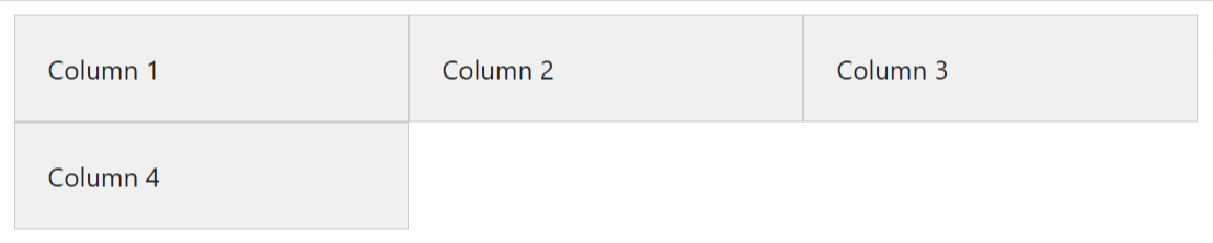
<div class="container"> <div class="row"> <div class="col-6 col-md-4 col-lg-3">Column 1</div> <div class="col-6 col-md-4 col-lg-3">Column 2</div> <div class="col-6 col-md-4 col-lg-3">Column 3</div> <div class="col-6 col-md-4 col-lg-3">Column 4</div> </div> </div> |
Output
Explanation
.col-6: The column takes up 6/12 (50%) of the container on extra smaller devices (less then 576px)..col-md-6: on medium devices (>=768px), each column takes up 4/12 (33.33%) of the container..col-lg-3: for large devices (>=992px), each column takes up 3/12 (25%) of the container.
Detailed Explanation of Each Breakpoints
1. Extra Small (.col)
- Class:
.col - Breakpoints: For devices less than 576px in width (e.g. small smartphones)
- Description: It is used to define how columns behave in very small screen devices. It applies to devices with screen width of less than 576px.
|
1 2 3 4 5 6 |
<div class="container"> <div class="row"> <div class="col">Column 1</div> <div class="col">Column 2</div> </div> </div> |
Output

- On extra small screens (less than 576px), both column will take 50% width
2. Small (.col-sm)
- Class:
col-sm - Breakpoints: For devices 576px and up in width (e.g. large smartphones)
- Description: The
col-smclass is used to define how columns behave on small screen devices. It applies to devices with screen width of at least 576px.
|
1 2 3 4 5 6 |
<div class="container"> <div class="row"> <div class="col-sm-6">Column 1</div> <div class="col-sm-6">Column 2</div> </div> </div> |
Output
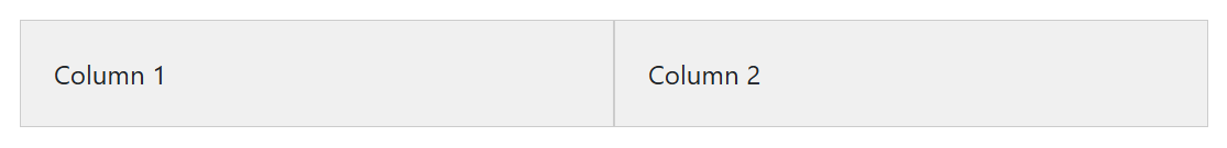
- On small screens (>= 576px), each column takes 50% of the container’s width.
3. Medium (.col-md)
- Class:
col-md - Breakpoints: For devices 768px and up in width (e.g. Tablets and small desktops)
- Description: The
col-smclass adjusts the column widths on medium sized screens. The default behaviour applies to all devices with screen width of at least 768px unless you define another breakpoint.
|
1 2 3 4 5 6 |
<div class="container"> <div class="row"> <div class="col-md-6">Column 1</div> <div class="col-md-6">Column 2</div> </div> </div> |
Output
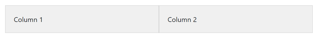
- On medium screens (>= 768px), each column take up 50% of the container’s width.
3. Large (.col-lg)
- Class:
col-lg - Breakpoints: For devices 992px and up in width (e.g. large desktops)
- Description: The
col-smclass applies to larger desktops with wider monitors with screen width of at least 992px.
|
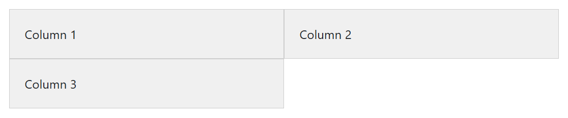
1 2 3 4 5 6 7 8 |
<div class="container"> <div class="row"> <div class="col-lg-3">Column 1</div> <div class="col-lg-3">Column 2</div> <div class="col-lg-3">Column 3</div> <div class="col-lg-3">Column 4</div> </div> </div> |
Output
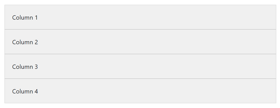
- On large screens (>= 992px), each column take up 25% of the container’s width.
4. Extra Large (.col-xl)
- Class:
col-xl - Breakpoints: For devices 1200px and up in width (e.g. large laptops and desktops)
- Description: The
col-xlclass is ideal for large screens and ensures your layout adjusts to take advantage of the extra width on such sized devices.
|
1 2 3 4 5 6 7 8 9 10 |
<div class="container"> <div class="row"> <div class="col-xl-2">Column 1</div> <div class="col-xl-2">Column 2</div> <div class="col-xl-2">Column 3</div> <div class="col-xl-2">Column 4</div> <div class="col-xl-2">Column 5</div> <div class="col-xl-2">Column 6</div> </div> </div> |
Output
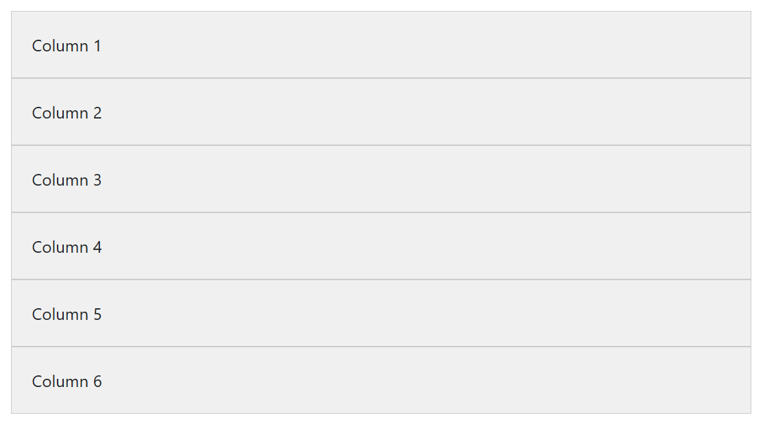
- On extra large screens (>= 1200px), each column take up 16.66% of the container’s width.
5. Extra Extra Large (.col-xxl)
- Class:
col-xxl - Breakpoints: For devices 1400px and up in width (e.g. very large screens like ultra wide monitors.)
- Description: This class allows even more precise control over layouts on very large screens.
|
1 2 3 4 5 6 7 8 9 10 |
<div class="container"> <div class="row"> <div class="col-xl-1 box">Column 1</div> <div class="col-xl-1 box">Column 2</div> <div class="col-xl-1 box">Column 3</div> <div class="col-xl-1 box">Column 4</div> <div class="col-xl-1 box">Column 5</div> <div class="col-xl-1 box">Column 6</div> </div> </div> |
Output

- On ultra-large screens (>= 1400px), each column take up 8.33% of the container’s width.
4. Using Multiple Breakpoints Together
If you want to create more flexible layouts, you can combine multiple breakpoints as given below:
|
1 2 3 4 5 6 7 |
<div class="container"> <div class="row"> <div class="col-12 col-md-6 col-lg-4 col-xl-3">Column 1</div> <div class="col-12 col-md-6 col-lg-4 col-xl-3">Column 2</div> <div class="col-12 col-md-6 col-lg-4 col-xl-3">Column 3</div> </div> </div> |
Output
Explanation
col-12: On extra small screens (less than 576px), each column will take 100% of the container’s width.col-md-6: On medium screens (>=768px), each column will take 50% of the container’s width.col-lg-4: On large screens (>=992px), each column will take 33.33% of the container’s width.col-xl-4: On extra large screens (>=1200px), each column will take 25% of the container’s width.
Complete Breakpoint Layout Example
|
1 2 3 4 5 6 7 8 9 10 11 12 13 14 15 16 17 18 19 20 21 22 23 24 25 26 27 28 29 30 31 32 33 34 35 36 37 38 39 40 41 42 43 44 45 46 47 48 49 50 51 52 53 54 55 56 57 58 59 60 61 62 63 64 65 66 67 68 69 70 71 72 73 74 75 76 77 78 79 80 81 82 83 84 85 86 87 88 89 90 91 92 93 94 95 96 97 98 99 100 101 102 103 104 105 106 107 108 109 110 111 112 113 114 115 116 117 118 119 120 121 122 123 124 125 126 127 |
<!DOCTYPE html> <html lang="en"> <head> <meta charset="UTF-8"> <meta name="viewport" content="width=device-width, initial-scale=1"> <title>Responsive Bootstrap 5 Layout</title> <!-- Bootstrap 5.3 CSS --> <link href="https://cdn.jsdelivr.net/npm/[email protected]/dist/css/bootstrap.min.css" rel="stylesheet"> <!-- Bootstrap Icons --> <link rel="stylesheet" href="https://cdn.jsdelivr.net/npm/bootstrap-icons/font/bootstrap-icons.css"> <style> .feature-card { min-height: 100%; } </style> </head> <body> <!-- ✅ Navbar --> <nav class="navbar navbar-expand-lg navbar-dark bg-dark"> <div class="container"> <a class="navbar-brand" href="#">MyWebsite</a> <button class="navbar-toggler" type="button" data-bs-toggle="collapse" data-bs-target="#navbarNav"> <span class="navbar-toggler-icon"></span> </button> <div class="collapse navbar-collapse" id="navbarNav"> <ul class="navbar-nav ms-auto"> <li class="nav-item"><a class="nav-link active" href="#">Home</a></li> <li class="nav-item"><a class="nav-link" href="#">Features</a></li> <li class="nav-item"><a class="nav-link" href="#">Services</a></li> <li class="nav-item"><a class="nav-link" href="#">Contact</a></li> </ul> </div> </div> </nav> <!-- ✅ Hero Section --> <header class="bg-primary text-white text-center py-5"> <div class="container"> <h1>Welcome to My Bootstrap 5 Website</h1> <p class="lead">Fully Responsive with Bootstrap Grid System</p> <a href="#" class="btn btn-light btn-lg">Get Started</a> </div> </header> <!-- ✅ Features Section --> <section class="container my-5"> <h2 class="text-center mb-4">Our Features</h2> <div class="row"> <div class="col-md-4"> <div class="card feature-card shadow p-3"> <div class="card-body text-center"> <i class="bi bi-speedometer2 display-4 text-primary"></i> <h4 class="card-title mt-3">Fast & Optimized</h4> <p class="card-text">Our website loads quickly and is optimized for performance.</p> </div> </div> </div> <div class="col-md-4"> <div class="card feature-card shadow p-3"> <div class="card-body text-center"> <i class="bi bi-shield-lock display-4 text-danger"></i> <h4 class="card-title mt-3">Secure</h4> <p class="card-text">Security is our top priority with strong encryption methods.</p> </div> </div> </div> <div class="col-md-4"> <div class="card feature-card shadow p-3"> <div class="card-body text-center"> <i class="bi bi-phone display-4 text-success"></i> <h4 class="card-title mt-3">Mobile Friendly</h4> <p class="card-text">Looks great on all screen sizes with a fully responsive design.</p> </div> </div> </div> </div> </section> <!-- ✅ Responsive Grid Layout --> <section class="container my-5"> <h2 class="text-center mb-4">Our Work</h2> <div class="row"> <div class="col-12 col-sm-6 col-md-4 col-lg-3"> <div class="card shadow p-2"> <div class="card-body text-center"> <h5 class="card-title">Project 1</h5> <p class="card-text">Description of Project 1.</p> </div> </div> </div> <div class="col-12 col-sm-6 col-md-4 col-lg-3"> <div class="card shadow p-2"> <div class="card-body text-center"> <h5 class="card-title">Project 2</h5> <p class="card-text">Description of Project 2.</p> </div> </div> </div> <div class="col-12 col-sm-6 col-md-4 col-lg-3"> <div class="card shadow p-2"> <div class="card-body text-center"> <h5 class="card-title">Project 3</h5> <p class="card-text">Description of Project 3.</p> </div> </div> </div> <div class="col-12 col-sm-6 col-md-4 col-lg-3"> <div class="card shadow p-2"> <div class="card-body text-center"> <h5 class="card-title">Project 4</h5> <p class="card-text">Description of Project 4.</p> </div> </div> </div> </div> </section> <!-- ✅ Footer --> <footer class="bg-dark text-white text-center py-3"> <div class="container"> <p class="mb-0">© MyWebsite. All rights reserved.</p> </div> </footer> <!-- Bootstrap 5.3 JS --> <script src="https://cdn.jsdelivr.net/npm/[email protected]/dist/js/bootstrap.bundle.min.js"></script> </body> </html> |
Conclusion
Using Bootstrap 5 grid breakpoints, you can create more flexible and responsive layouts that adapt to all screen sizes. by using appropriate breakpoints, you can ensure your website works seamlessly across all devices, from mobile phones to large desktop monitors.