Bootstrap 5 is the newest version of Bootstrap and the most popular front-end frameworks for developing responsive and mobile-first websites.
It is a free and open source framework that provides collection of CSS, Javascript, and other resources to help users design websites quickly and efficiently.
Bootstrap 5 Example
Here’s a complete layout example using Bootstrap 5. This layout includes a responsive navbar, hero section, a three column feature section, and a footer
|
1 2 3 4 5 6 7 8 9 10 11 12 13 14 15 16 17 18 19 20 21 22 23 24 25 26 27 28 29 30 31 32 33 34 35 36 37 38 39 40 41 42 43 44 45 46 47 48 49 50 51 52 53 54 55 56 57 58 59 60 61 62 63 64 65 66 67 68 69 70 71 72 73 74 75 76 77 78 79 80 81 82 83 84 85 86 87 88 89 90 91 92 93 94 95 96 97 98 |
<!DOCTYPE html> <html lang="en"> <head> <meta charset="UTF-8"> <meta name="viewport" content="width=device-width, initial-scale=1.0"> <title>Bootstrap 5 Complete Layout</title> <!-- Bootstrap CSS --> <link href="https://cdn.jsdelivr.net/npm/[email protected]/dist/css/bootstrap.min.css" rel="stylesheet"> <!-- Bootstrap Icons CSS --> <link href="https://cdn.jsdelivr.net/npm/bootstrap-icons/font/bootstrap-icons.css" rel="stylesheet"> </head> <body> <!-- Navbar --> <nav class="navbar navbar-expand-lg navbar-dark bg-dark"> <div class="container"> <a class="navbar-brand" href="#">MyWebsite</a> <button class="navbar-toggler" type="button" data-bs-toggle="collapse" data-bs-target="#navbarNav" aria-controls="navbarNav" aria-expanded="false" aria-label="Toggle navigation"> <span class="navbar-toggler-icon"></span> </button> <div class="collapse navbar-collapse" id="navbarNav"> <ul class="navbar-nav ms-auto"> <li class="nav-item"> <a class="nav-link active" href="#">Home</a> </li> <li class="nav-item"> <a class="nav-link" href="#">About</a> </li> <li class="nav-item"> <a class="nav-link" href="#">Services</a> </li> <li class="nav-item"> <a class="nav-link" href="#">Contact</a> </li> </ul> </div> </div> </nav> <!-- Hero Section --> <section class="bg-light text-center py-5"> <div class="container"> <h1 class="display-4">Welcome to MyWebsite</h1> <p class="lead">Build modern, responsive websites with Bootstrap 5</p> <a href="#" class="btn btn-primary btn-lg">Get Started</a> </div> </section> <!-- Features Section --> <section class="py-5"> <div class="container"> <div class="row text-center"> <!-- Feature 1 --> <div class="col-md-4"> <div class="card shadow-sm h-100 d-flex flex-column p-4"> <i class="bi bi-lightning-fill text-primary display-4 mb-3"></i> <h3>Fast Performance</h3> <p>Optimized for high performance and quick load times.</p> </div> </div> <!-- Feature 2 --> <div class="col-md-4"> <div class="card shadow-sm h-100 d-flex flex-column p-4"> <i class="bi bi-laptop text-success display-4 mb-3"></i> <h3>Responsive Design</h3> <p>Works seamlessly on any device and screen size.</p> </div> </div> <!-- Feature 3 --> <div class="col-md-4"> <div class="card shadow-sm h-100 d-flex flex-column p-4"> <i class="bi bi-shield-lock-fill text-danger display-4 mb-3"></i> <h3>Secure</h3> <p>Built with the latest security best practices.</p> </div> </div> </div> </div> </section> <!-- Footer --> <footer class="bg-dark text-white py-4"> <div class="container text-center"> <p>© 2025 MyWebsite. All Rights Reserved.</p> <p> Follow us on: <a href="#" class="text-white text-decoration-none me-2"><i class="bi bi-facebook"></i></a> <a href="#" class="text-white text-decoration-none me-2"><i class="bi bi-twitter"></i></a> <a href="#" class="text-white text-decoration-none"><i class="bi bi-instagram"></i></a> </p> </div> </footer> <!-- Bootstrap JavaScript --> <script src="https://cdn.jsdelivr.net/npm/[email protected]/dist/js/bootstrap.bundle.min.js"></script> </body> </html> |
Output
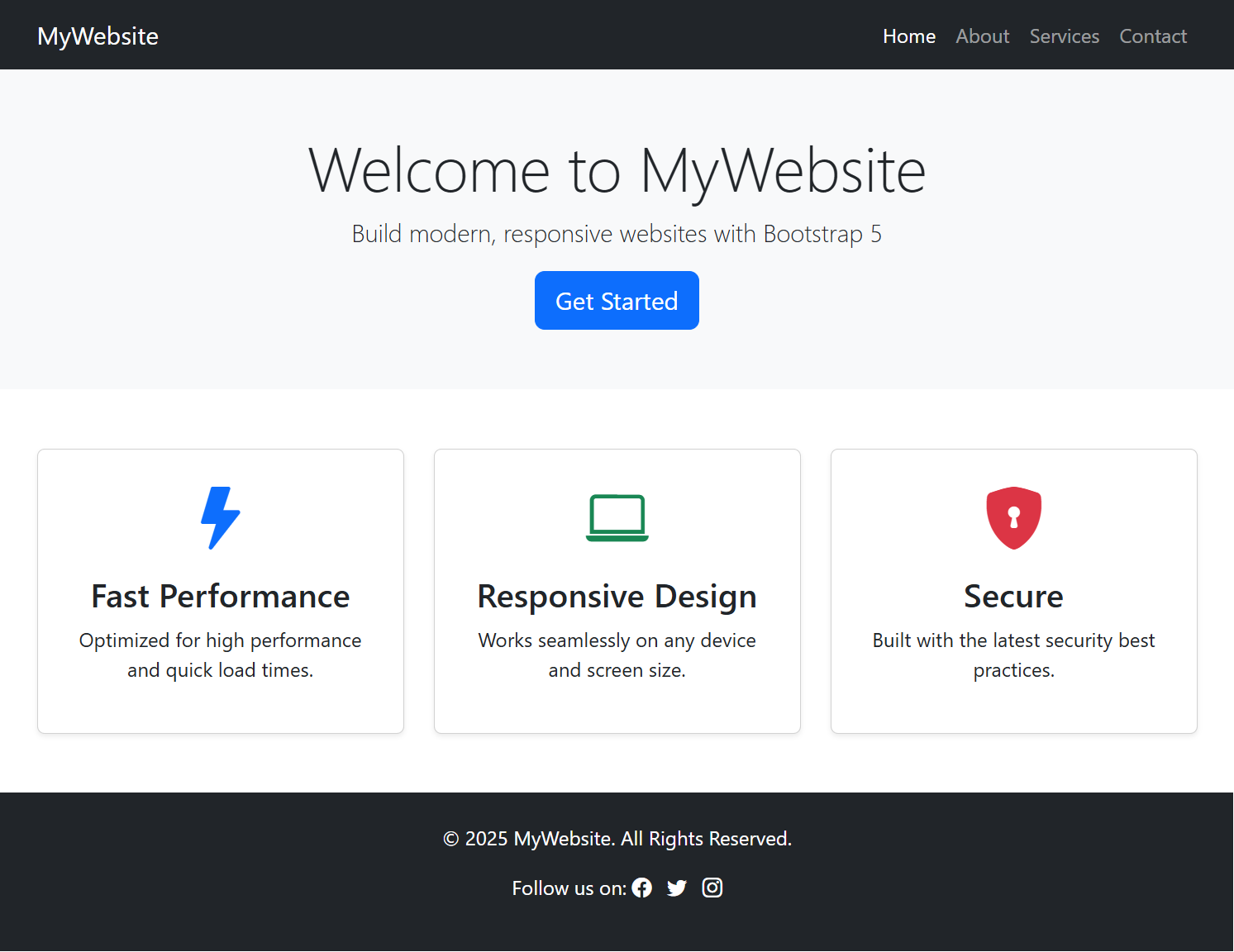
This example will render a modern and responsive webpage that adjusts beautifully to all screen sizes, thanks to Bootstrap 5 powerful grid system and components. It’s a great starting point for websites like portfolios, landing pages, or business websites.
The above example also contains Bootstrap icons in the features and footer section which makes it look beautiful.
What is Bootstrap
Bootstrap is a framework designed to help web developers create beautiful and responsive websites with minimal effort. It was initially developed by Twitter, but it has grown to become one of the most widely used framework for building websites.
The goal of Bootstrap is to make web development faster by providing pre-styled components and layout structures. It can help developers to focus only on functionality rather than designing websites from scratch.
Why Bootstrap 5?
Bootstrap 5 is the latest version of framework that comes with several new improvements and features as compared to old versions:-
- No jQuery Dependency: One of the major changes in Bootstrap 5 is that it no longer require jQuery to make it more lighter and faster. Users can work with pure Javascript with this.
- Enhanced Grid System: The 12-column grid system has been improved, offering more flexibility in designing reponsive layouts.
- Customizable: It provides more options to customize its components using utilities and variables. You can easily fine tune the design with greater control.
- Improved Forms: Bootstrap 5 has a more modern and streamlined approach to form controls. It offers better styling and more consistent behaviour across devices and browsers.
- Updated Icons: Bootstrap now includes its own set of icons known as Bootstrap icons, making it easier to add visual elements to your projects without relying on external icon libraries.
- CSS Flexbox and Grid Support: With flexbox and grid support, Bootstrap 5 allows for advanced layouts and designs without relying on complex CSS hacks. These technologies allows developers to create responsive and flexible layouts with ease.
- Utility API: Bootstrap 5 introduced a utility API for better customization of styles and classes directly in the HTML structure.
- Browser Compatibility: Bootstrap 5 is compatible with all modern browsers (Chrome, Firefox, Edge, Safari, and Opera). If you want support for IE11 and its lower versions, you must choose to use Bootstrap 4 or Bootstrap 3.
How to Include Bootstrap 5 to your Project
There are two ways to include Bootstrap 5 to your web project:-
1. Via CDN (Content Delivery Network)
CDN is the easiest way to add Bootstrap to your project. It involves adding the links of Bootstrap CSS and Javascript files hosted on a server.
To include Bootstrap 5 using CDN, follow these steps:-
1. Copy and paste the following link inside the <head> tag of your HTML file to include the CSS:
|
1 2 |
<!-- Bootstrap CSS --> <link href="https://cdn.jsdelivr.net/npm/[email protected]/dist/css/bootstrap.min.css" rel="stylesheet"> |
2. Then, include the Javascript files before the closing </body> tag:
|
1 2 |
<!-- Bootstrap JavaScript --> <script src="https://cdn.jsdelivr.net/npm/[email protected]/dist/js/bootstrap.bundle.min.js"></script> |
By using CDN, you can start using Bootstrap immediately without having to download anything.
2. Downloading Bootstrap Locally
If you prefer to host Bootstrap locally, you can download the framework and include it in your project files.
1. Go to official Bootstrap website (https://getbootstrap.com/). Find the download link and click.
2. Download the compiled CSS and Javascript files
3. Link these files in your HTML document like so:
|
1 2 |
<link href="path/to/bootstrap.min.css" rel="stylesheet"> <script src="path/to/bootstrap.bundle.min.js"></script> |
How to Quick Start with Bootstrap 5
1. Add HTML5 Basic Structure
First of all, create an HTML 5 Doctype structure as given below:
|
1 2 3 4 5 6 7 8 9 10 |
<!DOCTYPE html> <html lang="en"> <head> <meta charset="UTF-8"> <title>Bootstrap 5 Example</title> </head> <body> <!-- Your content goes here --> </body> </html> |
2. Include Meta Viewport Tag
Add meta viewport tag for proper responsive behaviour across mobile devices:
|
1 2 3 4 5 6 7 8 9 10 11 12 |
<!DOCTYPE html> <html lang="en"> <head> <meta charset="UTF-8"> <!-- Include meta viewport tag --> <meta name="viewport" content="width=device-width, initial-scale=1.0"> <title>Bootstrap 5 Example</title> </head> <body> <!-- Your content goes here --> </body> </html> |
3. Include Bootstrap 5 CSS and JS
Add Bootstrap 5 CSS lnk using the <link> tag and JS link using <script> tag.
|
1 2 3 4 5 6 7 8 9 10 11 12 13 14 15 16 |
<!DOCTYPE html> <html lang="en"> <head> <meta charset="UTF-8"> <!-- Include meta viewport tag --> <meta name="viewport" content="width=device-width, initial-scale=1.0"> <title>Bootstrap 5 Example</title> <!-- Bootstrap CSS --> <link href="https://cdn.jsdelivr.net/npm/[email protected]/dist/css/bootstrap.min.css" rel="stylesheet"> <!-- Bootstrap JavaScript --> <script src="https://cdn.jsdelivr.net/npm/[email protected]/dist/js/bootstrap.bundle.min.js"></script> </head> <body> <!-- Your content goes here --> </body> </html> |
Now, you are ready to quick start with Bootstrap 5 with the above HTML code. Start building your web pages with Bootstrap fastly. Add layouts, components, utilities and more with Bootstrap.
Bootstrap 5 Components and Features
Once Bootstrap is included in your project, you can start using its pre-styled components to build your webpage quickly. Some of the most important components of Bootstrap 5 are:
- Navbar: A responsive navigation bar that adapts to different screen sizes.
- Buttons: Predefined button styles for various actions like primary, secondary, success, and danger.
- Cards: A flexible and extensible content container with options for images, text, and actions.
- Modals: Interactive dialog window popup that overlay the content.
- Forms: A collection of form controls, input fields, checkboxes, and radio buttons.
- Alerts: Prestyled notification messages that can be customized.
- Dropdowns: Clickable menus that expand when triggered.
- Tooltips and Popovers: Small interactive popups for displayiing additional information.
The Grid System
Bootstrap uses a grid system to create complex layouts in a responsive manner. The grid system is based on 12-column layout. It means you can divide the into 12 equal-width columns.
Here’s an example on how to use the grid system:-
|
1 2 3 4 5 6 7 |
<div class="container"> <div class="row"> <div class="col-md-4">Column 1</div> <div class="col-md-4">Column 2</div> <div class="col-md-4">Column 3</div> </div> </div> |
In this example:
- The container class ensures proper alignment and spacing.
- The row class creates a horizontal group of columns.
- The col-md-4 class defines each column’s width (1/3 of the page on medium size screen sizes and above.)
The flexible layout grid system allows the layout to adjust automtically based on screen size. This makes it easier to create responsive websites.