1. What is Bootstrap 5 Grid System
The grid system in Bootstrap 5 is based on 12-column layout. Each row in a grid is divided into 12 equal parts. You can specify how many columns a particular element should span in different screen sizes.
Key Concepts
- Containers: Used to wrap the content and align in a grid system.
- Rows: Rows are horizontal group of columns.
- Columns: Columns are the building blocks of the grid where you place your content.
2. Basic Grid Structure
Below is a basic example showing the basic grid structure:-
|
1 2 3 4 5 6 7 |
<div class="container"> <div class="row"> <div class="col">Column 1</div> <div class="col">Column 2</div> <div class="col">Column 3</div> </div> </div> |
Output
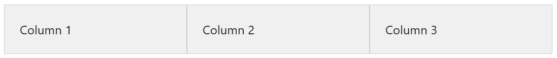
The above example contains the following classes for the grid system:-
.container: for responsive and fixed width layout..row: creates horizontal row to align columns..col: Divides the row into equal width columns.
3. Grid Breakpoints
In Bootstrap 5, you will get 6 responsive breakpoints for grid layouts:
| Breakpoint Name | Class Prefix | Min Width (px) |
|---|---|---|
| Extra Small |
col
|
<576px
|
| Small |
col-sm
|
≥576px
|
| Medium |
col-md
|
≥768px
|
| Large |
col-lg
|
≥992px
|
| Extra Large |
col-xl
|
≥1200px
|
| Extra Extra Large |
col-xxl
|
≥1400px
|
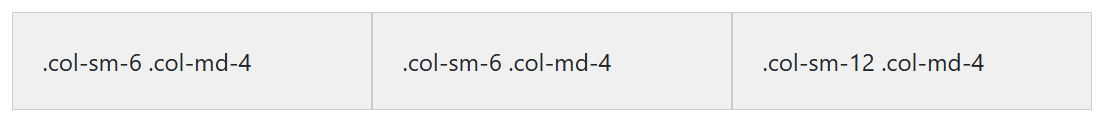
Example with breakpoints:
|
1 2 3 4 5 6 7 |
<div class="container"> <div class="row"> <div class="col-sm-6 col-md-4 box">.col-sm-6 .col-md-4</div> <div class="col-sm-6 col-md-4 box">.col-sm-6 .col-md-4</div> <div class="col-sm-12 col-md-4 box">.col-sm-12 .col-md-4</div> </div> </div> |
Output
Explanation:
col-sm-6: Span 6 grid columns on small screens (50% width)col-md-4: Span 4 grid columns on medium screens (33.3% width)col-sm-12: Span 12 grid columns on small screens (100% width)
4. Equal and Variable Column Widths
Equal-Width Columns
|
1 2 3 4 5 6 7 |
<div class="container"> <div class="row"> <div class="col">.col</div> <div class="col">.col</div> <div class="col">.col</div> </div> </div> |
Output
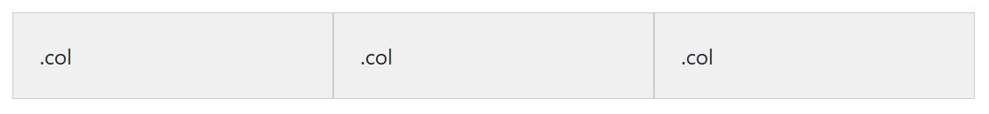
Columns automatically divide the available space equally.
Variable Width Columns
|
1 2 3 4 5 6 |
<div class="container"> <div class="row"> <div class="col-4">4 Columns Wide</div> <div class="col-8">8 Columns Wide</div> </div> </div> |
Output
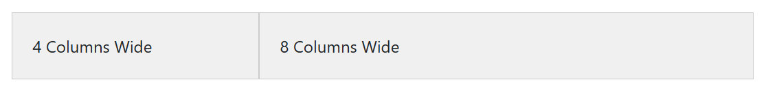
Use col-[number] to specify how many columns a specific element spans.
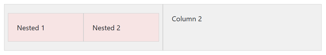
5. Nesting Grid Columns
You can create nested grids by placing rows and columns inside a column:
|
1 2 3 4 5 6 7 8 9 10 11 |
<div class="container"> <div class="row"> <div class="col-6"> <div class="row"> <div class="col-6">Nested 1</div> <div class="col-6">Nested 2</div> </div> </div> <div class="col-6">Column 2</div> </div> </div> |
Output
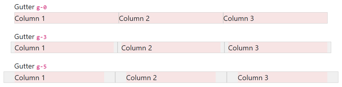
6. Gutter Control
Gutters are the spaces between columns. In Bootstrap 5, you can control gutter spacing using classes.
|
1 2 3 4 5 6 7 |
<div class="container"> <div class="row g-3"> <div class="col">Column 1</div> <div class="col">Column 2</div> <div class="col">Column 3</div> </div> </div> |
Output
Explanation
g-3: Adds a gutter of1rembetween columns and rows.- Other gutter sizes are:
g-0,g-1,g-2,…,g-5.
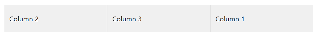
7. Responsive Order Classes
You can easily change the order of columns according to different screen sizes.
|
1 2 3 4 5 6 7 |
<div class="container"> <div class="row"> <div class="col order-1 order-md-3 box">Column 1</div> <div class="col order-2 order-md-1 box">Column 2</div> <div class="col order-3 order-md-2 box">Column 3</div> </div> </div> |
Output
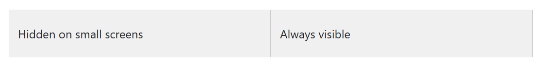
8. Hiding and Showing Columns
Use the .d-none and display utility classes to hide and show columns on specific screen sizes.
|
1 2 3 4 5 6 |
<div class="container"> <div class="row"> <div class="col d-none d-md-block">Hidden on small screens</div> <div class="col">Always visible</div> </div> </div> |
Output
9. Responsive Layout Using Grid System
Here’s a complete layout using the grid system:-
|
1 2 3 4 5 6 7 |
<div class="container"> <div class="row"> <div class="col-12 col-md-6 col-lg-4">Block 1</div> <div class="col-12 col-md-6 col-lg-4">Block 2</div> <div class="col-12 col-md-6 col-lg-4">Block 3</div> </div> </div> |
Output
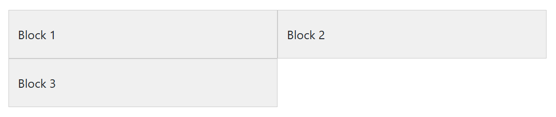
After learning the complete grid system, you can easily create dynamic and responsive layout for any type of web page.
Complete Example of Grid System
|
1 2 3 4 5 6 7 8 9 10 11 12 13 14 15 16 17 18 19 20 21 22 23 24 25 26 27 28 29 30 31 32 33 34 35 36 37 38 39 40 41 42 43 44 45 46 47 48 49 50 51 52 53 54 55 56 57 58 59 60 61 62 63 64 65 66 67 68 69 70 71 72 73 74 75 76 77 78 79 80 81 82 83 84 85 86 87 88 89 90 91 92 93 94 95 96 97 98 99 100 101 102 103 104 105 106 107 108 109 110 111 112 113 114 115 116 117 118 119 120 121 122 123 124 |
<!DOCTYPE html> <html lang="en"> <head> <meta charset="UTF-8"> <meta name="viewport" content="width=device-width, initial-scale=1.0"> <title>Bootstrap 5 Grid System Complete Example</title> <!-- Bootstrap CSS --> <link href="https://cdn.jsdelivr.net/npm/[email protected]/dist/css/bootstrap.min.css" rel="stylesheet"> <style> .grid-box { background-color: #f8f9fa; border: 1px solid #dee2e6; text-align: center; padding: 20px; font-size: 1.1rem; color: #495057; } .highlight { background-color: #e9ecef; } </style> </head> <body> <!-- Header --> <header class="bg-primary text-white text-center py-4 mb-5"> <h1>Bootstrap 5 Grid System Example</h1> <p class="lead">Learn and master the grid system with this example</p> </header> <!-- Container --> <div class="container"> <!-- Basic Grid System --> <section class="mb-5"> <h2 class="mb-3">1. Basic Grid System</h2> <div class="row"> <div class="col grid-box">Column 1</div> <div class="col grid-box">Column 2</div> <div class="col grid-box">Column 3</div> </div> </section> <!-- Responsive Columns --> <section class="mb-5"> <h2 class="mb-3">2. Responsive Columns</h2> <div class="row"> <div class="col-sm-12 col-md-6 col-lg-4 grid-box">Responsive 1</div> <div class="col-sm-12 col-md-6 col-lg-4 grid-box">Responsive 2</div> <div class="col-sm-12 col-md-6 col-lg-4 grid-box">Responsive 3</div> </div> </section> <!-- Gutter Spacing --> <section class="mb-5"> <h2 class="mb-3">3. Gutter Spacing</h2> <div class="row g-3"> <div class="col-md-4 grid-box">Gutter 1</div> <div class="col-md-4 grid-box">Gutter 2</div> <div class="col-md-4 grid-box">Gutter 3</div> </div> </section> <!-- Nested Grid --> <section class="mb-5"> <h2 class="mb-3">4. Nested Grid</h2> <div class="row"> <div class="col-md-6 grid-box"> Parent Column <div class="row mt-3"> <div class="col-6 grid-box highlight">Nested 1</div> <div class="col-6 grid-box highlight">Nested 2</div> </div> </div> <div class="col-md-6 grid-box">Parent Column</div> </div> </section> <!-- Alignment Options --> <section class="mb-5"> <h2 class="mb-3">5. Alignment Options</h2> <div class="row align-items-center" style="height: 200px; background: #e9ecef;"> <div class="col grid-box">Align Center</div> <div class="col grid-box">Align Center</div> <div class="col grid-box">Align Center</div> </div> </section> <!-- Order Classes --> <section class="mb-5"> <h2 class="mb-3">6. Responsive Order Classes</h2> <div class="row"> <div class="col-md-4 order-3 order-md-1 grid-box">First in Desktop</div> <div class="col-md-4 order-1 order-md-2 grid-box">Second in Desktop</div> <div class="col-md-4 order-2 order-md-3 grid-box">Third in Desktop</div> </div> </section> <!-- Full-Width Container --> <section class="mb-5"> <h2 class="mb-3">7. Full-Width Layout with Fluid Container</h2> <div class="container-fluid"> <div class="row"> <div class="col-md-4 grid-box">Fluid 1</div> <div class="col-md-4 grid-box">Fluid 2</div> <div class="col-md-4 grid-box">Fluid 3</div> </div> </div> </section> </div> <!-- Footer --> <footer class="bg-dark text-white text-center py-3"> <p>Made with Bootstrap 5.3</p> </footer> <!-- Bootstrap JS --> <script src="https://cdn.jsdelivr.net/npm/[email protected]/dist/js/bootstrap.bundle.min.js"></script> </body> </html> |